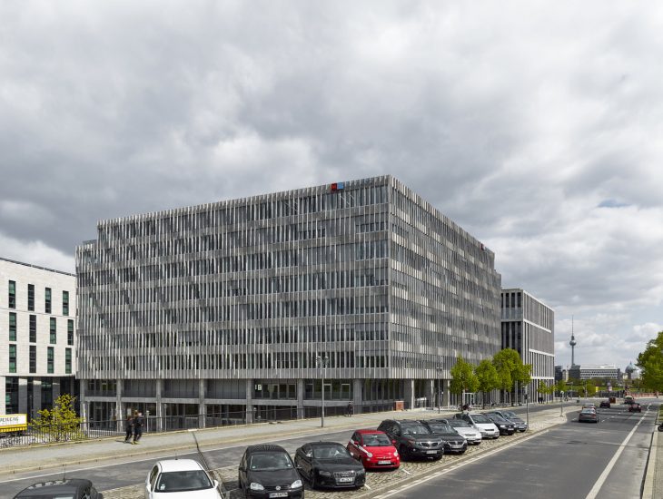
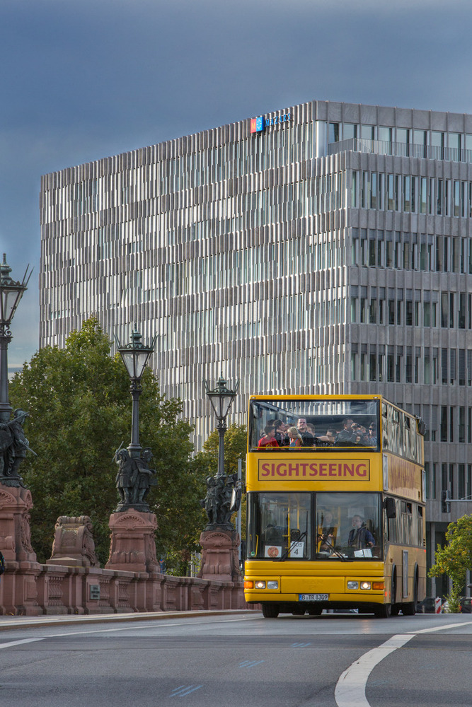
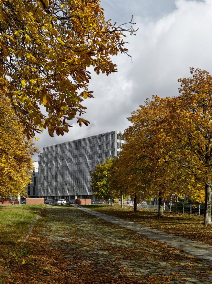
A nine-story office building of 25,000 m2 is completed on Bertha-Benz-Straße as a fourth and final component of the “Lehrter Stadtquartier”, directly south-west of Berlin’s main railway station. The building is in direct dialog with the three other volumes of the ensemble, for which clear master planning directives were given in terms of the buildings’ volume, height, and materiality.
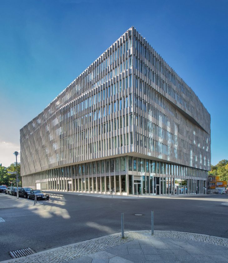
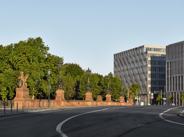
The design guidelines for the quarter were refined in 2006 following an urban development competition via the office Auer + Weber + Assoziierte, designed as a further continuation of the existing development plan: Oswald Mathias Ungers’ 1994 urban master plan for Humboldthafen, which isolates the railway station while sectioning off the adjacent area to the west into 7 plots based on the traditional Berlin block structure.
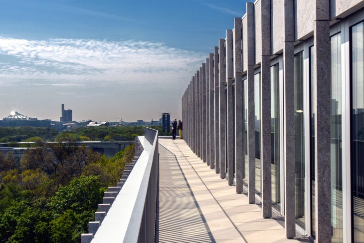
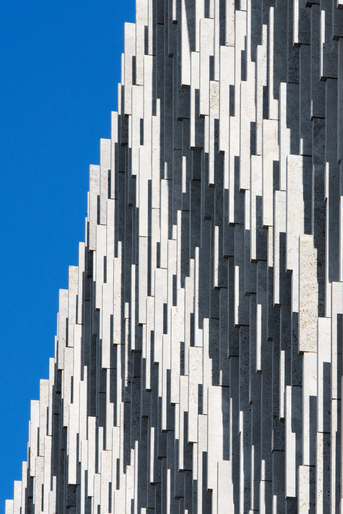
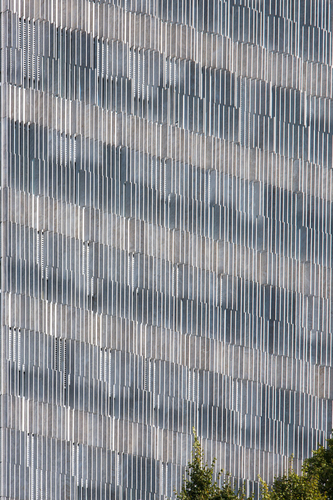
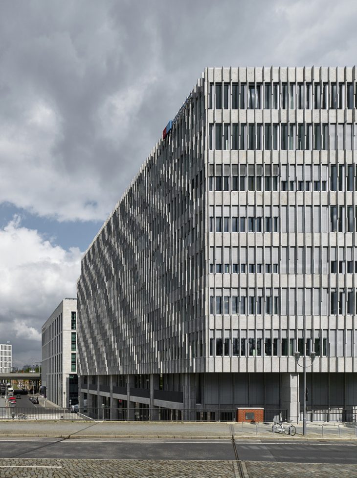
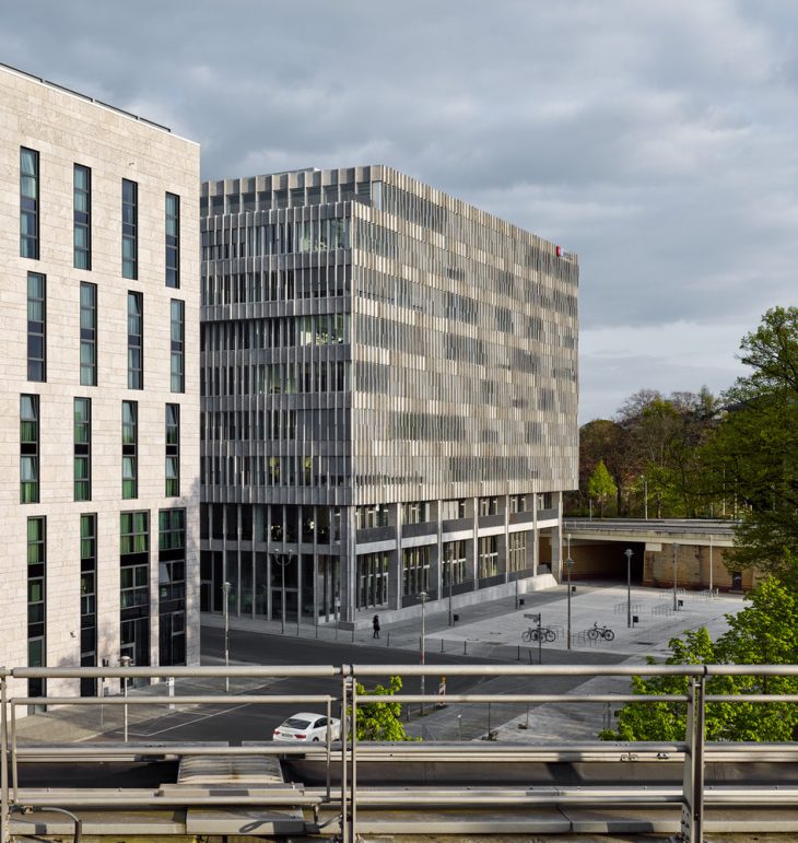
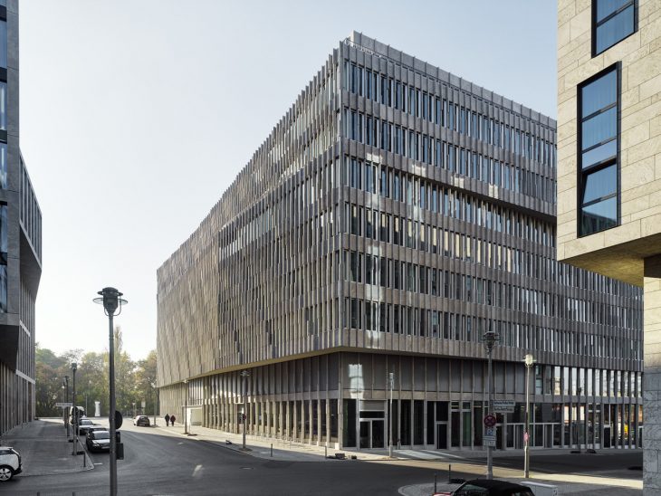
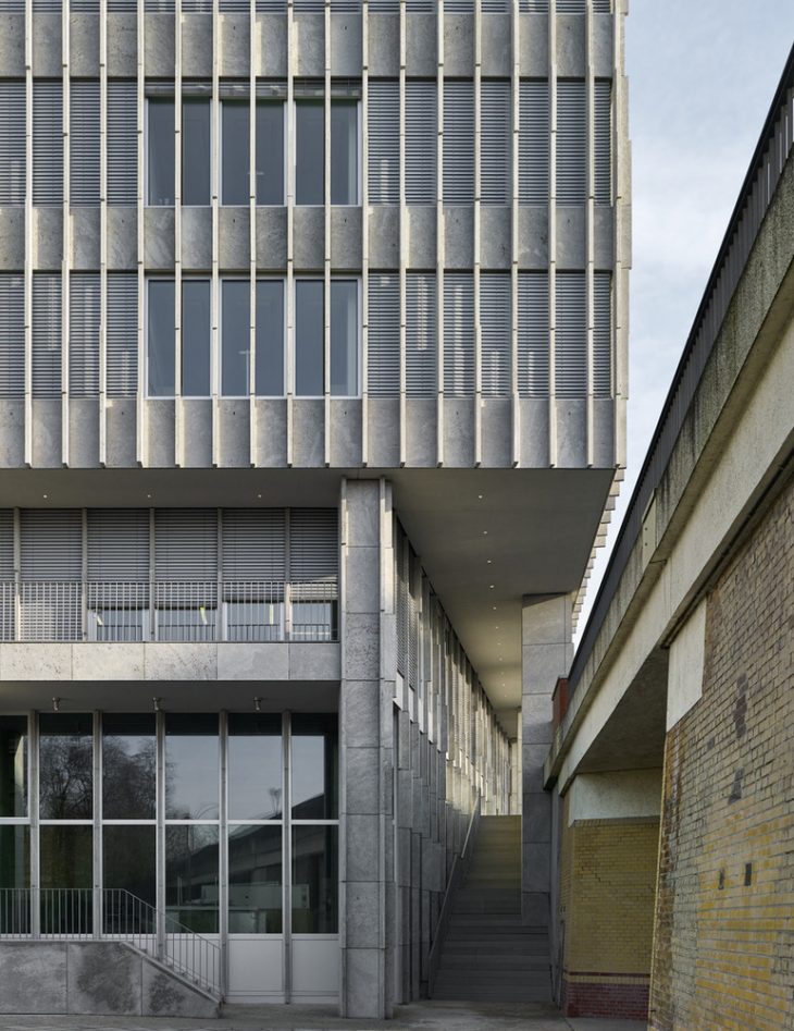
In addition to stipulations for a uniform building height and façades clad in light-colored stone, the design guidelines call for surface folding that modulates in response to one another on the inner-facing façades of the ensemble. Thus, the building has a “static” appearance towards the city on the outer-facing south and west sides, while the two façades toward the center of the quadrant dynamically undulate. In doing so, three horizontal bands – base, body and top floor – are articulated.
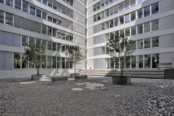
To compensate for the sloping terrain of the property, the building, which is organized around a central courtyard, is one story higher than the 3 neighboring building volumes. It is accessed via two main entrances on different levels – one towards the north on Berta-Benz-Straße and a higher, second entrance at the street Alt-Moabit towards the south. With their generous heights, these two levels offer space for two lobbies, several retail spaces, and a dining area, where a covered terrace opens up towards ULAP-Park to the west.
Parking spaces have been created in the areas on the base level that shift underground due to the slope of the site, joined by additional sub-level parking. Seven floors of offices rise above the ground level, cantilevering out slightly around the building and varying in depth. Here, three infrastructural cores allow for a floor plan that can be flexibly divided into up to six units per floor, allowing for a versatile range of possibilities from individual offices to open-plan areas. On the top floor setbacks on the north and east side create covered terraces with views over the city, the Chancellery, and the river Spree.
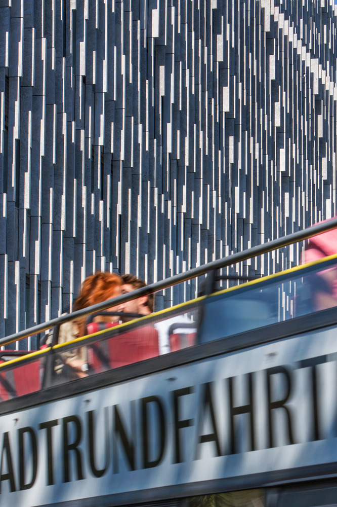
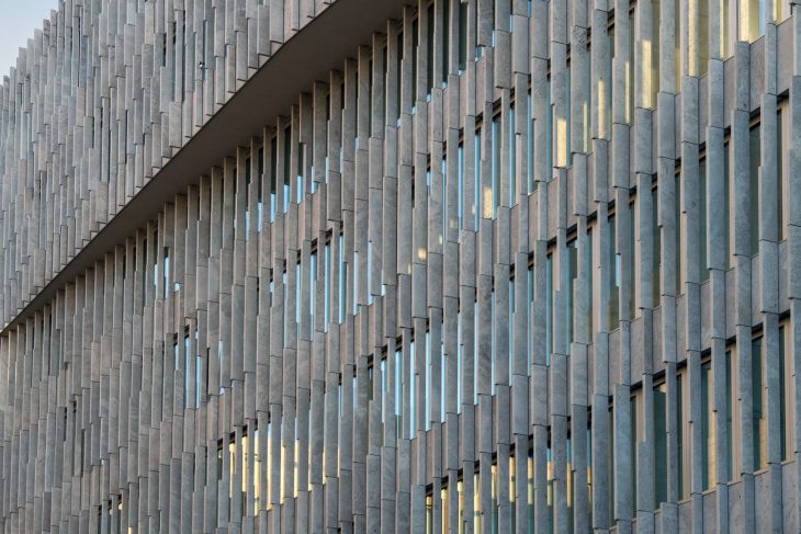
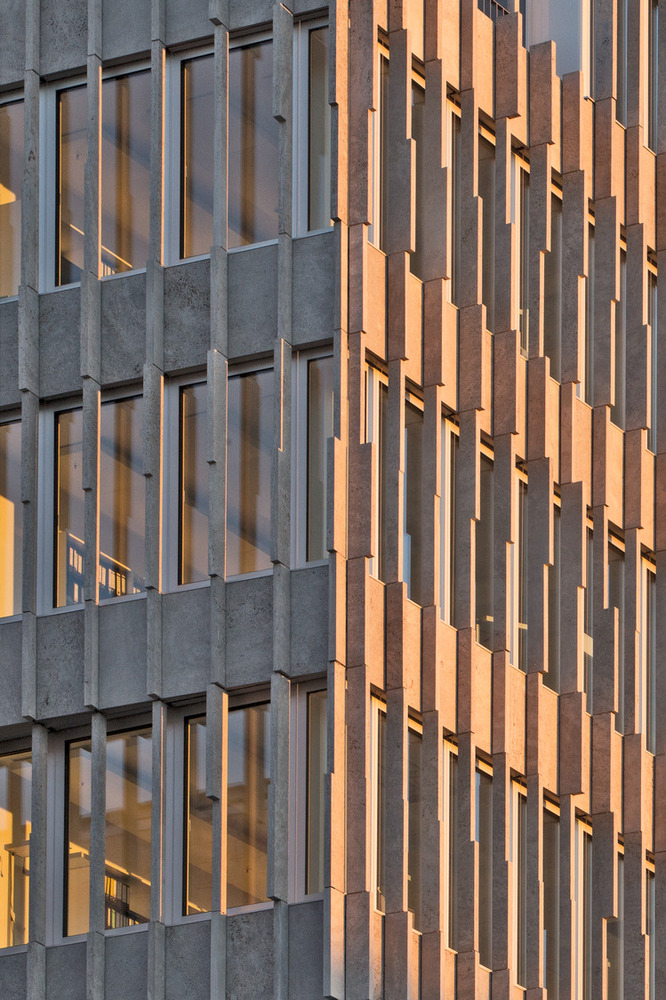
With its dynamic façade made of “Sellenberger Muschelkalk”, a light-colored natural stone, the building fits into the material and color spectrum of the ensemble. While shell limestone is a material rooted in the Berlin building tradition, its unconventional use here gives it an individual, memorable appearance: narrow vertical fins, only 8-cm wide and with a spacing of 67.5 cm, cover the building with a light, elegant curtain wall. Varying in depth, the fins stagger over 3 divisions per floor height, therein forming an incremental gradient like a fabric cladding.Sustainability certificate: DGNB Gold
Photography by Corinne Rose, Stefan Müller
Visit Barkow Leibinger


