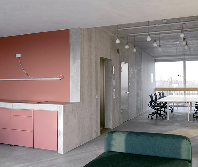
LOEHR was in charge of designing the the new rooms of the Berlin-based digital innovation company of Unicorns&Lions. Their studio, located on an upper floor of the neo-brutalistic LOBE block in Berlin-Wedding, is reminiscent of a loft. The concept is based on colourblocking and surface materiality to code the functional areas – a subtle and emotional subdivision of the otherwise open space. Take a look at the complete story after the jump.

The LOBE Block in Berlin’s Wedding district is a special place. According to the vision of Olivia Reynolds – a Londoner, who chose Berlin as her home for this project – architects Brandlhuber + Emde, Burlon and Muck Petzet had it built as a studio building to attract artists and cultural professionals. With its mixed use of residential and commercial space, the building has an unorthodox shape even for Berlin. On the one hand it refers to the classic inner-city Gründerzeit mixed-use typology, on the other hand it is formally associated to terraced houses found in Switzerland or Mediterranean countries. The LOBE Block, completed in late summer 2018, was one of the top five nominees for the European architecture prize “Mies van der Rohe Award 2019”. It not only attracts people with an interest in architecture and culture within Berlin, but from all over Europe. A future hotspot in the northwest of Berlin.
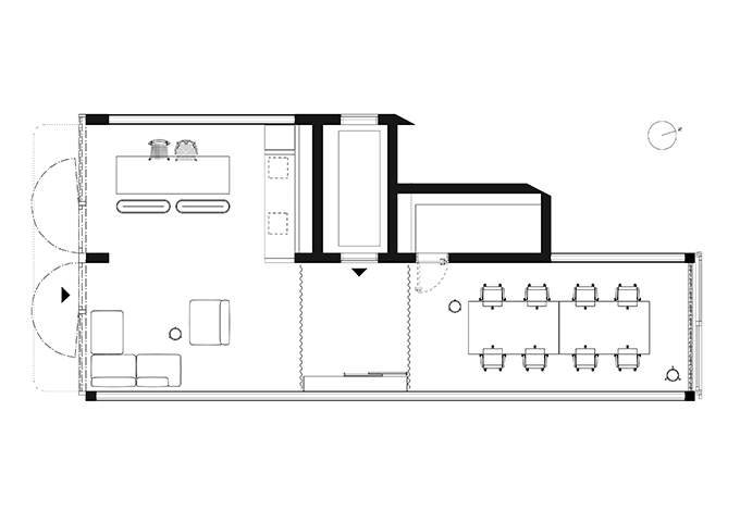
The unit that is the home of of Unicorns&Lions is shaped as an open “L” when viewed in the floor plan. By the concept, it is divided into five zones: A workspace, the entrance area, lounge, kitchen and dining area. The raw surfaces of the building are contrasted with strong colours and high-quality, natural materials. These colour and material fields code the individual functional areas. Intuitively, the design of these areas is based on favourite places and common areas of spacious apartments.
The interior design concept is the result of an intensive and joint dialogue in which the requirements for working methods, experience and habits of Unicorns&Lions formed the basic criteria for the design. Proposed solutions were systematically tested with models and then transformed into a viable final concept.
Interdisciplinary exchange and in-depth involvement of the client in creative and compositional decisions form the basis for a methodology that LOEHR is convincingly using for its CREATIVE SERVICES. Applied in this way, the result is architecture that profoundly reflects the culture and character of the client.
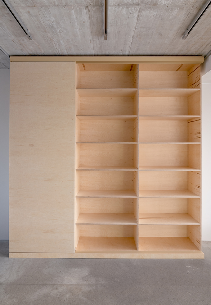
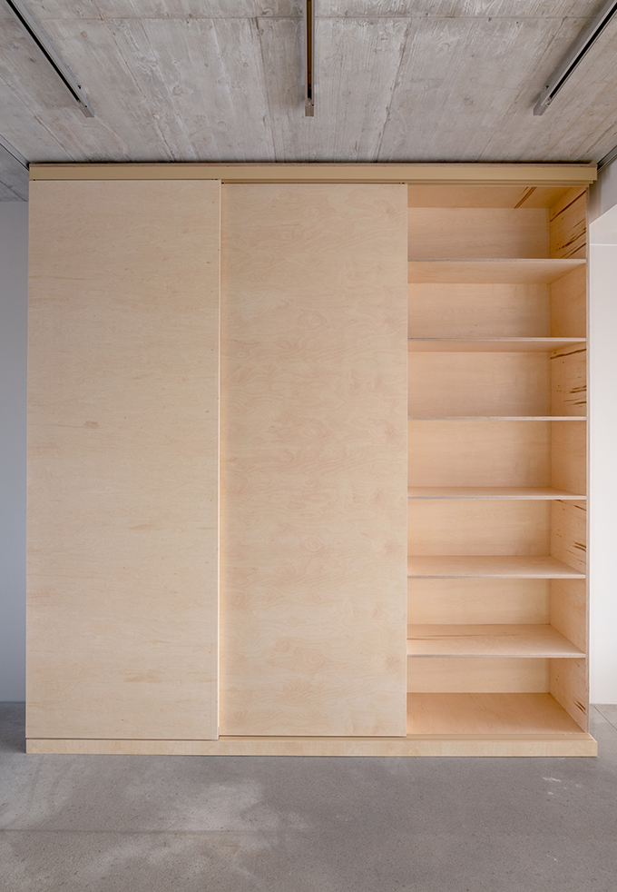
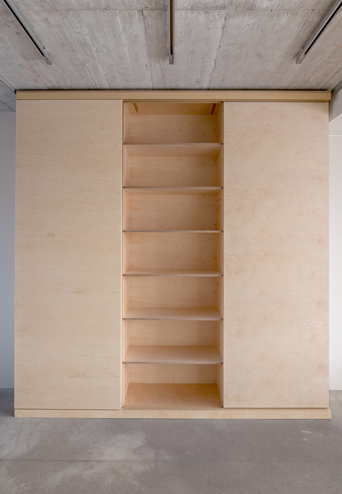
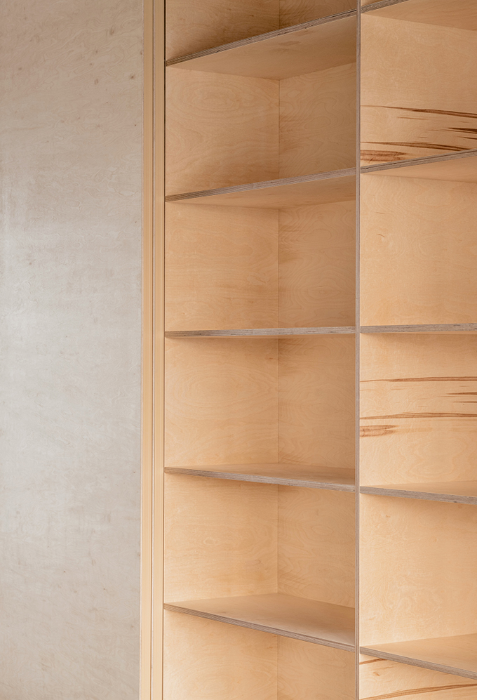
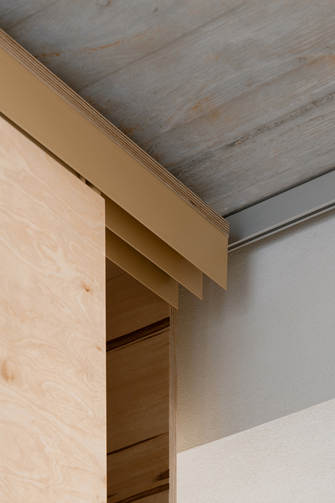
When entering the studio – which is possible mainly by elevator – you are standing in a generous entrance zone. This area also works as a junction and a storage space. Opposite the entrance door a floor-to-celing bespoke shelf with sliding doors that are made from birch plywood offers space for various utensils.
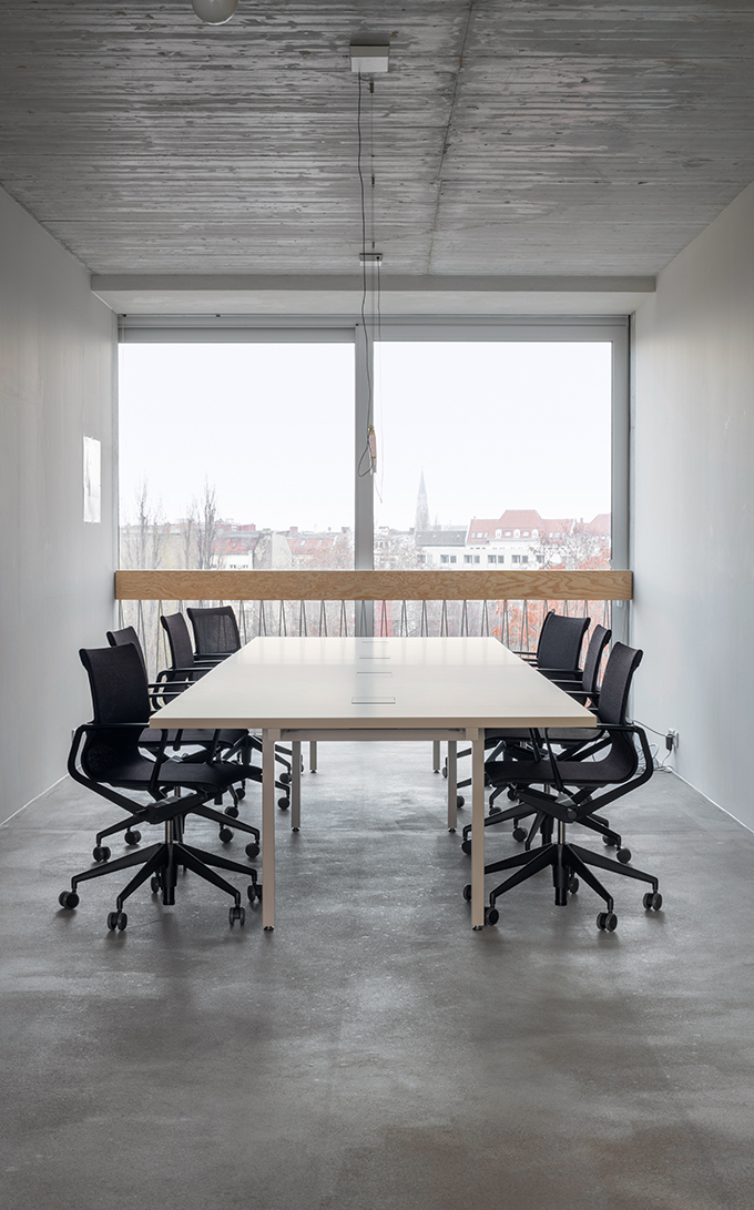
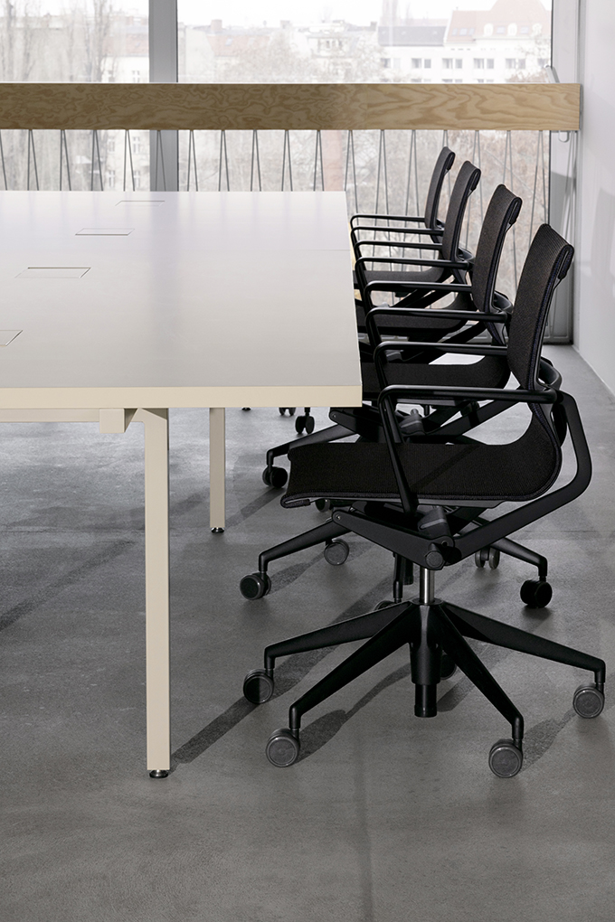
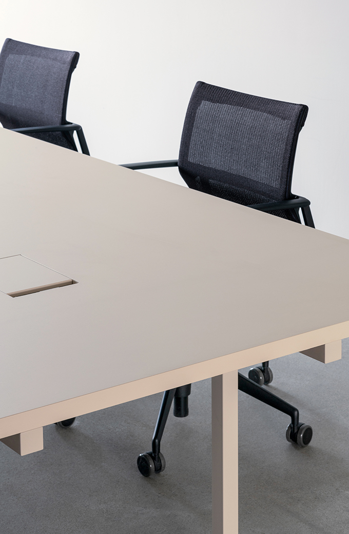
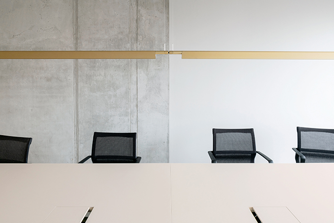
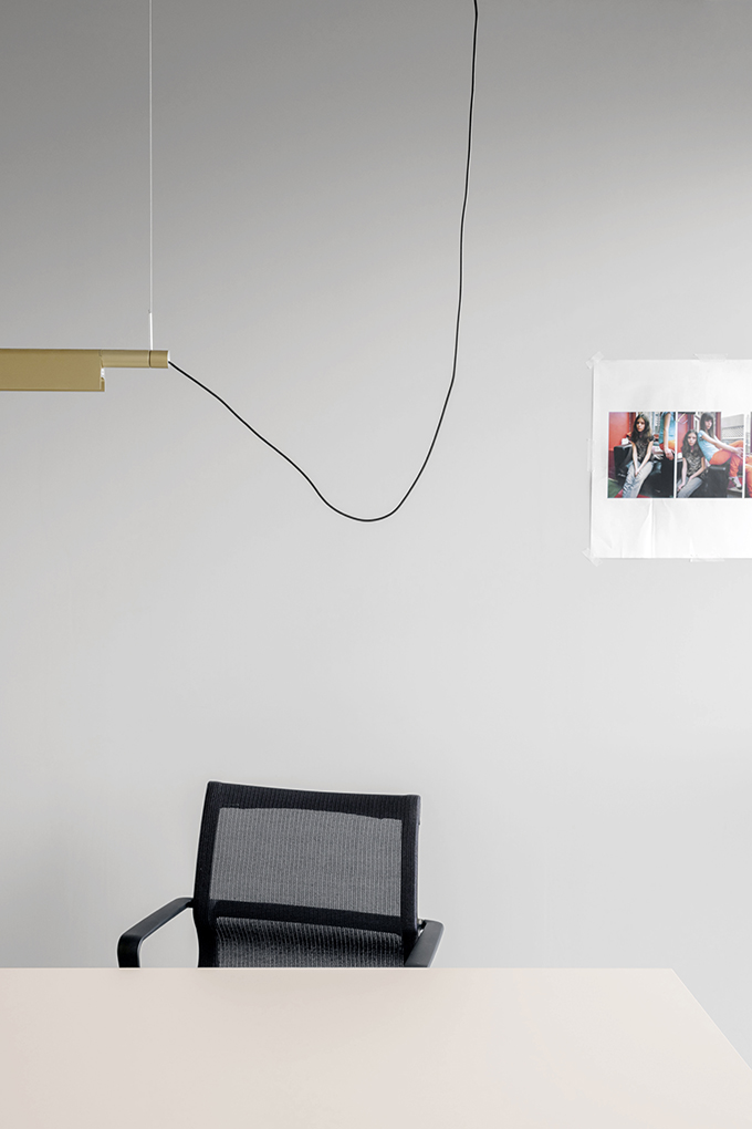
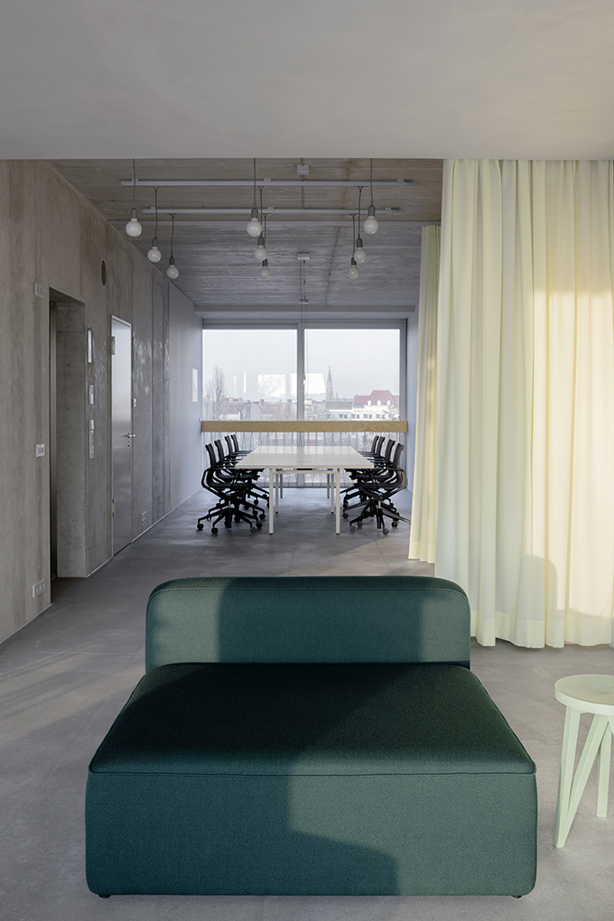
To the left, the workspace extends to the north. It is furnished with two chain-linked ENO tables that form a large-format workbench. Up to ten people work here – room-high windows provide a direct view to the neighbourhood across the street. ENO’s recessed underframe offers maximum legroom, while the integrated cable management provides convenient access to power supply and data lines. For seating LOEHR designers chose the light-looking Physix office chair from Vitra.
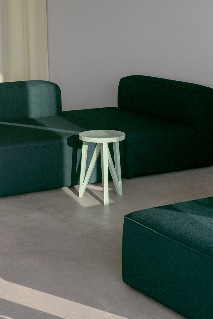
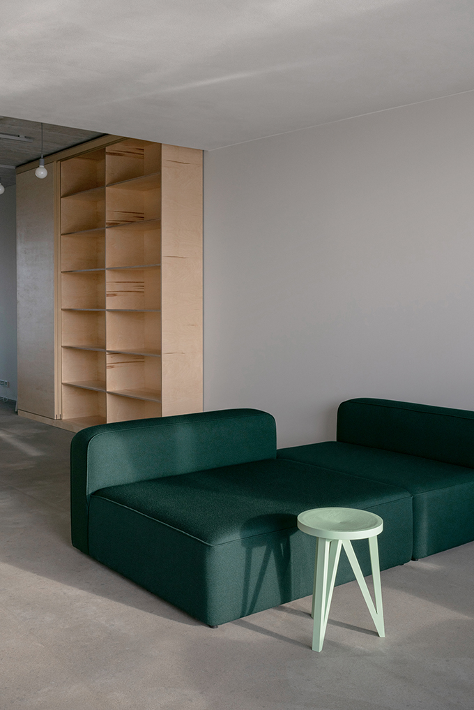
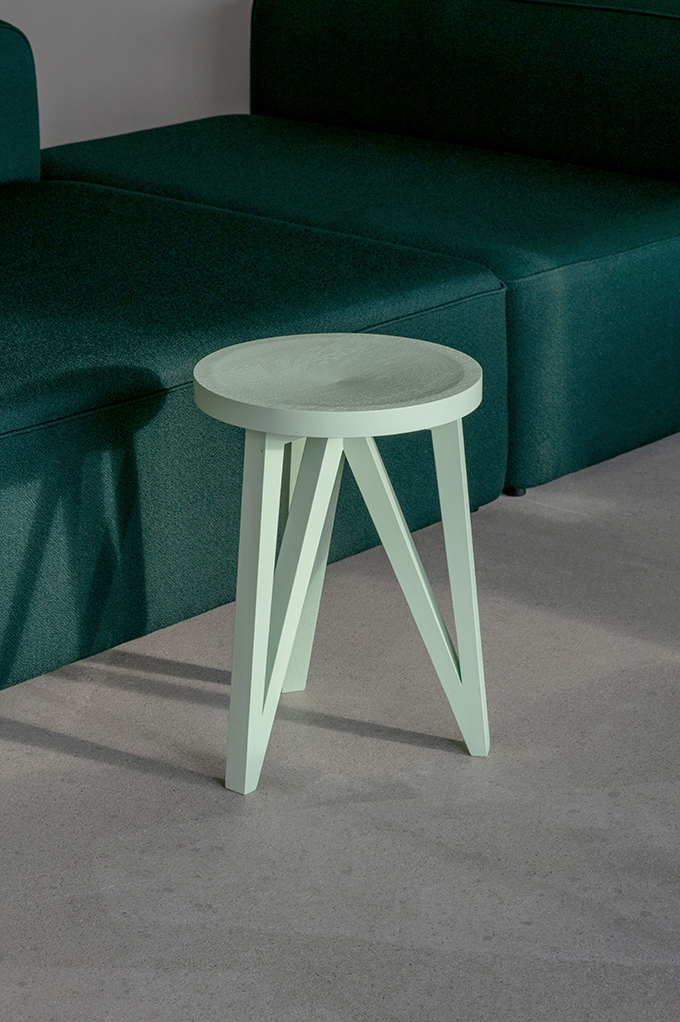
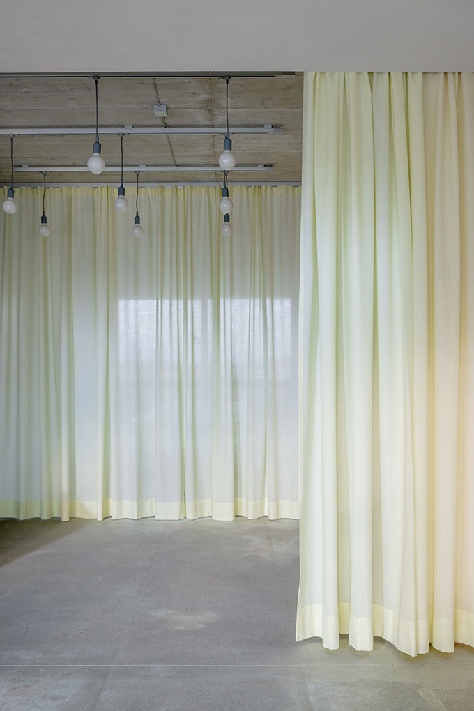
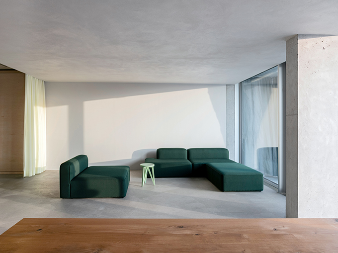
The entrance zone can be separated with two pastel yellow curtains to create a buffer zone. In addition the textile also improves acoustics. To the south, a space spanning two axes opens up. First, there is a low seating landscape made of the Rope modular sofa from Danish manufacturer Normann Copenhagen. It is a customized version dressed in Kvadrat’s moss-green Vidar fabric, which is also used in LOEHR’s own upholstered furniture EUCLIDES and PLATO.
RELATED: FIND MORE IMPRESSIVE PROJECTS FROM GERMANY
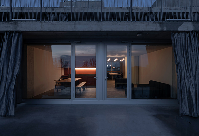
Like a large meadow, this lounge spreads out in front of the fully glazed front to one of the more than six-metre-deep terraces. Team meetings take place here, but you can also relax and read or write here. The view opens up over the roofs of Berlin, the adjoining terrace can be used as a room extension on warmer days.
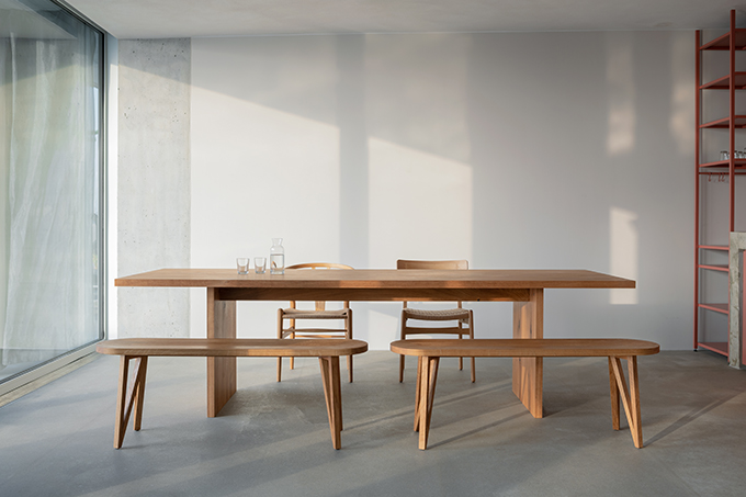
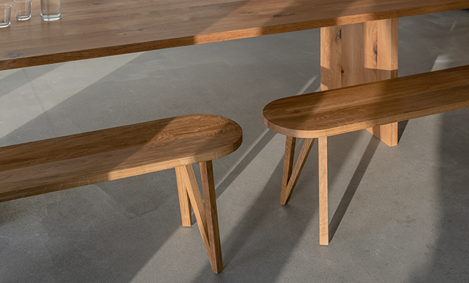
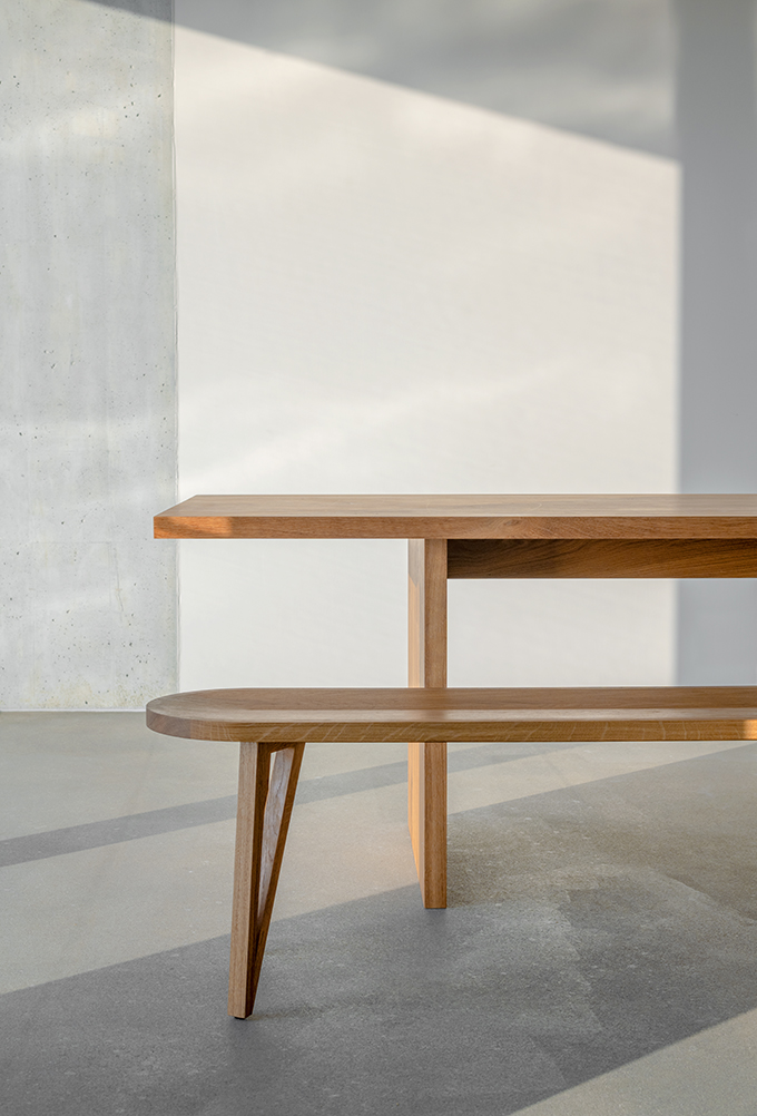
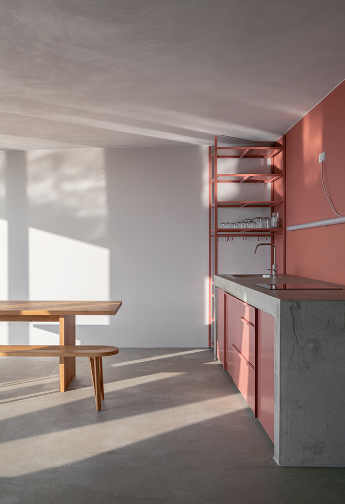
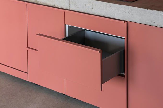
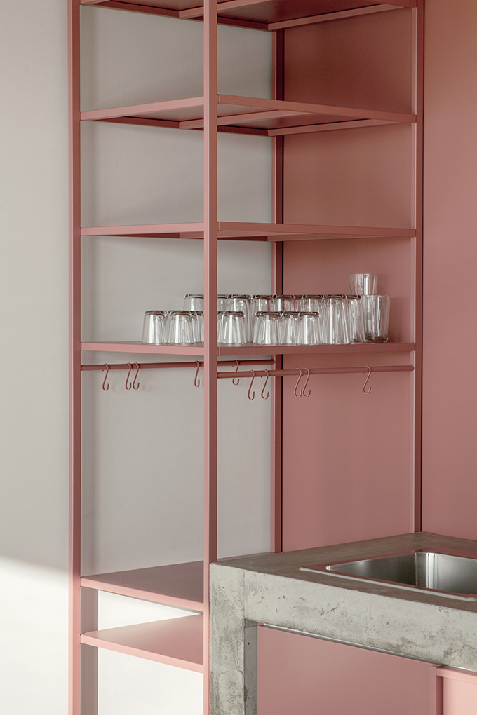
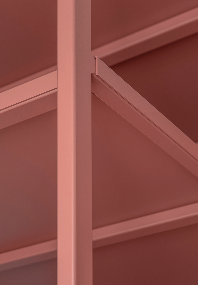
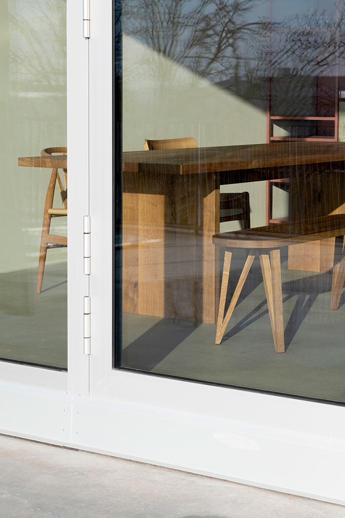
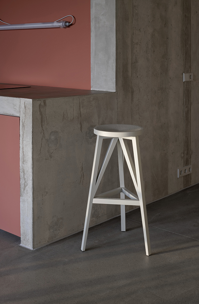
The next colour block is just a few steps away: the kitchen is made of a terracotta-coloured functional unit which is installed below the massive concrete counter pre-installed by the architects. LOEHR designed bespoke metal shelving, custom-fit cabinets and metal handles, all tinted in the same earthen tone. The dining area in front of the kitchen is furnished with a long oak table by manufacturer e15. The seating, also in oiled oak finish, consists of two FABER benches by LOEHR as well as two chairs by Hans. J. Wegner. This area has the atmosphere of a casual eat-in kitchen. No wonder the people working at of Unicorns&Lions feel at home here.
Find more designs by LOEHR: loehr.co


