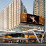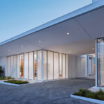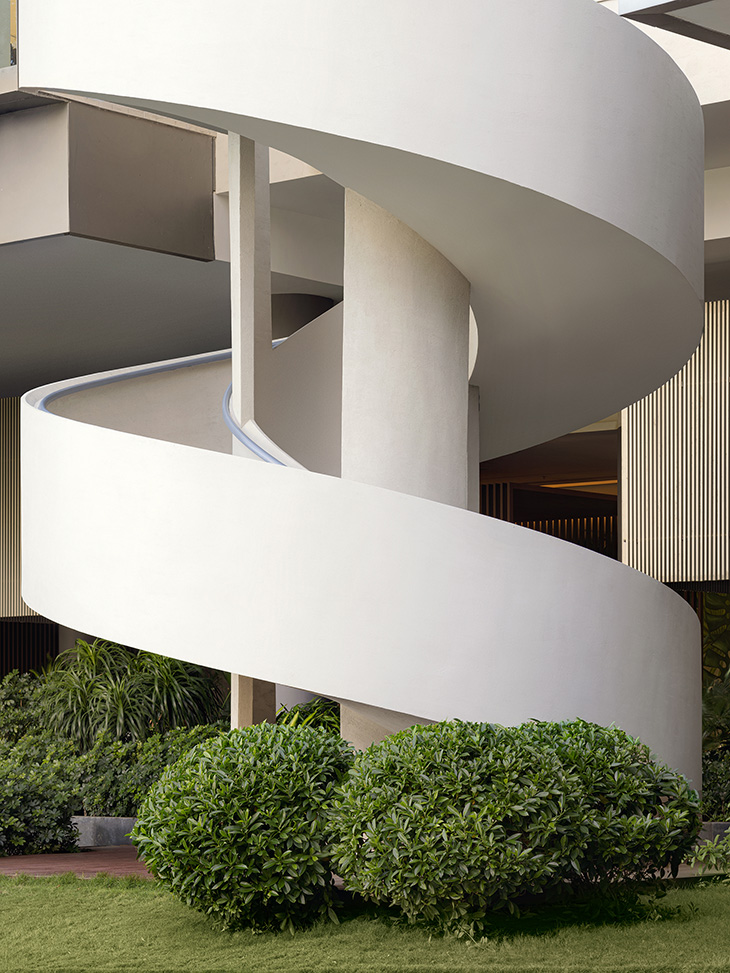
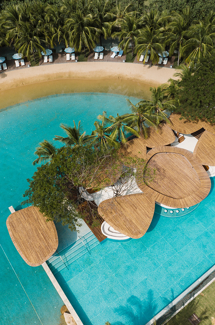
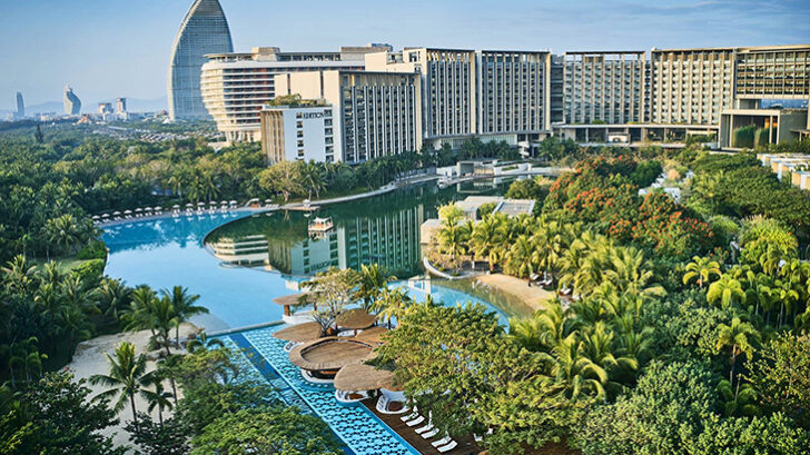
Life Aesthetics Community at The Sanya EDITION, a project completed jointly by the hotel and Various Associates. This addition to the hotel in Haitang Bay, China, includes a public commercial space, shopfronts, an Art Center, retail stores, a bookstore, and a café area. The design aimed to balance commerce and fashion while serving the needs of the hotel, client, and retail brands.
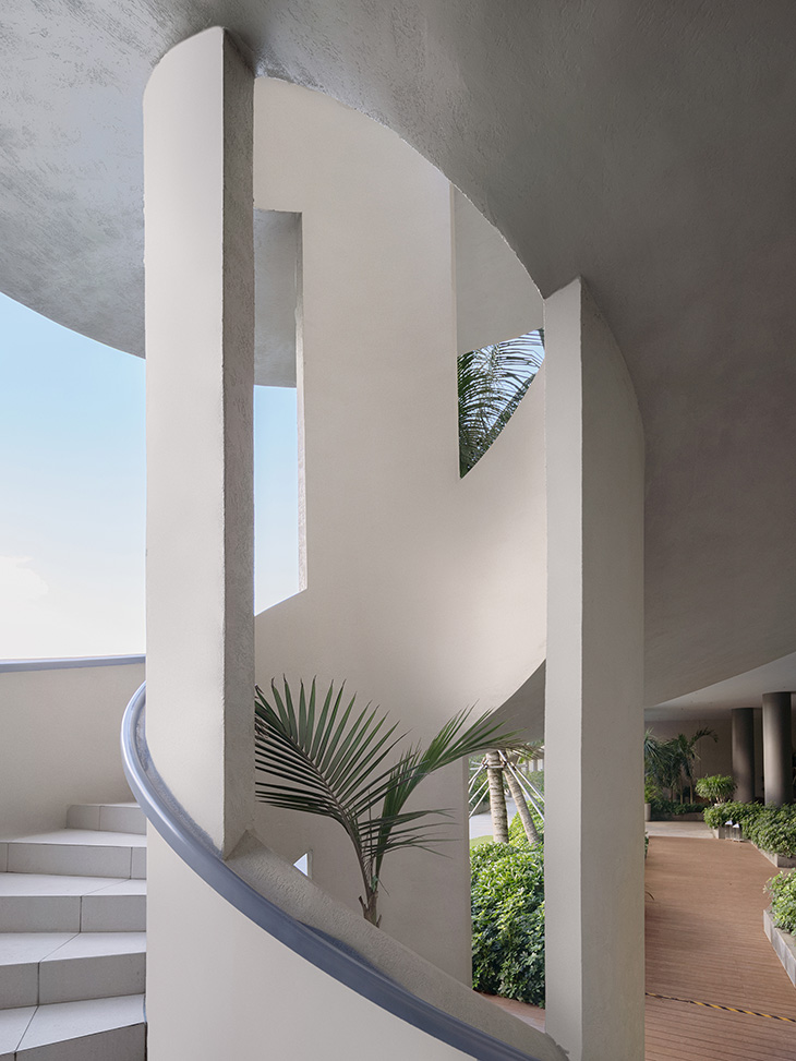
Key features include a new circulation with a spiraling staircase connecting floors and offering panoramic views of the tropical landscape. The design integrates commercial and hotel spaces, using glass curtain walls and shopfront designs to enhance natural light and create a pleasant shopping experience.
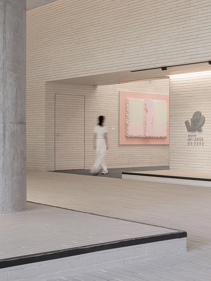
The Art Center is a focal point, with a unique ceiling design and black floor to define space. It features various artworks and original sofa collections by Various Associates.
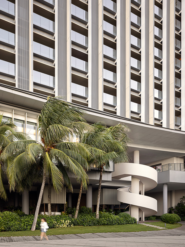
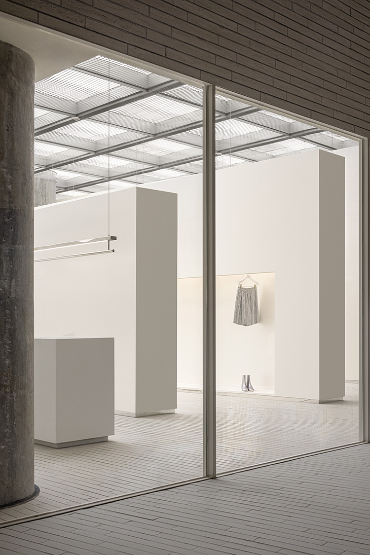
The project also includes the SND fashion boutique store, designed with a ‘waves’ concept, offering a unique shopping experience. The design from the exterior to the interior aims to blend art, nature, and urban resort lifestyle, capturing the essence of the hotel. The project was completed in 2022 by Various Associates.
To give us a better idea of the project Various Architects founders Dongzi Yang and Qianyi Lin sit down with our Editor Zarko Davinic for an exclusive interview:
Dongzi and Qianyi, can you describe the inspiration behind the design of the Life Aesthetics Community at The Sanya EDITION? – Sense of ease, quality and culture.
Starting from ease, how did the local tropical island climate and marine sports culture influence the design and functionality of the community? – The local tropical climate forms the hotel’s own characteristics – the lobby and public areas are basically open. However, Air conditioning is needed in retail, coffee and other spaces, so that more guests can stay. Therefore, in the preliminary work, there was a discussion about whether the new part of the area was open, but in the end, we still hoped that the upgraded public area part could be connected with other public area parts, so in the end, we can see that our design is to make the shops into small boxes, and the two shops are naturally formed. Scenic area.
The project emphasizes a balance between commerce and fashion; how was this achieved in the design and layout? – Edition itself is a stylish hotel with artistic atmosphere, it’s not difficult to present fashion here – the people who come and go are very fashionable and trendy. The generous window size for the facade also caters to the window display of retail brands, we encourage merchants to do more creations and temporary installations in the windows– this has proven to be effective, the branded aesthetic attracts guests to take photos.
The spiral staircase is a notable feature; what was the concept behind its design and how does it enhance the guest experience? – The spiral staircase is crafted with an elegant curved design language, echoing the flair of an art gallery with its pure form. When ascending the pure white steps, visitors are treated to a breathtaking panoramic view of the stunning tropical landscape, making this spot one of the sought-after instagrammable attractions for tourists.
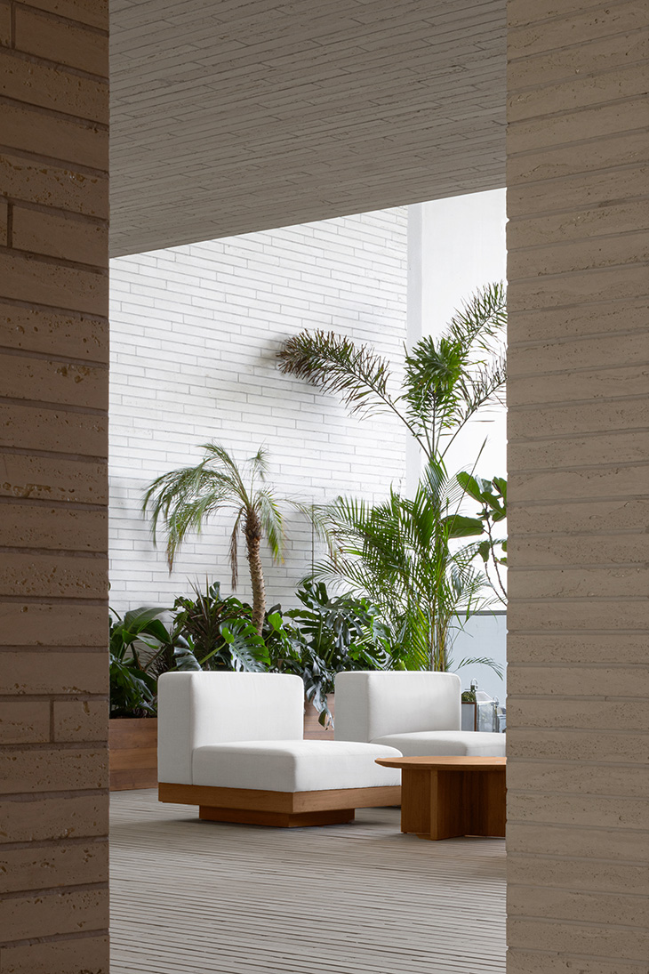
Can you explain the integration of natural elements, such as natural daylight and vegetation, into the community’s design? – In order to integrate the site better, we rearranged the space with the original vegetation, at the same time we used glass curtain walls on the facades of suitable shops, so that sunlight can be better introduced into the public area, it will not affect the use of independent indoor spaces.
How do the design and arrangement of the open viewing areas contribute to the overall ambiance of the space? – The open viewing areas are strategically placed in the gaps between the shops, providing a delightful view of the outdoor natural landscape. The openness and simplicity of the space create a serene, cozy, and relaxing atmosphere. The clever arrangement of structural blocks resulted in a meandering passageway, which helps to eliminate the monotony and exhaustion that can arise from traversing a long passageway.
The Art Center is a vital part of the project. Could you elaborate on its design and how it complements the surrounding area? – The Art Center is a vital area to convey the artistic sense and enhance the overall ambiance. We have made an inward retreat space on the facade of the shop as a display area, which can be used for the window display, artwork or installation display of the shop, which is an effective way to unify the display atmosphere of the whole space, our concept is an art museum-like display corridor – which not only meets the display needs of the window, but also allows the art of the museum to be displayed in the display space of the whole space.
What was the approach to selecting and displaying artworks and products in the community’s public spaces? – The curatorial arrangement and direction are from the Jinghope team, our previous advice is to choose some artists’ works related to materials and nature.
How did you tackle the challenge of integrating the retail spaces with the hotel’s existing structure and style? – The existing 6-meter-high floor height of the public area posed a challenge in controlling the guests’ sightlines at an appropriate level. Taking advantage of the floor height, the design team incorporated glass curtain walls into the upper and lower levels of store facades combined with new shopfront designs. The introduction of natural daylight enhances transparency and brightness in the indoor area, while the large show windows act as a platform to display artworks or products, creating a pleasant shopping experience for customers.
Can you discuss the design and impact of the fashion boutique store SND within the community? – SND is a boutique of international brands with a collection of branded apparel and products from all over the world, it attracts a lot of fashionable guests. We’ve heard from SND that many of their regular guests bring only a small amount of clothes to the hotel, then shop in the SND and go out for a photo shoot in their new clothes. It’s like a mobile wardrobe. Some regular guests will even ask SND to mail their favorite clothes from stores in the city then pick them up here.
What were the key considerations in choosing materials and textures for the interior design? – The materials present the natural and authentic textures. The design team cut the travertine tiles into smaller pieces and applied them throughout the space, producing a cultural ambiance and a sense of place through the simple texture and its extending form.
How does the Life Aesthetics Community reflect the overall essence of The Sanya EDITION and contribute to the guests’ experience? – For the general hotel, Life Aesthetics Community is a special existence, because it is a new attempt to implant multi-category formats into the hotel, it provides more accurate and benchmark brand choices to the guests, such as fashionable swimwear and corresponding products from brands around the world can be purchased in SND boutique store. The irregular exhibitions and exhibition derivatives in the gallery can also provides a sense of freshness to the guests.
Project Name: Jinghope · Life Aesthetics Community at The Sanya EDITION
Area: 3000 ?
Project Location: Sanya, China
Completion Time: 2022
Client: Jinghope Real Estate Co., Ltd.
Project Type: Facade/Interior Design/Small Building Design
Design Firm: Various Associates
Website: various-associates.com
Lead Designers: Qianyi Lin, Dongzi Yang
Design Team: Jianpeng Liu, Baizhen Pan, Zebing Li, Meiyu Jiang
Photography: SFAP


