Avanto Architects have recently completed their latest project in Turku, Finland – Finnish Design Shop. The new headquarters building of the world’s largest online Nordic design retailer includes a logistics center that ships products to over a hundred countries, a showroom, and a café.bThe project was done in close collaboration with the principal designer Arkkitehtiruutu and the interior designer Studio Joanna Laajisto. Photos are by kuvio.com / Anders Portman.
We talked to Avanto Architects about the main inspiration behind the project, design features and the and the building’s materialization.
What was your main inspiration behind the project?
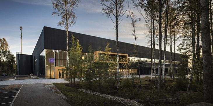
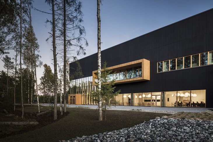
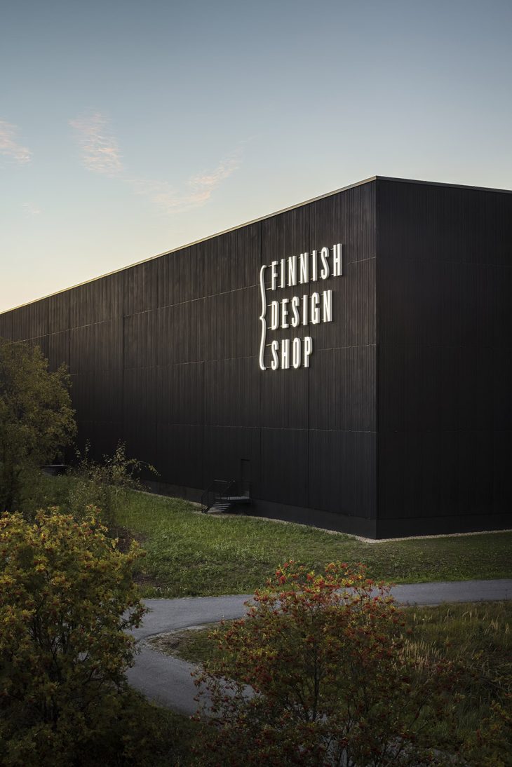
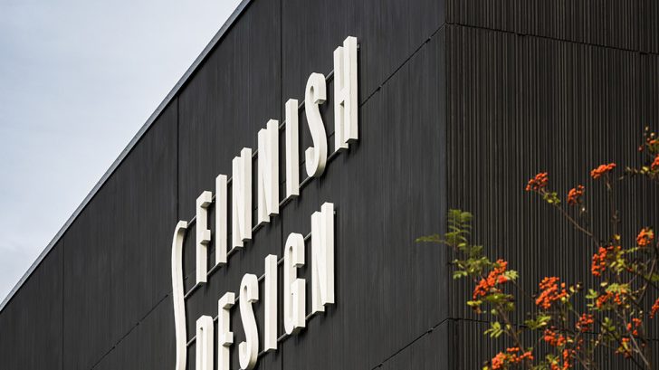
Right north from the building plot, there is a nature conservation area and the third biggest boulder from ice age called the Devil’s Nest. The forest theme is visible in the facades having a vertical three dimensional pattern that reminds us of the tree trunks in the surrounding forest. As many trees as possible were preserved on the plot. The area was landscaped with natural forest undergrowth and stones excavated from the site. The parking lot was divided into smaller units with green areas with domestic trees and vegetation found in the wild nature. The building’s large windows offer unobstructed views to the surrounding forest. There is direct access to the outdoors both from the restaurant’s terrace, and from the first floor office spaces through a long balcony.
Could you briefly introduce the concept behind the Finnish Design Shop project?
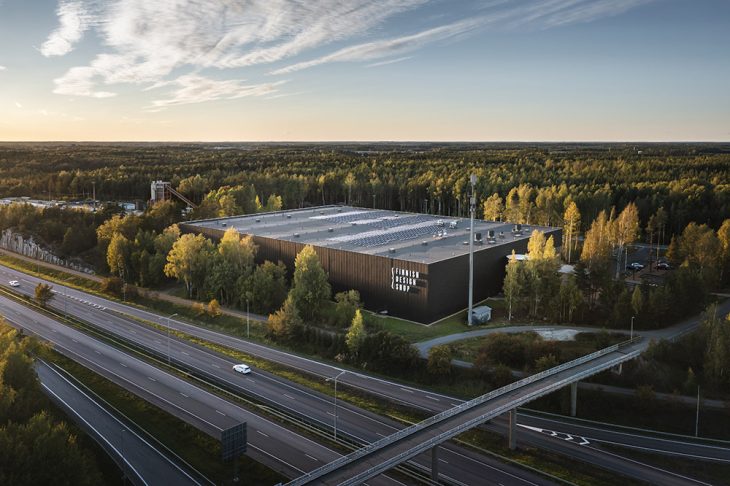
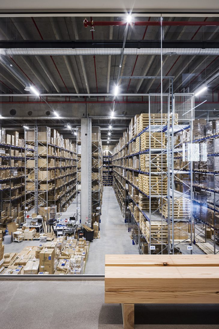
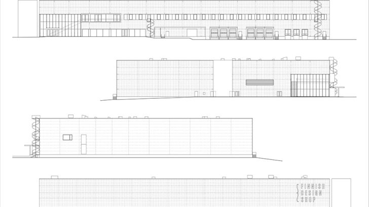
The design task was challenging. The large-scale building was mainly formed according to the requirements of the automated robot warehouse inside, and there was no possibility to articulate the building with massing or roof form. Even though the location right next to the Turku city ring road and near the airport allowed for a simple structure, the user wished for the building to represent the design company’s values of high quality and easy to approach.
Even though the building couldn’t tell about its use by its form, we didn’t want to design just “a decorated shed” as described in the classic book Learning from Las Vegas. Instead of searching for the concept too far, we found the concept for the building in the near surroundings. (see previous answer)
What considerations go into designing a good retail space?
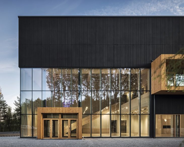
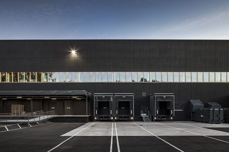
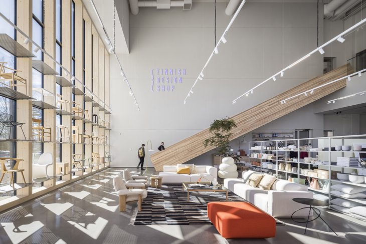
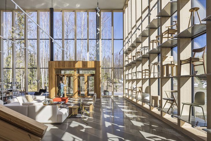
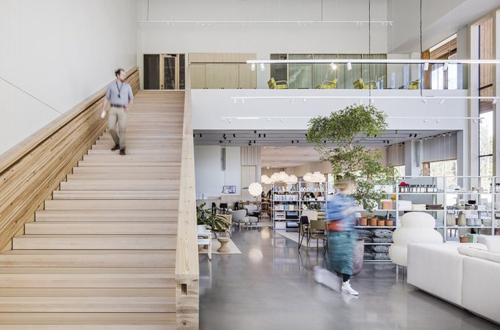
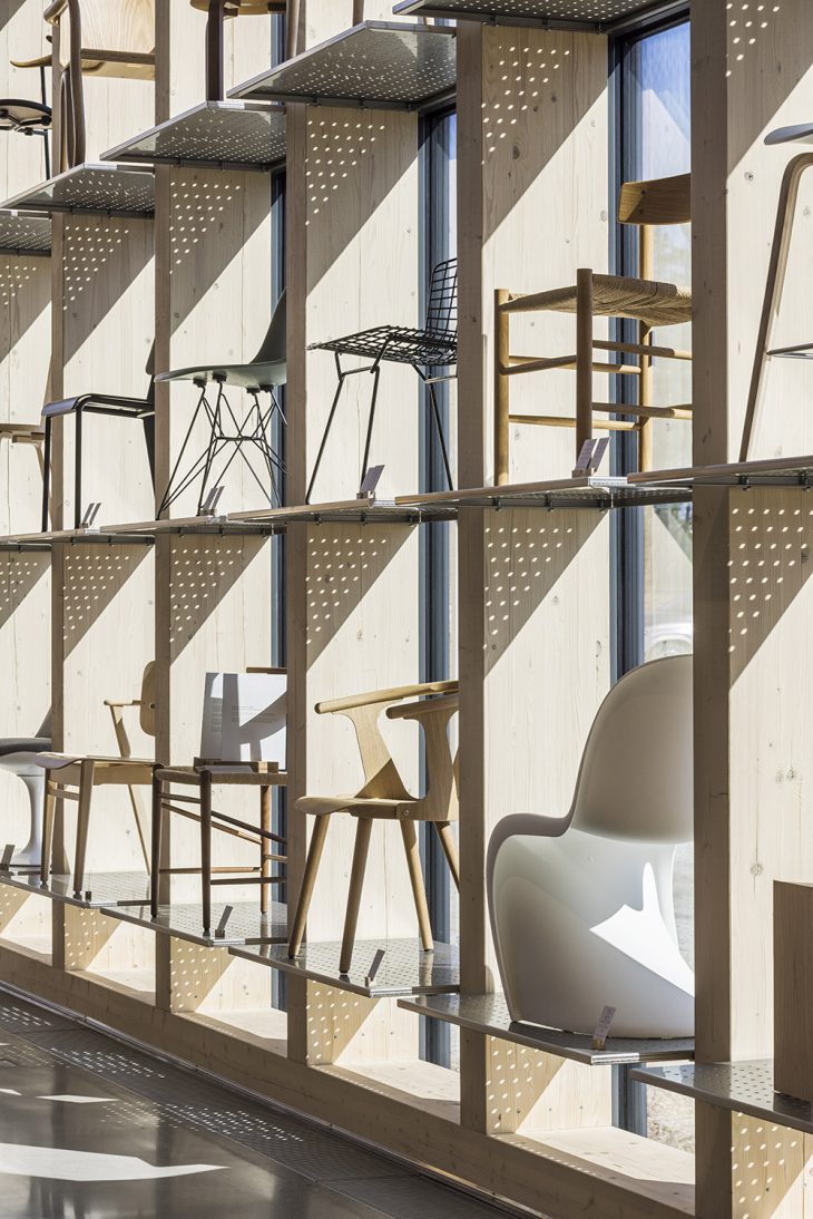
The Finnish Design Shop is actually not a pure retail space but a hybrid building comprising the logistics center for the online shop, the company headquarters, a showroom and a restaurant. Nor we are really a specialist of retail architecture. But we thought it was a good idea to have an exhibition space in the entrance hall showcasing the very high quality furniture the company sells. The client wanted that the showroom opens up to the surrounding with large glazed curtain walls. We liked this idea as the building is otherwise more or less just a black box without any windows as natural light was not wanted for the logistics hall. As Finland has long and dark winter time, the glazed showroom is like a lantern inviting people to enter the building and making it easy to approach.
We have a bit problems with retail sector as we think that in the developed countries we already have enough everything and we shouldn’t buy much more to save the planet. However, if you really need to buy something, it should be of high quality so that the same piece of furniture can be passed to next generation or even further. We should stop consuming affordable but low quality products that don’t last long and create a lot of waste as the recycling systems are still developing. This is why this project was interesting: the company sells only high quality furniture that can be sold as vintage furniture if you would have a need to abandon the furniture because of moving to another apartment for example. The company actually even has their own online store Frankly to sell vintage furniture. What is really interesting that the price doesn’t necessarily go down but up when you sell your used furniture, as some of the furniture is produced only in small series so they become a sought-after collector item. So we were super happy to share the same ethical values with the client.
But directly to the question: today’s retail space is not just a place to showcase and sell the goods offered for purchase as you get the same goods cheaper in online store, but it is all about signaling the company brand. Moreover, to compete with online sops, the physical shops need to offer experiences that you don’t get online. Finnish design shop is a true destination with its showroom and very high quality restaurant in a building of high quality architecture. Picking up your purchased product from the pick-up counter is made to a pleasant experience for all senses instead of just basic visit to a warehouse building.
How did you shape the concept in regards to materials, layout, forms?
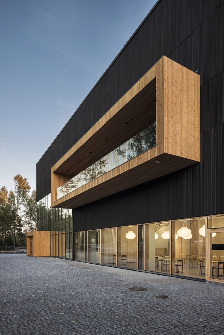
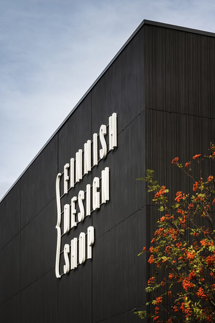
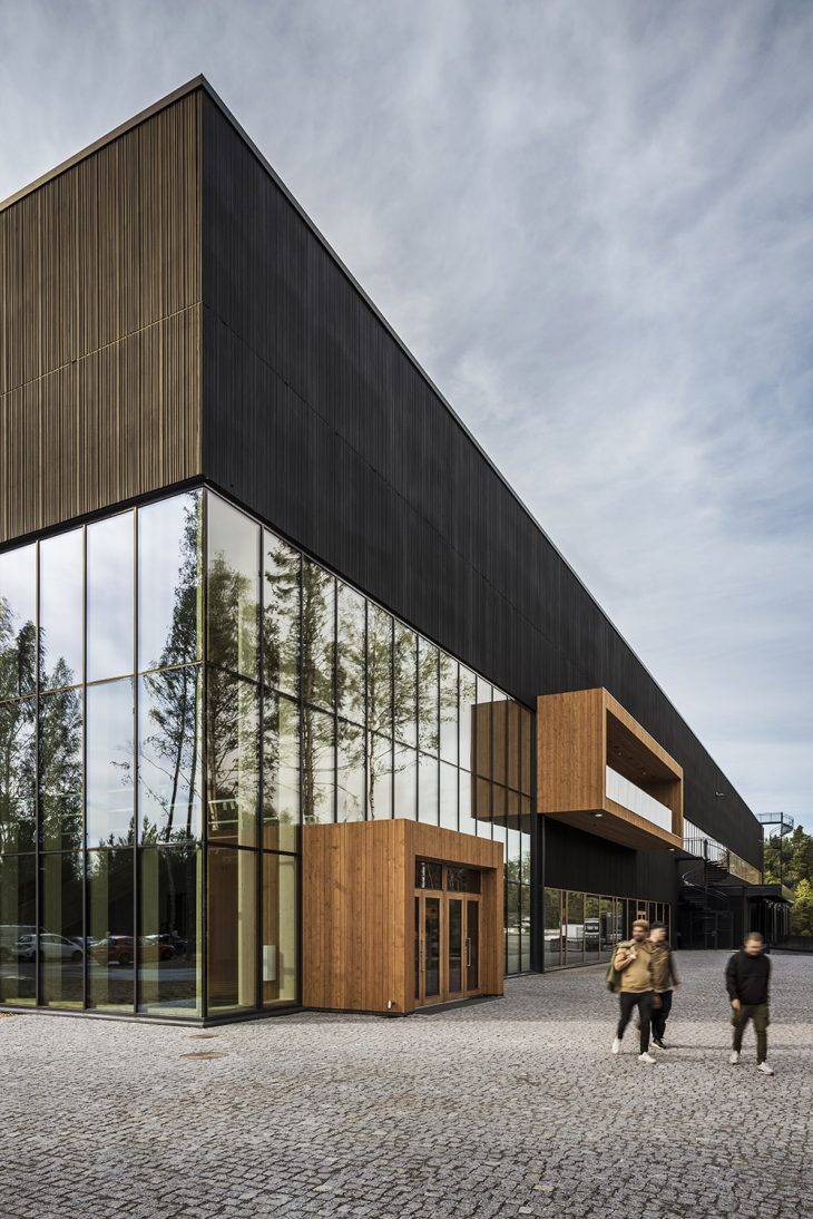
Since the building layout was defined according to the requirements of the automated robot warehouse inside, and there was no possibility to articulate the building with massing or roof form, our design concentrated on the façade surface and detailing. The façade is built with sandwich elements made of concrete. The timetable of the project, which started in late spring of 2020, was very tight. The building needed to be in use already by summer of 2021, so that there would be no harm to the coming Christmas sales that is the high season of online stores. This is why we ended up using readymade concrete form liner Brisbane produced by Recli. Even though the relief is just 15 millimeters deep, the appearance of the surface changes according to the sun angle making the pattern look deeper and more three dimensional. The pattern introduces a smaller scale to the large scale façade surface. The relief is visible only when you walk near the wall making the approach of the building interesting. To optimize the building costs, the concrete has basic aggregate and typical Portland cement. The concrete was colored with 6 % black Bayferrox pigment produced by Lanxess. The surface was treated with black Faceal Color varnish to make the black surface more intense and to blend the building to its surroundings.
How did you manage to build a bond with the surrounding nature and integrate it into the design?
The whole concept of the building was inspired by its setting next to a valuable nature conservation area. It is impossible to integrate fully large scale building to a natural setting but the dark color reduces the visual impact of the massive building. The façade relief pattern also helps to make the building more interesting as the façade pattern only reveals itself when you approach the building.
Sustainability wise, what are the main features of the design?
The building was the first BREEAM Excellent (the second highest level) certified logistics building in Finland. This ambitious goal was achieved with help from a life cycle assessment expert. The energy needed in the building is produced by geothermal heat powered by electricity from solar panels, and the sustainability measures were taken care of in all design solutions and building works.
RELATED: FIND MORE IMPRESSIVE PROJECTS FROM FINLAND
Could You tell us about the materials that were used in your project?
Apart from the concrete façade we described earlier, the entrance vestibule marking the main entrance of the building and first floor balcony are clad with wood to contrast the black concrete surfaces. Wooden windows and doors also bring warmth to the exterior of the building.
And finally, can You tell us about the lighting solutions for the interior?
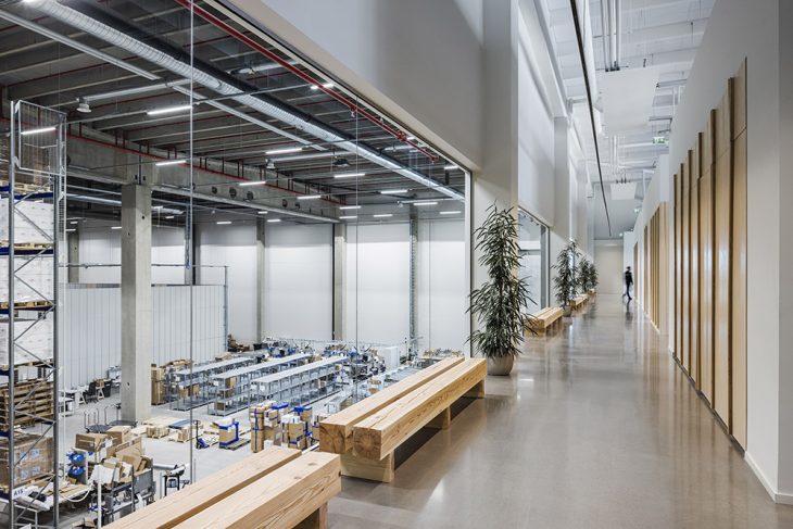
The lighting of the interior was challenging as most of the spaces are really high. The interior designer Joanna Laajisto solved this using hanging rails where spotlights could be attached freely and modified if the interior layout changes. In the restaurant there are pendants to create an intermediate scale and reduce the feeling of a single open space. For details, it’s better to contact directly her.
Building type Logistics center, headquarters, showroom and restaurant
Address Aviatie 2, Turku, Finland
Design 2020-2021
Construction 2021
Gross floor area 12 129 br-m²
Client NREP IV FinCo 8 Oy / Sanna Vikström and Jarkko Äikää
PCM JL- Projektikonsultit Oy / Jarmo Leskinen
User Finnish Design Shop Oy / Teemu Kiiski
Supervisor Auratec Oy / Juhani Virtala
Mechanical supervisor TA-Tekniikka Ky / Asko Tamminen
Designers:
Facade design: Avanto Architects Ltd / Ville Hara, Anu Puustinen and Noora Lehtinen, architects SAFA, Veronika Farvozdinova, architect
Principal and architectural design: Arkkitehtiruutu Oy / Riku Aramo, Päivi Mäntylä and Susanna Rantanen
Interior design: Studio Joanna Laajisto / Joanna Laajisto and Mimmu Hirvonen
Structural design: SWECO Rakennetekniikka Oy / Aki Luntamo
Geo design: SM Maanpää Oy / Sauli Maanpää
Mechanical designs: SWECO Talotekniikka Oy / Antti Mustalammi,
Santtu Meristö (HVAC), Juha-Pekka Laiho (EL), Petteri Lehtinen (automation), Anu Hannukkala (EN)
Fire technical design: Palotekninen insinööritoimisto Markku Kauriala Oy / Marianna Kauriala, Milla Saarto, Tea Nieminen
Sprinkler design: Afire Oy / Antti Virtanen, Harri Jokela
Landscape design: VSU Oy / Saara Oilinki
Traffic design: WSP Oy / Harri Haantio
Acoustical design: Akucon Oy / Anssi Ruusuvuori
LCA consultant: Green Building Partners Oy / Timo Rintala
Main Contractor: YIT Suomi Oy / Juha Kohonen, Arvi Lehtovaara, Toni Tahkoniemi, Jouni Kääriäinen, Rauno Vilén, Ilari Havia (vastaava mestari), Olli Lehtonen, Kari Hallanheimo
Photos: kuvio.com / Anders Portman
Find more projects by Avanto Architects: avan.to


