Project: Fuse
Designed by Box Architecture
Principal Designer: Gary Mongey (Project Architect)
Design Team: Gary Mongey (Project architect), Ashlene Ross, Peter Gowran, Jonathon woods, Terry Murphy
Client: Fuse
Quantity Surveyor: Flynn McNally McKell Partnership
Structural Engineer: Lohan & Donnelly
Contractor: Irish Conservatories
Area: Site Area: 20.5m2 x 3.5m2, Built-up Area: 117 m2
Location: Portobello, Dublin, Ireland
Website: www.box.ie
Photographer: Paul Tierney
Fuse project comes our way from Box Architecture, who created this modern office building for an expanding graphic design company. For more images as well as the architect's description continue after the jump:
From the Architects:
Introduction. The client, an expanding graphic design company owned two small adjacent buildings on the corner of Synge Street, a residential terrace, and Lennox Street, a mix of commercial and residential, in Dublin 8. The proposal was to demolish the badly constructed existing 1950s commercial premises, in order to extend the office space of the remaining building.
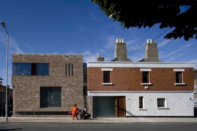
The site was narrow (20.5m x 3.5m) and was a left over space at the junction of the two streets with the commercial premises on Lennox Street once overlooking a canal basin. The redundant1950s building was an anomaly in the existing streetscape as it was in disrepair and subject to vandalism. The new proposal was intended to contribute to the urban fabric of this street and the new elevational treatment responds to both the neighbouring buildings and the urban context of the site.
Brief.
– to provide a modern office building to meet current building standards and a creative working environment
– to increase the efficiency of the building and provide additional functional space for a growing company
– to create a hierarchy of private and public spaces, with designated private offices, open plan working spaces and a client meeting room
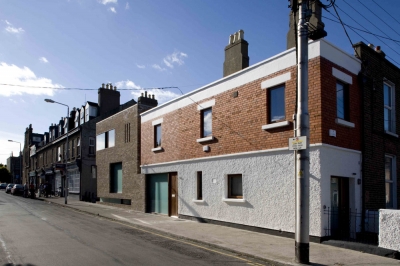
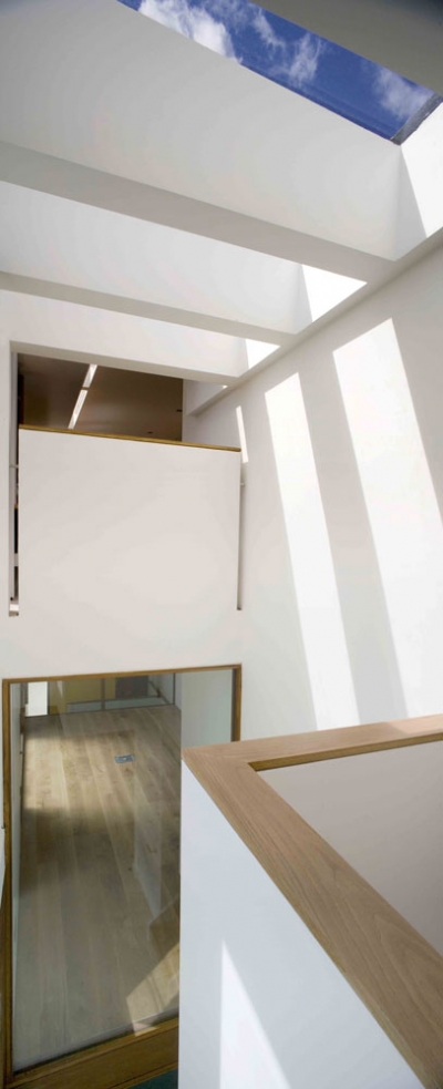
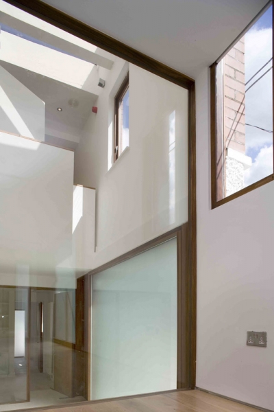
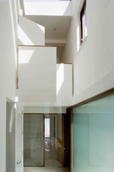
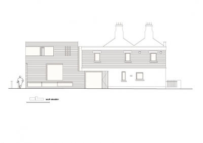
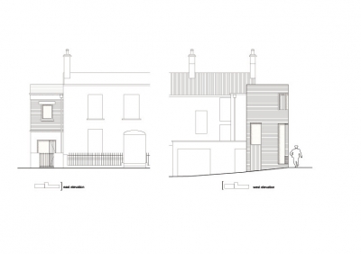
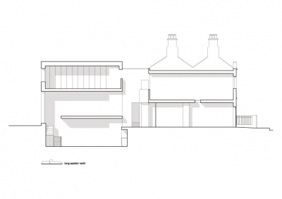
Design. With the site being long and narrow the location of the entrance was key and a decision was made to move the entrance onto Lennox Street, being more appropriate to the residential nature of Synge Street. Moving the entrance also maximised the space available and created a double height, top lit space with the circulation is behind a wall concealing how one moves from the differing levels. The new elevation proclaims the extension to be a modern intervention through its contemporary style with original detailing of materials. The new facade interlocks three dimensionally with the façade of the retained building to create a coherent composition of new and old.
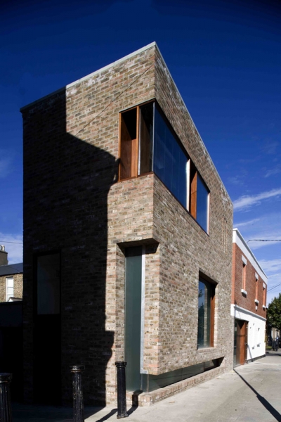
On an urban scale the new extension acknowledges its position as a building with a view to the canal. The line of the adjacent parapet level is broken as the new build steps up slightly repeating a condition, which occurs further along the street. Brick was selected to clad the extension, referencing the existing material of the retained building, with the new brickwork responding to the tones of the neighbouring brick buildings on Lennox Street. The new entrance is defined by a recessed large opal glass screen and adjacent timber door. The recess emphasises the sense of entrance and re-appropriates the language of the adjacent shop fronts on Lennox Street.
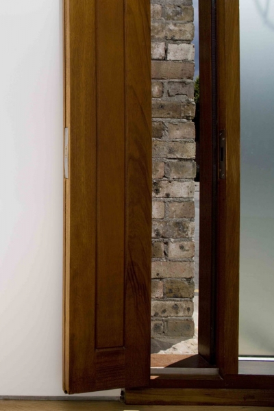
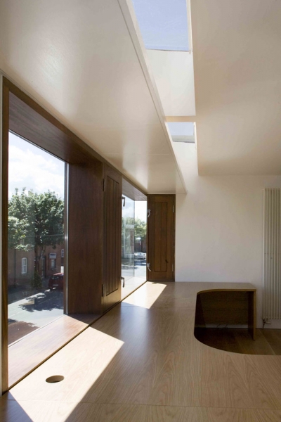
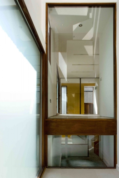
The brick skin is punctured by glazed openings informed by the interior spaces. The glazed band at street level provides clerestory natural lighting to the basement area. This glazed band wraps around the corner vertically to acknowledge the laneway and, in conjunction with a window above the side door, provides additional light to the basement area in the afternoon. At Ground floor level, a large picture window provides a view to the street from the meeting room (this is temporarily opal glazed). This window has timber ventilation panels to each side, and externally the brick skin is detailed to conceal this panel so the window appears as a simple glazed opening. Internal glazed screens are used to both ends of the meeting room and basement to provide views to the double height voids within the building.
This visual link between levels provides a sense of how this complex building works and orientates the occupant. At first floor level, rooflights above a light shelf provide reflected natural light to the open plan workspace, views are provided by a large corner window and three slit windows provide more focused intimate views and allow increased occupant control.
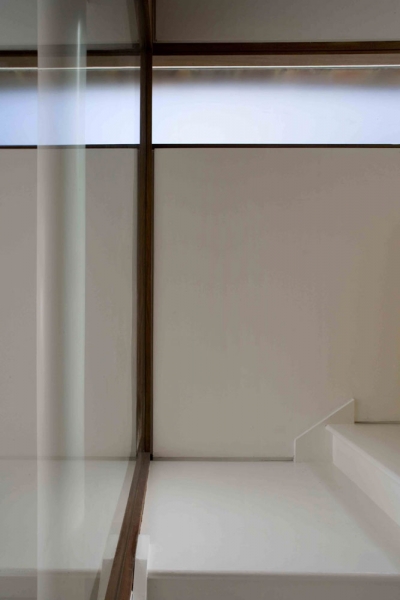
The combination of tall voids, carefully positioned rooflights and clear internal glazing screens ensures natural light enters all areas of the building from multiple sources and the occupants have a sense of openness and space within this relatively small building. The vertical glazing at the stairwell, defines the link between the old and new building, and provides a consistent visual reference to the external surroundings. Externally this glazing defines the break between the two buildings, enhancing the interplay between old and new.


