Stu.dere – Oficina de Arquitectura e Design completed this project of a children’s clothing store. The intention was to create a sense of exploration as one walked through space, as though it were a labyrinth, like a game for a kid. Take a look at the complete story after the jump.

From the architects:
As if it was a game… so a new project started!
It was a sad and a empty place turned into a large light space and dynamically fitted, as a space for children should be.
In the first contact with the building, it was found a place too wanton in terms of space distribution.

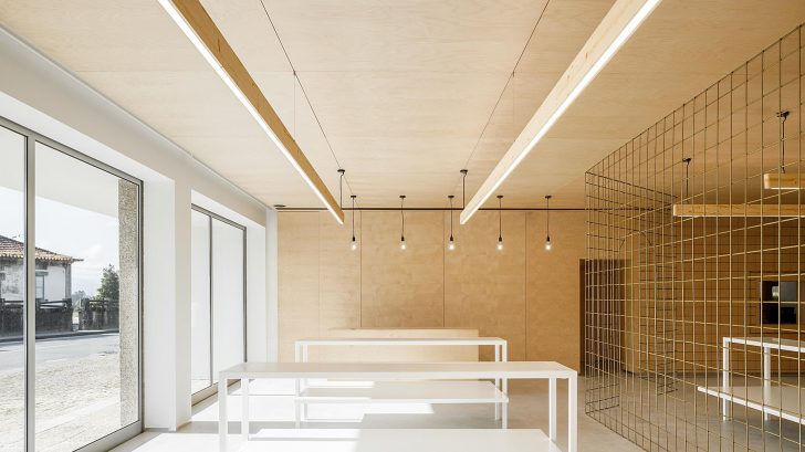
Despite the client’s request for an open space concept, the intention was to create a sense of exploration as one walked through space, as though it were a labyrinth, like a game for a kid. Hence the implementation of the wire mesh, which creates a physical but not visual barrier, thus fulfilling the client’s premises.

In addition to the area devoted to displaying and storing the items, the ground floor includes an office and a small storage room. When accessing the upper floor, there is a studio for product photography. This division was subdivided into two spaces with a glazing system, which were designed to expand space.
RELATED: FIND MORE IMPRESSIVE PROJECTS FROM PORTUGAL
The materials used have been selected in such a way that their use is unique, without the need for adjacent layers and finishing with other products . Honeycomb polycarbonate has been chosen for the interior walls, suggesting an industrial appearance in harmony with the microcement-coated floor. To counterbalance this, the ceilings and the office were lined with birch plywood, creating a more intimate feel. This note has a regular metric that allows both the rhythm to be created and the organization of space, such as furniture layout, to be guided.

A small area dedicated to children was created next to the stairs to the upper floor. This playful space was covered with polycarbonate and with a double height, at which the lights of a design object fell. The lights reflected in the polycarbonate allude to a world of magic, imagination and creativity. The industrial style pendant lamp was designed specifically for the place.

Project name: Warehouse Morinha
Office: stu.dere – Oficina de Arquitectura e Design – studere.pt
Architects: Ulisses Cost
—
Location: Vila Meã – Amarante
Conclusion year: 2020
Build Area (m2): 334 m2
Client: Belo & Tavares, SA
Photographer: Ivo Tavares Studio – www.ivotavares.net


