PIG DESIGN, lead by Li Wenqiang, designed MORE FUN, an innovative new bar in Hangzhou. The design team changed the facade and spatial form, creating a succession of inventive sceneries to respond to the cultural setting and pattern of streets and alleyways in Hangzhou, and to create a destination concealed in the historic neighborhood. Discover more after the jump.
Mysterious facades
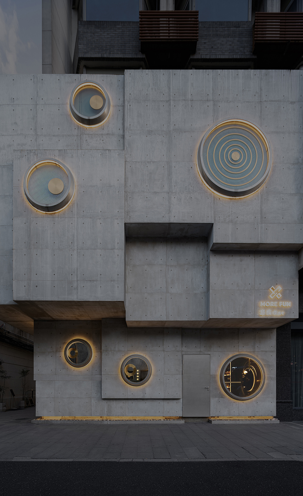
Located in Jiefang Road adjacent to West Lake, the project occupies parts of the first and second floors of an old residential building at the street corner. The memory of the neighborhood and the fabrics of streets and alleys in its surroundings provide infinite possibilities for breeding future new lifestyles. Inspired by the staggered blocks of the existing building, the designers decided to take “Rubik’s cube” as the design concept. Cubic blocks at staggering heights interpenetrate each other, and window openings are subtly carved out on the exteriors. The square and round shapes form an irregular, intriguing polyhedron.
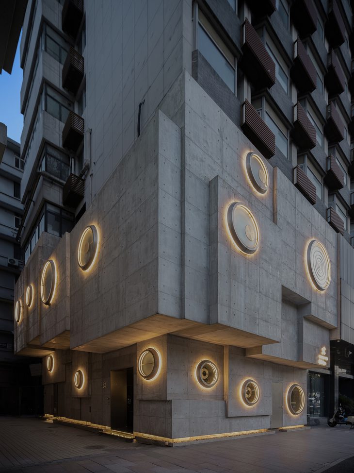

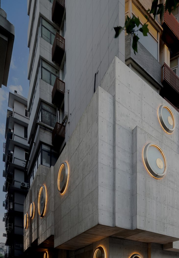
The curtain wall system is formed by thin, prefabricated modular cement panels, rather than cast-in-situ concrete, which realized rapid and low-cost construction within a month. The lightweight modular components also effectively solved the load bearing problems of the old building, and obtained an exterior texture similar to fair-faced concrete. As time goes, the grain on the facades is enriched, and reveals a rough aesthetic complemented by light and shadows.
Infinite possibilities
The project is positioned as a fashionable leisure and socializing space serving creative cocktails. Just like the diverse combinations of a Rubik’s cube, cocktail making requires subtle coordination among ingredients and the strength and speed of shaking, to present rich sensory experiences through the change of layers and colors.
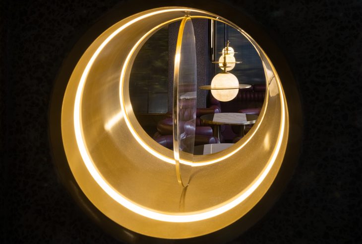
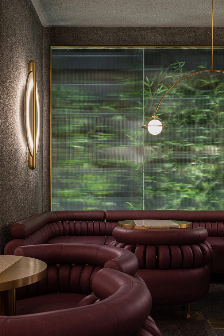
The interior space of the bar features staggered blocks, which echo the external facades’ structures and proportions. Window openings are carved out on the walls based on the arrangement of seating and the needs of introducing light and creating frame views. Set at different heights, those windows create fun visual interaction from different angles.
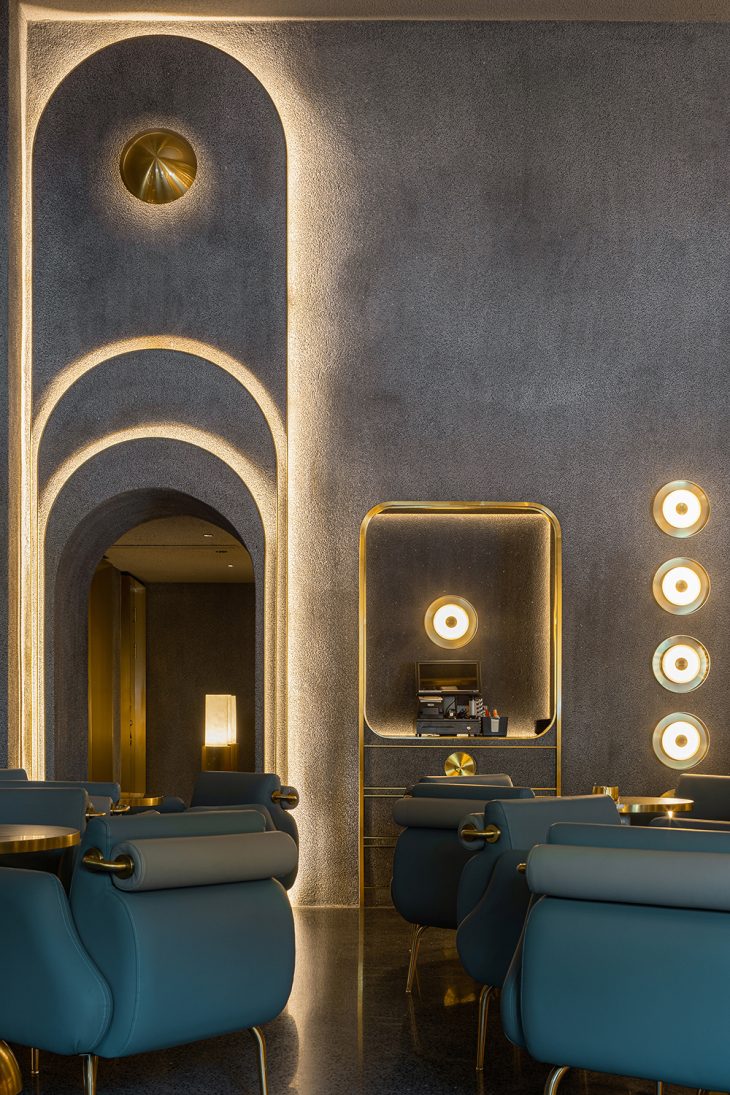
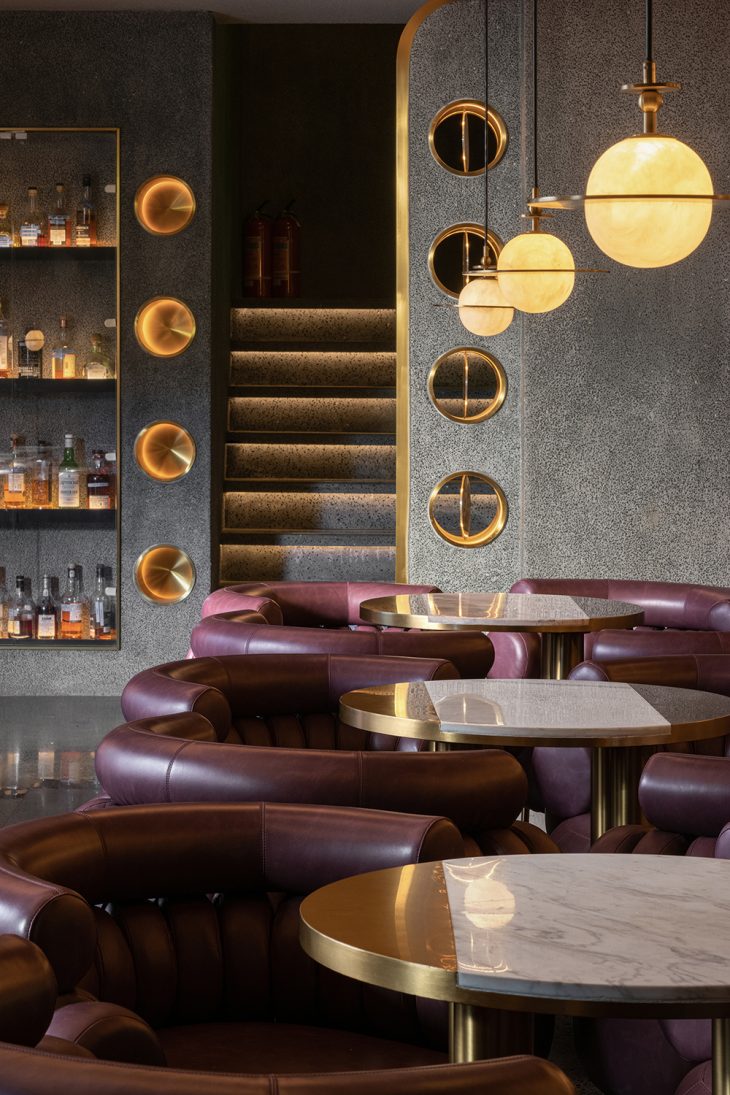
The two-floor interior space continues the modular concept of the architectural facades. Taking point, line and plane as basic elements, the designers created various functional geometric forms and decorative surfaces. The space is highlighted by the textural contrast of different materials like brass, washed stones and terrazzo.
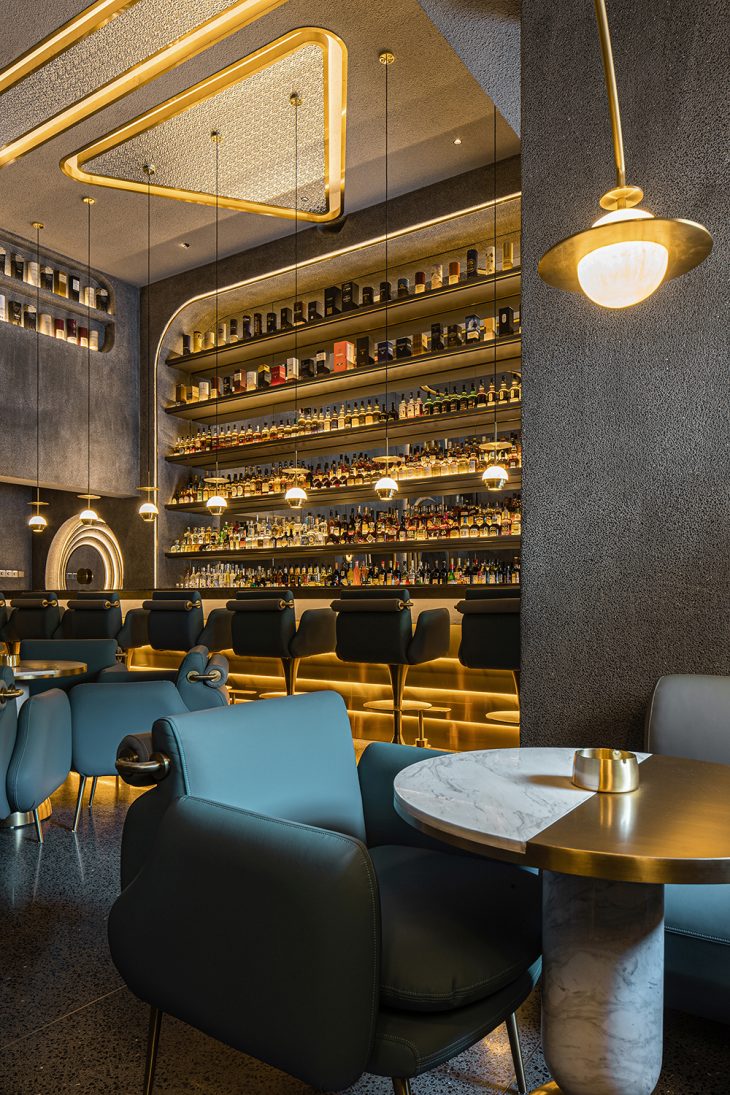
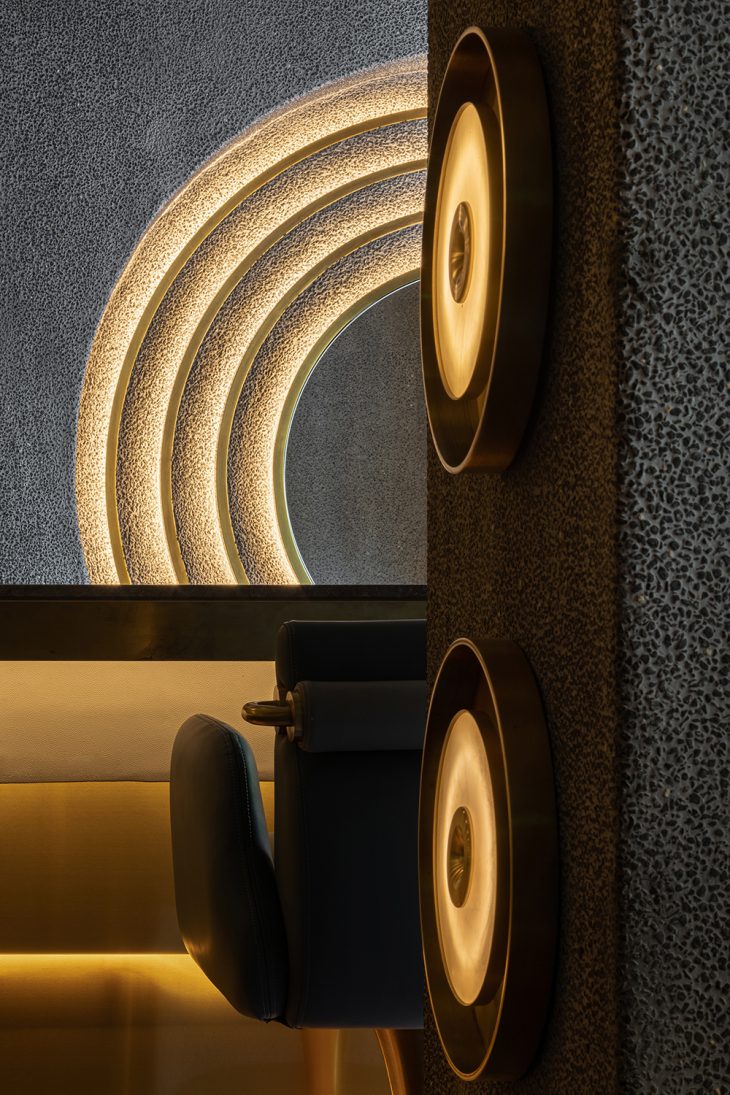
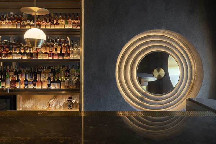
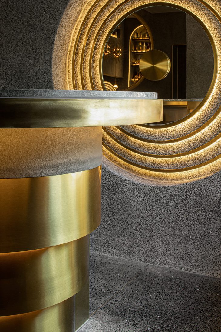
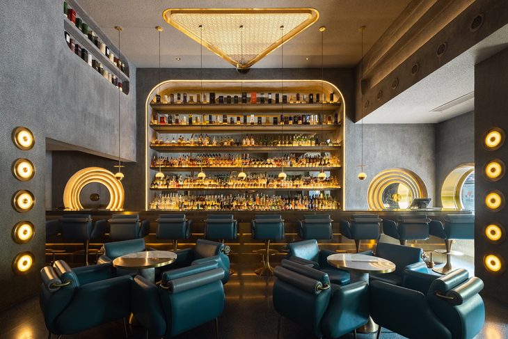
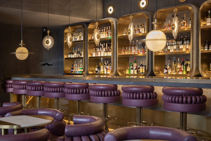
With an area of 80 sqm, the first floor presents a neutral tone coordinated by blue, green and gray, and provides an inclusive, leisurely atmosphere suitable for general customers. The linear bar counter, the dotted seats, the unique lighting fixtures at different heights as well as the light strips create diversified sensory experiences, and stimulate customers’ desire to explore the space.
RELATED: FIND MORE IMPRESSIVE PROJECTS FROM CHINA
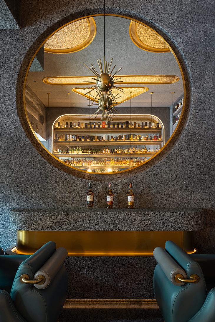
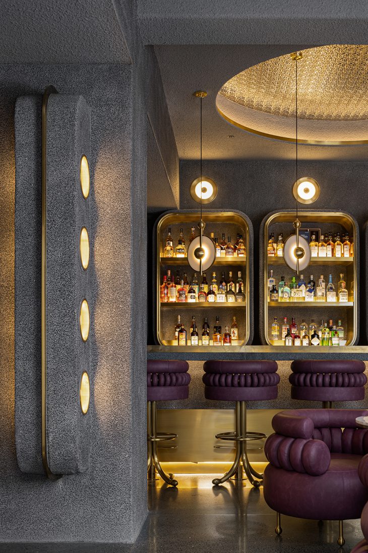
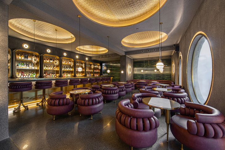
The 120-square-meter space on the second floor mainly adopts gray and purple hues, and offers exquisite, mysterious scenes to satisfy the demands of customers with strong brand stickiness for customized services. Circular lines extend from the ceiling lighting to the chairs. Leather and brass generate a retro, industrial tone, and the orderly arrays of mirrored round holes at vertical or horizontal levels create dramatic visual effects.
Hidden surprises
The staircase leads to casual “stages” where cool elements and restrained expressions are interwoven. With chamfered corners, the seemingly cold materials show a warm touch. Washed stone veneers with dense grains produce an increasing sense of textures over time. Made of stones and brass, the three cylindrical lighting installations simulate enlarged “candlesticks”, and brighten six ancillary functional spaces around. The various visual signs on the doors are like magical keys, featuring downy patterns outlined by straws and rice papers.
Washrooms are arranged in the mezzanine between 1F and 2F. The unified formal languages of the main spaces are extended to this area. In a tranquil enclosed background complemented by indirect lighting, the glossy metal and mirrors create visual order and continuous perceptual experiences, and also generate a sense of warmth and a geometric aesthetic of abstract lines. Mirrors above the washbasin and the reflections in the middle form a cute “cartoon pig”. This is a funny surprise that PIG DESIGN conceived for users.
Simplified solutions
It took a year to complete the project. At the preliminary stage of the project, the design team dug into the trends of bar sector from the perspective of the brand More Fun. The spatial layout reserves sufficient possibilities for commercial operation, and meanwhile helps release maximum potential to fulfill diversified consumption demands.
The logic of Rubik’s cube is a process of changing disorder into order, which is based on its underlying principles to show visible formal variations. Through the process of rotating and recovering a puzzle cube, its various sides are presented.
More Fun is a dynamic space that fuses diversified elements, clarity and vagueness, hardness and warmth. It records daily life, absorbs urban spirit reflected by socializing culture, and writes a chapter about the future unknown world with different people coming here.
Project information
Client: MORE FUN
Design firm: PIG DESIGN – pigdesign.art
Project area: 216 square meters
Chief designer: Li Wenqiang
Design team: Zhu Yiyun, Yang Zhiwei
Construction firm: Hangzhou Mingcong Decoration Engineering Co., Ltd.
Lighting design: Hangzhou Licheng Lighting Engineering Co., Ltd.
Furniture design: PIG DESIGN
VI design: Qian Chaofan
Props production: Deyao Metal Products Co., Ltd.
Photography: SFAP


