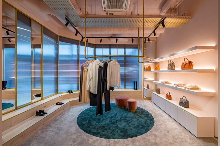
Award-wining british practice Michaelis Boyd designed the new flagship boutique for Luxembourg based luxury retail brand Muse by… The boutique is designed with premium materials and bespoke furniture to create a chic and distinctive interior for a luxurious yet contemporary consumer experience. |Take a look at the complete story after the jump.
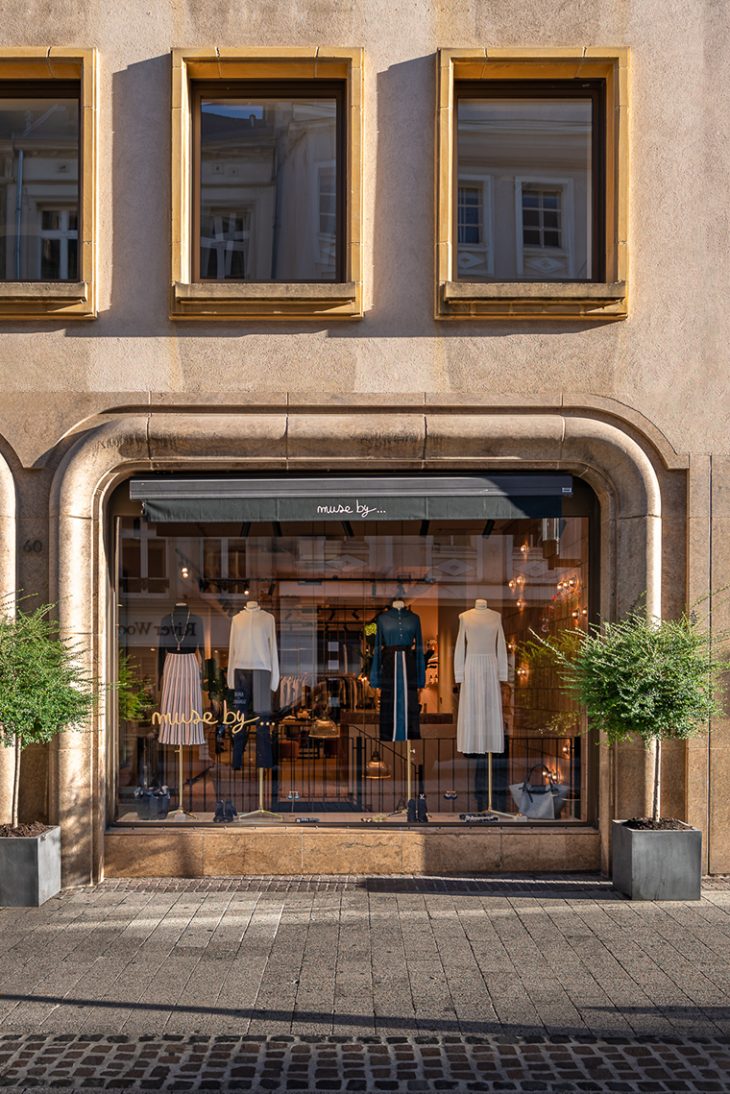
From the architects: Leading architecture and interior design studio Michaelis Boyd have recently completed their first flagship boutique in Luxembourg for luxury retail brand, ‘Muse By…’.
Michaelis Boyd were tasked with building on the brand’s strong identity to realise a space that would resonate with its existing customer base, while attracting new customers.
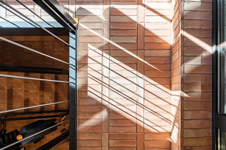
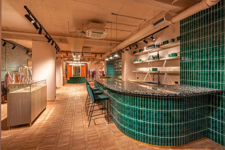
The retail space is spread over two floors, each showcasing high-end ready-to-wear clothing, footwear and accessories. The design concept balances soft and industrial elements with a focus on premium materials and bespoke solutions to create a fresh and impactful interior. Handmade terracotta tiles are used throughout and are complemented by green glazed tiles, colourful terrazzo, sumptuous carpet and timber finishes and brushed brass hardware.
Design details
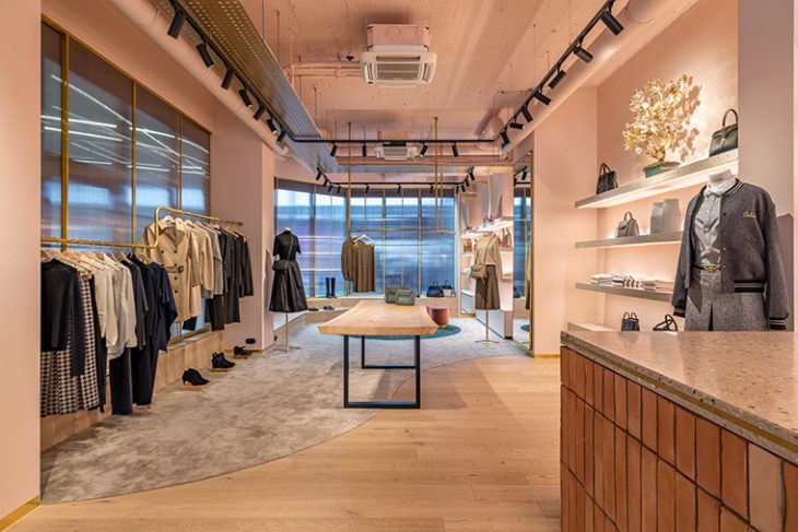
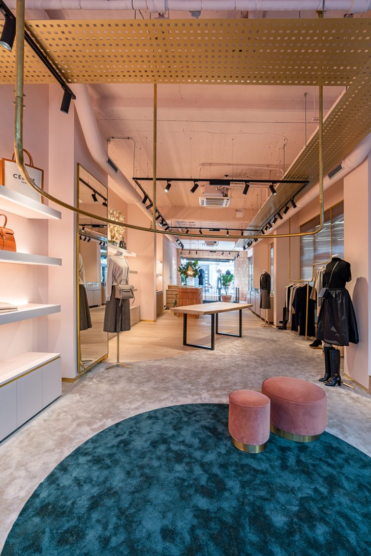
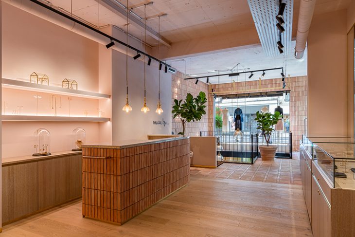
The ground floor design seeks to create designated zones characterised by specific materials and textures that change and evolve as customers journey through the store. Handmade terracotta tiles lead from the front entrance, transitioning into oak floorboards further into the space, before melting into soft carpet towards the rear of the store.
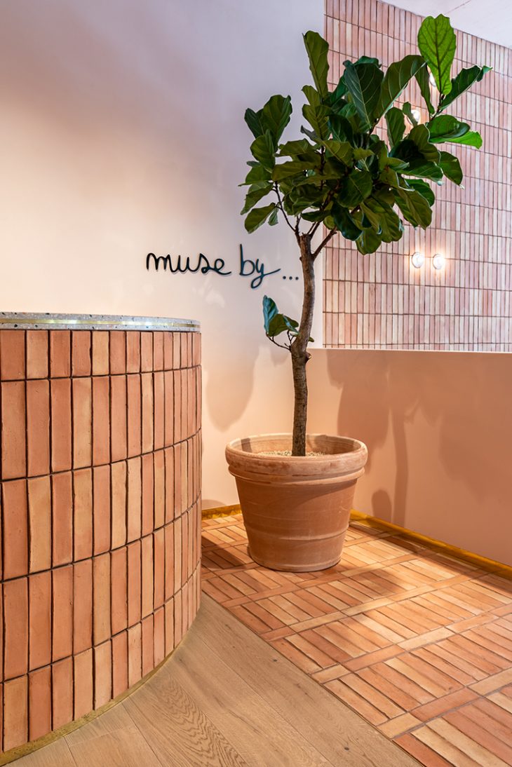
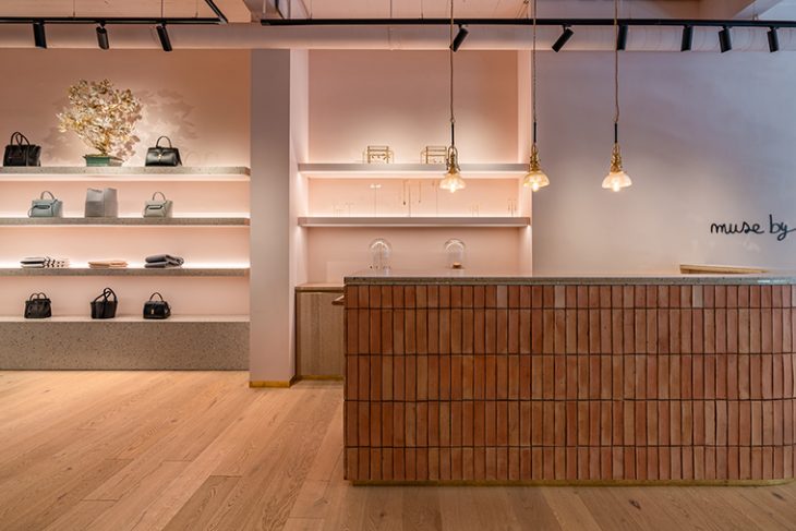
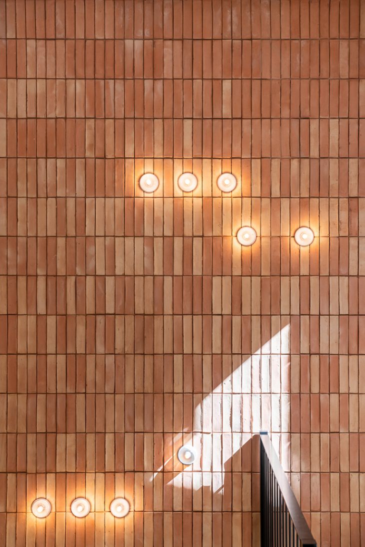
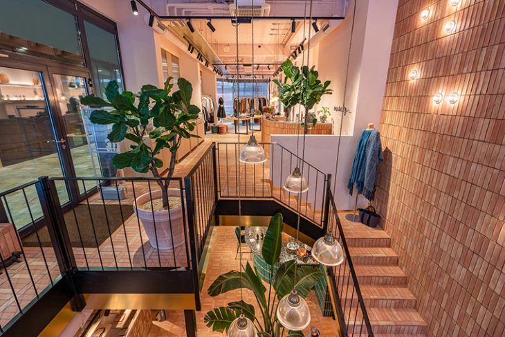
The entrance area creates an immediate visual impact through an interesting mix of warm and welcoming materials. A curved till point topped with a terrazzo worktop is clad in handmade terracotta tiles, which also wrap up the back wall and are accentuated by small glass wall lights from Bocci and add to the warmth of the space.
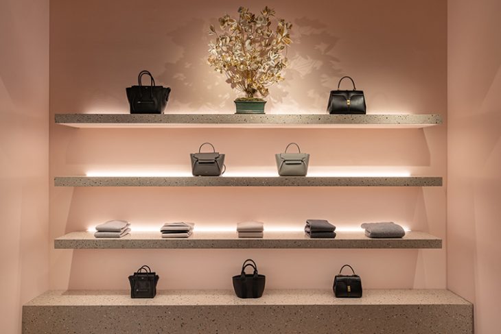
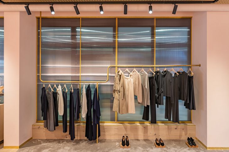
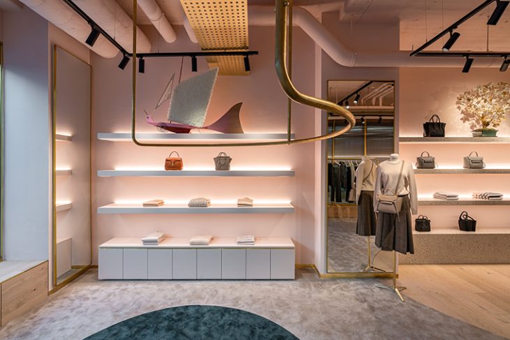
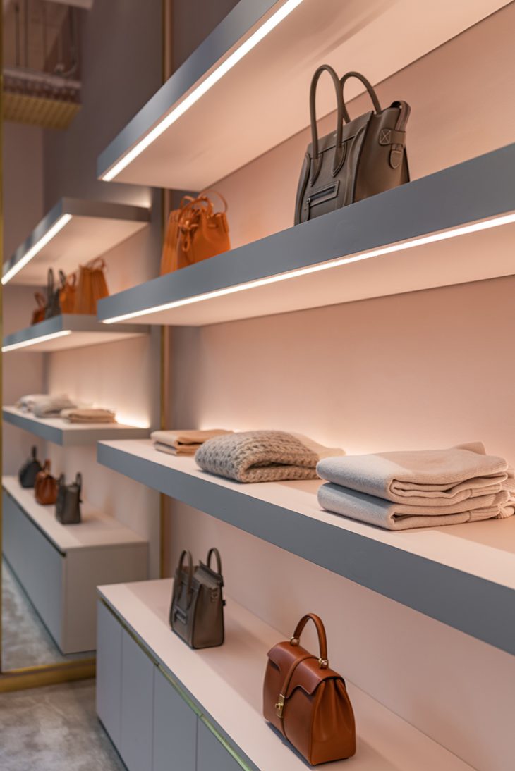
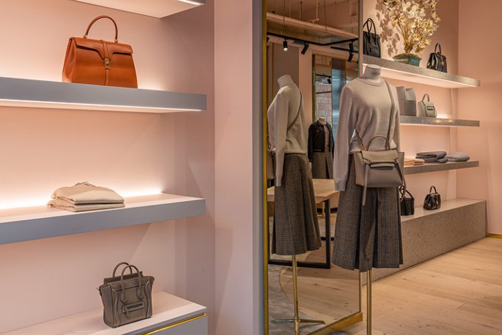
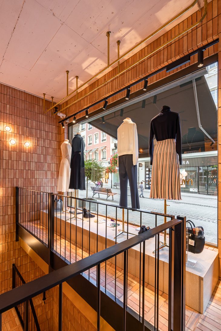
Bespoke joinery and custom hardware work together to highlight and display merchandise. In the shop window, mannequins sit upon bespoke timber plinths, with undulating hanging brushed brass rails which display clothing from above, and backlit floating shelves highlight goods with a warm glow.
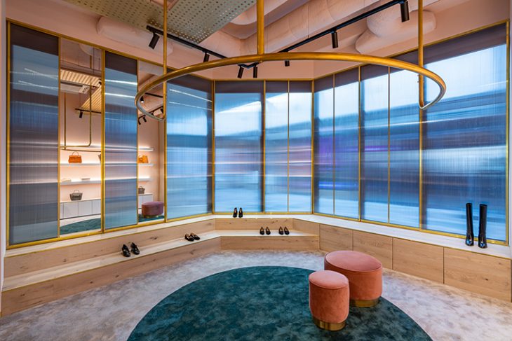
Custom cabinets are deliberately minimalist, made from timber, glass panelling and brass details to lead the gaze towards the jewellery contained within. Behind the cabinets, and throughout the space, external windows have been concealed inside by semi translucent polycarbonate screens with a brass trim, creating privacy whilst allowing natural light in.
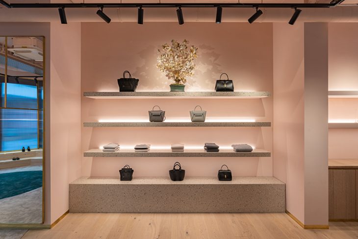
The second section of the ground floor includes a central shelving bay and plinth made of grey terrazzo, speckled with terracotta, green and ivory marble chips that feed into the existing colour scheme and complement the light dusty pink walls.
The shoe zone to the rear of the store has a soft taupe carpet with a circular cut of green sitting within the carpet, creating a zone which highlights the curved semi circular hanging rail directly above. A mix of bespoke oak low levelled steps follow the perimeter of the building creating a simple yet effective showcase for footwear.
RELATED: BROWSE MORE INSPIRING FASHION RETAIL PROJECTS HERE
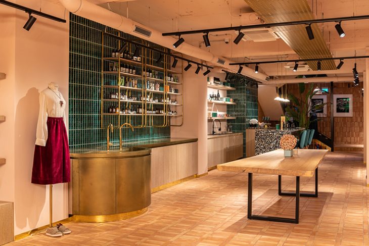
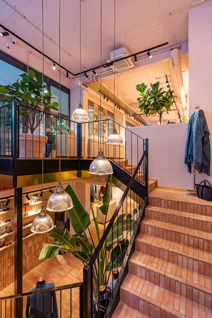
The ceilings on both floor levels have been purposely left exposed, revealing ductwork and suspended track light fittings which lends the space an industrial look.
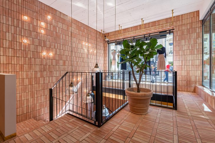
A staircase with a black steel balustrade and brass detailing leads down to the basement floor. Michaelis Boyd created a void to draw both light and the customer’s gaze down into this level. The existing staircase and wall are clad in terracotta tiles, while pendant lights suspended on brass chains in the void illuminate the space below.
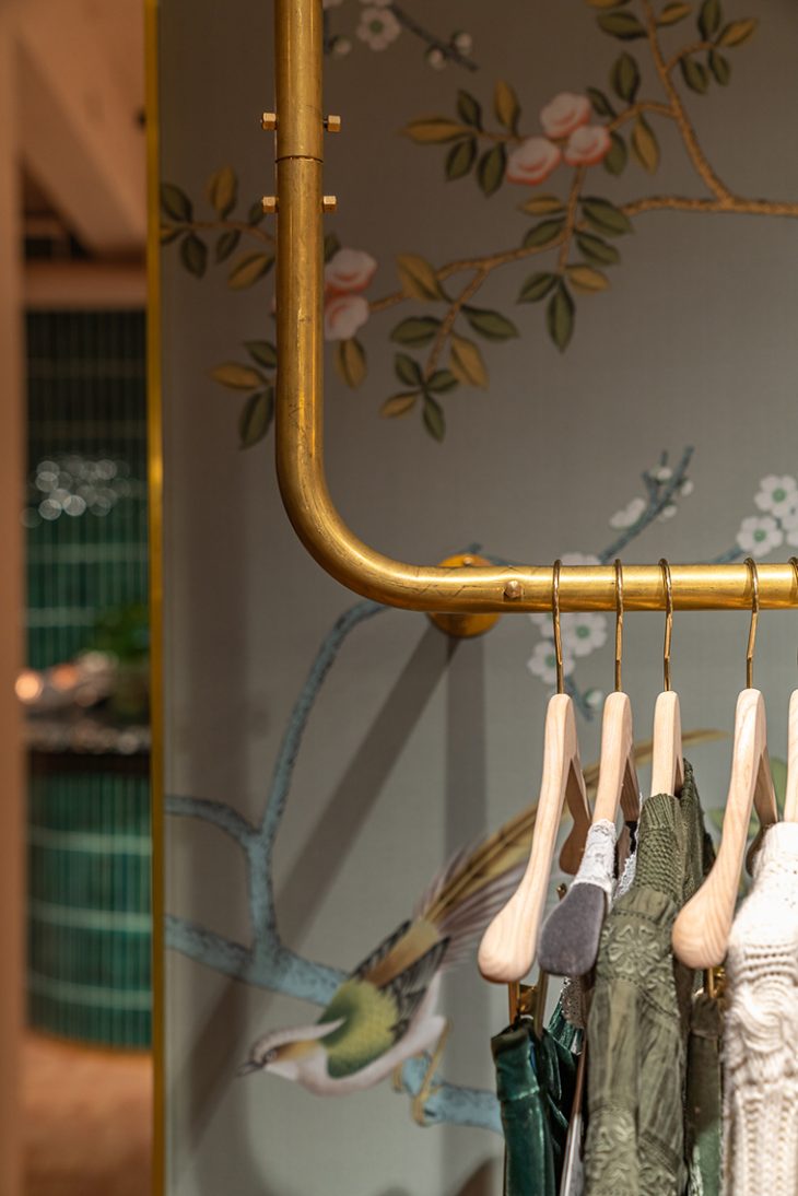
The material palette throughout the basement consists of terracotta flooring and nature-inspired De Gourney wallpaper. The wallpaper adds a touch of femininity and texture to the space, contrasting with the brass hanging rails.
As at ground floor level, the basement design creates designated zones showcasing different products.
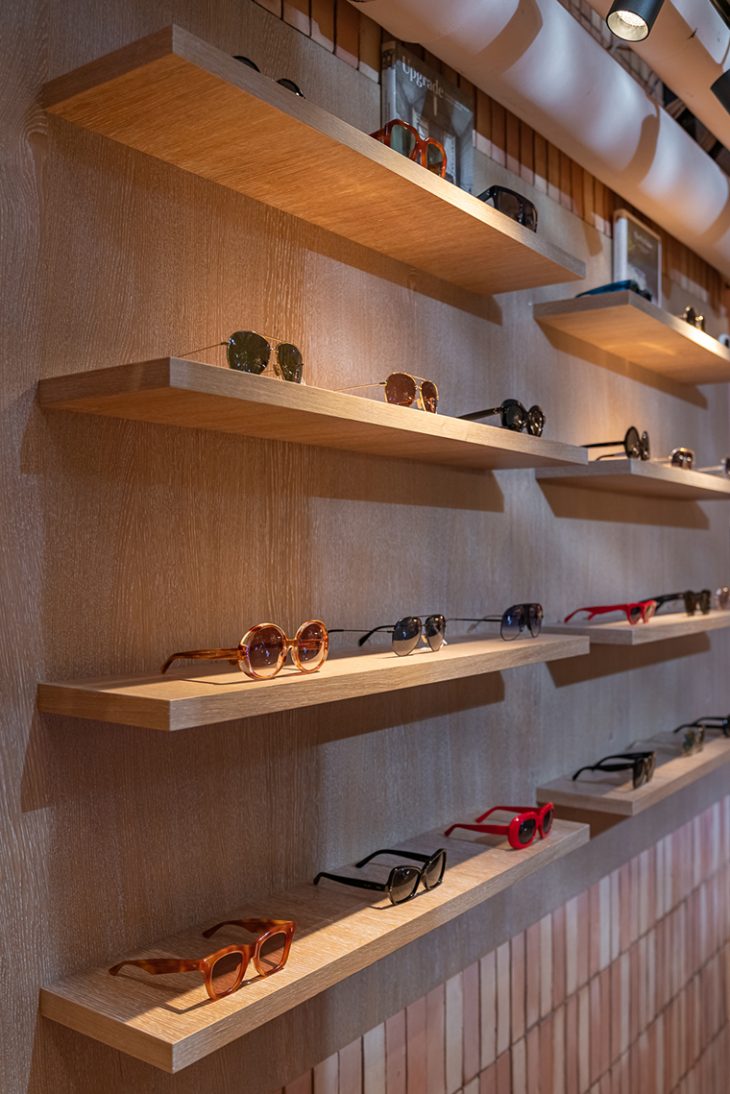
As you desend the stairs, you are welcomed by a wall of sunglasses, which is clad in terracotta with a timber backdrop and shelves.
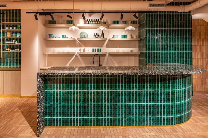
As you move through the space, you come across a luxurious café counter which serves champagne to customers. The counter is clad in handmade glazed green tiles by Otto Tiles with a worktop surface in dark grey terrazzo, peppered with earth toned chips. Dark green velvet barstools are positioned around the lip of the counter.
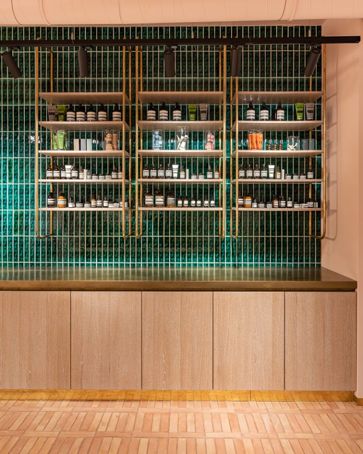
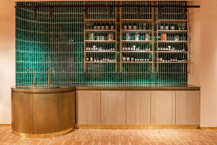
Beyond the café area lies the cosmetics counter clad in unlacquered brass which will patinate over time. Above the counter sit a series of timber shelves, supported by a curved brass wall-hung frames. The backdrop to the counter is a wall of glazed green tiles with bespoke oak joinery below.
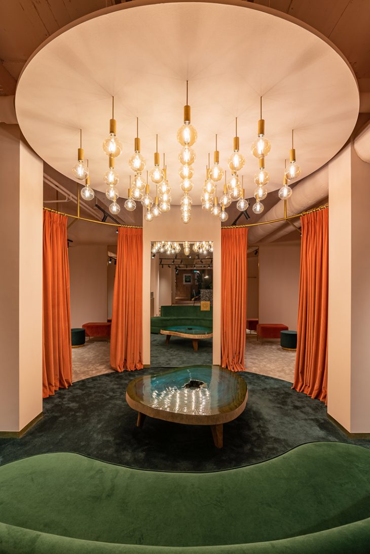
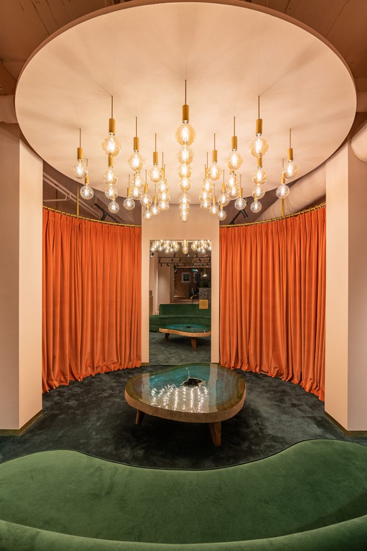
The terracotta tiles merge into a green circular carpeted area which forms the changing area zone. A bespoke curved green velvet sofa follows the radius of the green carpet. Above hangs a series of filament bulbs arranged in concentric circles further defining the space. Rich materials and lighting in the basement changing area provide a touch of glamour. Customers enter the dressing room via a pink velvet curtain suspended from a curved brass rail which makes the space feel enclosed and intimate.
Combining industrial features with a rich material palette, Michaelis Boyd have created a welcoming and inspiring retail interior fit for the flagship of a luxury brand.
Photography: Gavriil Papadiotis – www.gavriilux.com
Location: 60 Grand Rue, L-1660, Luxembourg
Size: Ground 214 Sqm, Lower Ground Floor 100 Sqm
Find more projects by Michaelis Boyd: michaelisboyd.com


