Project: Hanjie Wanda Square
Designed by UNStudio
Competition: Ben van Berkel, Caroline Bos, Astrid Piber withLuis Etchegorry, Ger Gijzen and Ariane Stracke, Cynthia Markhoff, Veronica Baraldi, Mo Ching Ying Lai, Iris Pastor, Elisabeth Brauner, Jinming Feng, Tomas Mokry, Florian Licht, Patrick Noome, Ali Ashgar
Development: Ben van Berkel, Caroline Bos, Astrid Piber, with Ger Gijzen and Ariane Stracke, Veronica Baraldi, Mo Ching, Ying Lai, Konstantinos Chrysos, Rodrigo Cañizares, Chiara Marchionni, Thomas van Bekhoven, Albert Gnodde , Ka Shin Liu, Machiel Wafelbakker, Patrick Noome, Jinming Feng, Cheng Gong, Shuang Zhang, Xinyue Guo
Client: Wuhan Wanda East Lake Real State Co., Ltd
Structure, Facade: Arup
Landscape Design: Loos van Vliet
Building Area: 22 630 sqm
Location: Wuhan, China
Website: www.unstudio.com
The world renowned architecture practice UNStudio has designed the project for Hanjie Wanda Square shopping plaza in the growing Chinese city Wuhan, while creating the solution the architects have combined both contemporary and classic architecture elements.
From the Architects:
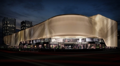
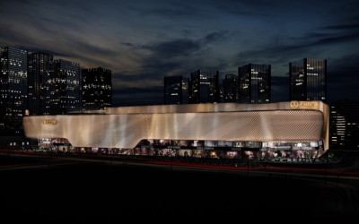
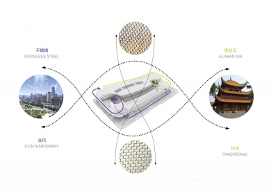
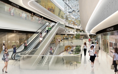
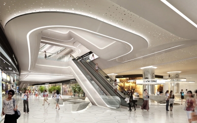
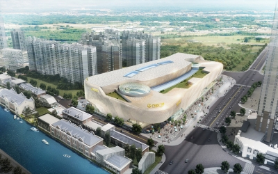
Hanjie Wanda Square is a luxury shopping plaza which will house international luxury brand stores, world-class boutiques, catering outlets and cinemas. Unstudio’s approach considers the Hanjie Wanda Square as a contemporary classic, combining both contemporary and traditional design elements in one concept.
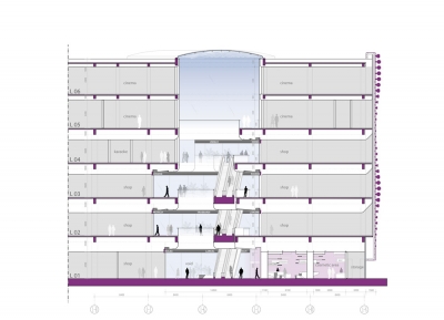
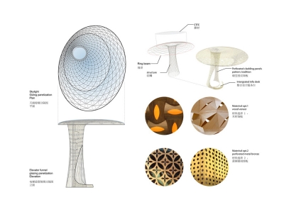
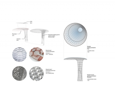
The concept of synergy of flows is key to all of the design components; the fluid articulation of the building envelope, the programming of the dynamic façade lighting and its content design, the pattern and space articulation of the public landscape surrounding the building and the interior pattern language which guides customers from the central atria to the upper levels and throughout the building via linking corridors. The interior concept is developed around the North and South atria, creating two different, yet integrated atmospheres. Variations in geometry, materials and details define these differing characters. The North atrium is characterized by warm golden and bronze materials reflecting a cultural, traditional identity. In the South atrium Silver and grey nuances with reflective textures reflect the city identity and its urban rhythm. Both atria are crowned by skylights with a funnel structure which connect the roof and the ground floor, in addition to integrating the panorama lifts.
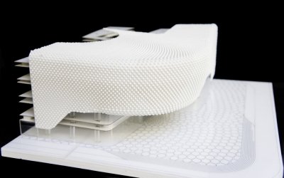
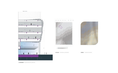
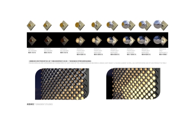
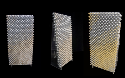
The façade design focuses on achieving a dynamic effect reflecting the handcrafted combination of two materials: polished stainless steel and Alabaster. These two materials are crafted into nine differently shaped, but standardized spheres. Their specific positions in relation to each other recreate the effect of movement and reflection in water, or the sensuous folds of silk fabric.


