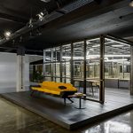
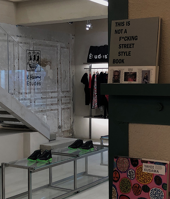
Sò Studio designed this stunning store in Shanghai, China. Take a look at the complete story after the jump.
From the architects: CANAL ST. is a select shop introduced from Downtown New York. We hope it will bring the Downtown lifestyle to Shanghai by creating a retail storefront that merged the lifestyle of two cities with both local and Downtown ethos. In New York, you see the coexistence of the mark made hundreds of years ago back to the industrial age with the cutting-edge art, fashion and pop culture in our era. Such kind of inclusion and diversity resonate Shanghai. Differently, Shanghai’s unique ethos is built upon in Chinese traditional culture as well as nearly a century’s concession experience. As a rising international city, Shanghai is younger and more energetic. We perceived Shanghai is a bit of rebel but in the meantime, exquisite. More interestingly, the vulgar part is wrapped in Shanghai’s exquisiteness. The constant tension let everything new here has also been polished and precipitated by time. We hope that people visiting the store can feel and experience it.
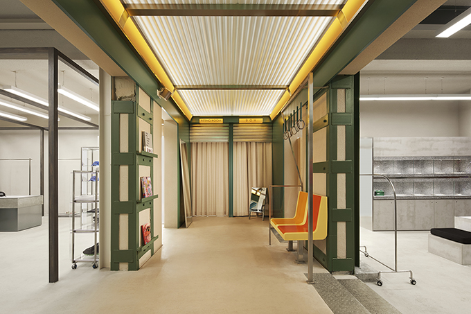
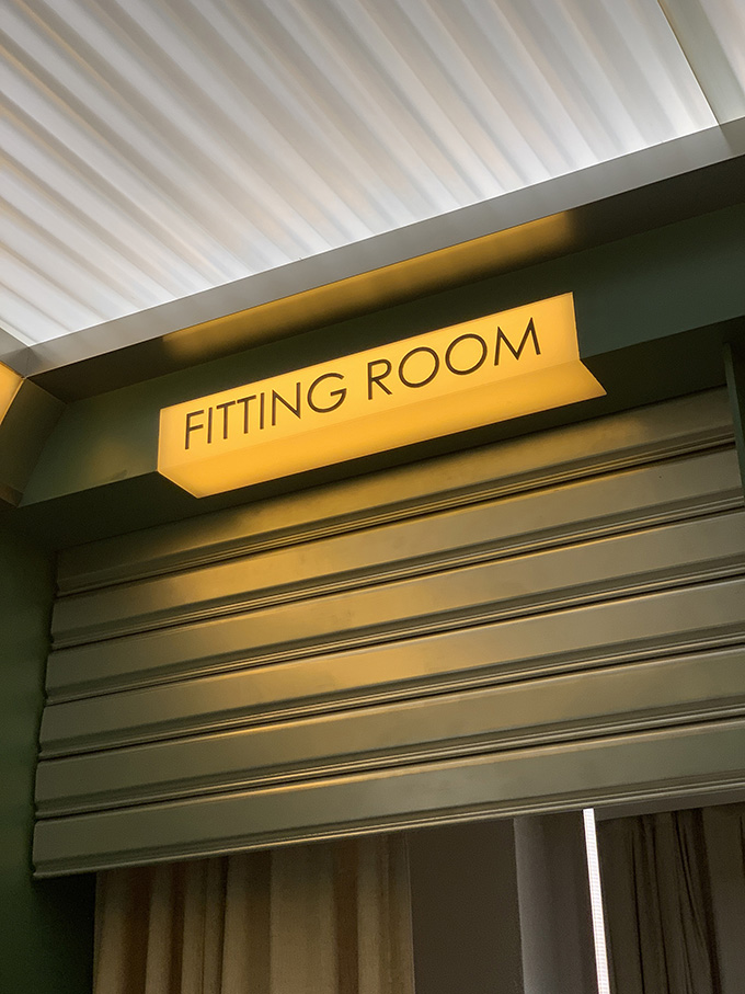
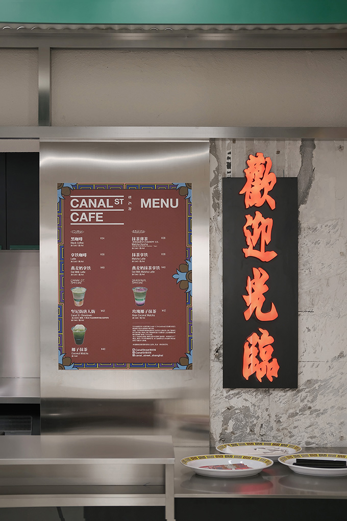
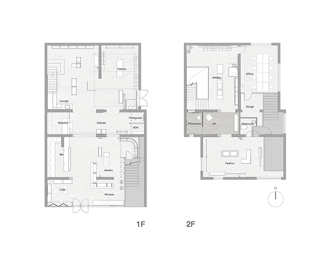
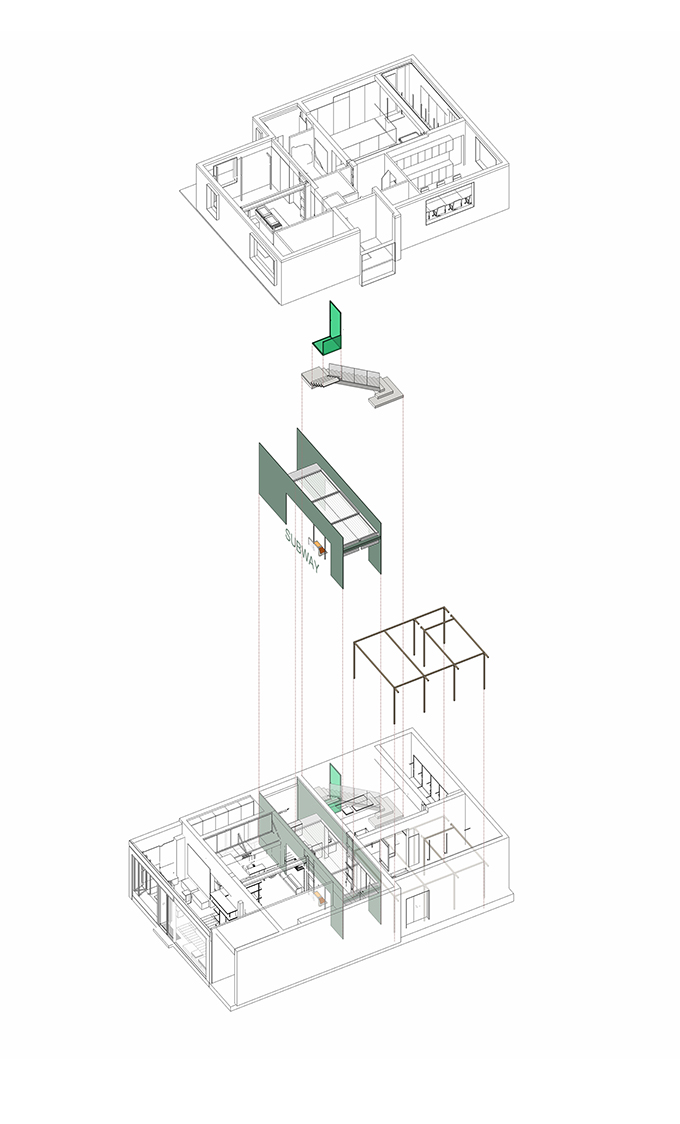
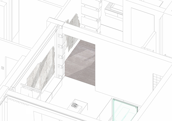
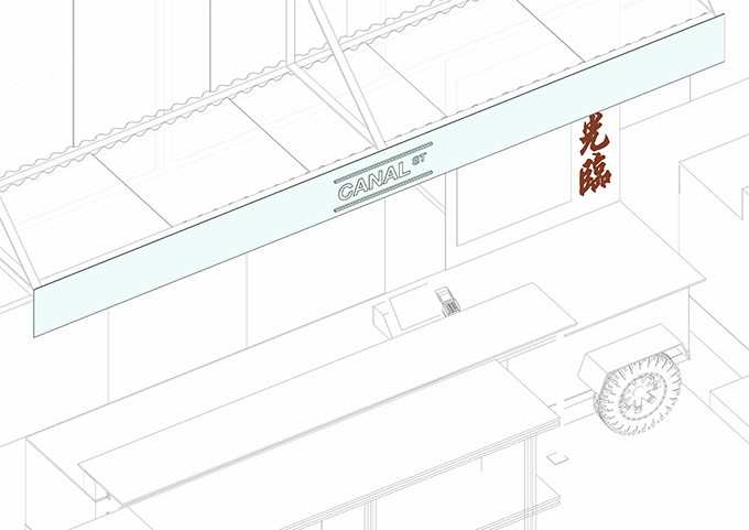
The space of subway located on the first floor of CANAL ST. was originally the stairs of the building which was long and narrow, which lies in the middle of the whole space. So, we take advantage of this horizontal space to create a transition space with the atmosphere of New York City subway carriage. The long and deep space is divided into two parts and the miniature of the dining cars on the streets from New York City also becomes the gene of our café.
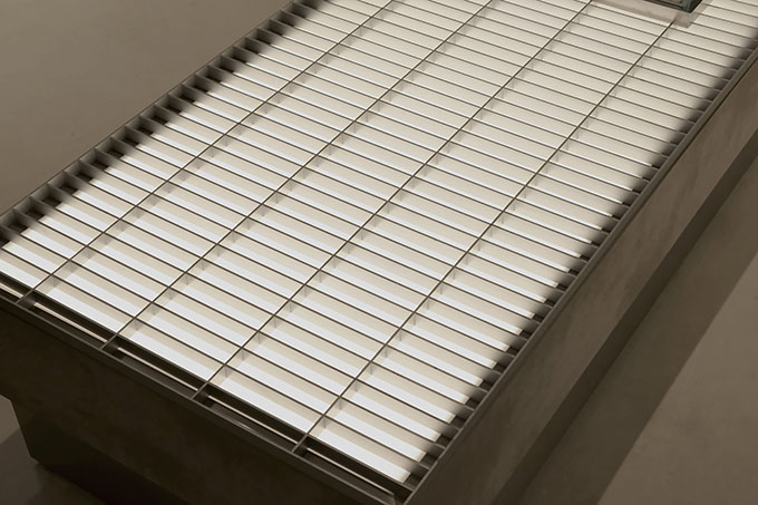
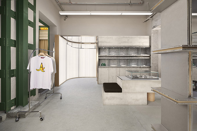
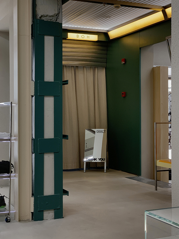
The grille decoration of the manhole cover, neon lights, the reserved steel structure of the building, the exposed bricks and etc. all represent the details of downtown. It may be different from the downtown of New York City, but it conveys the same temperament.
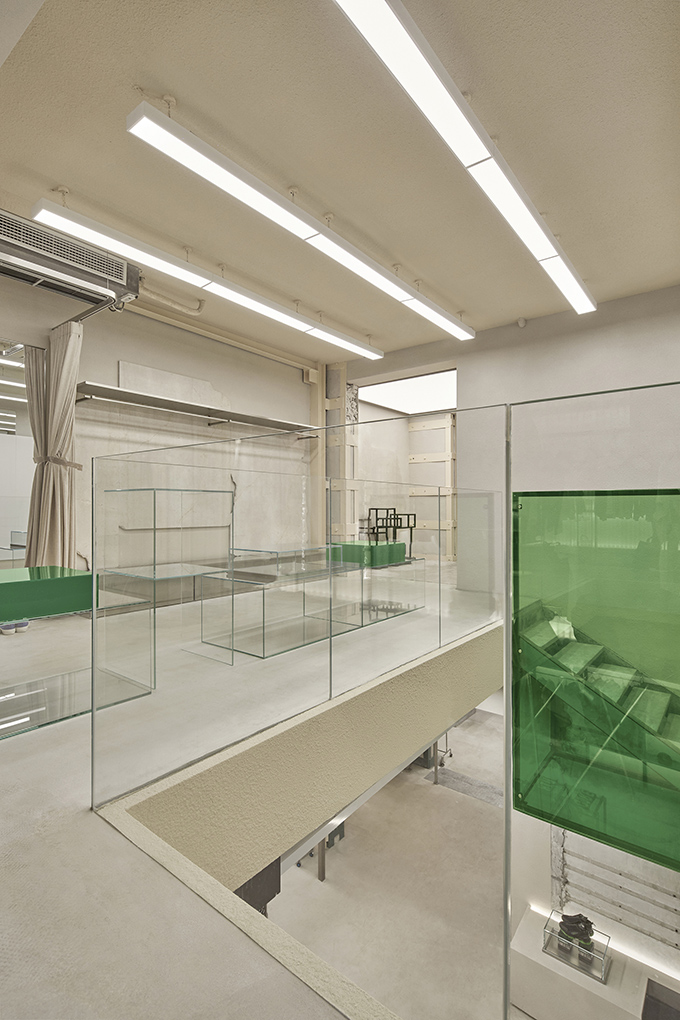
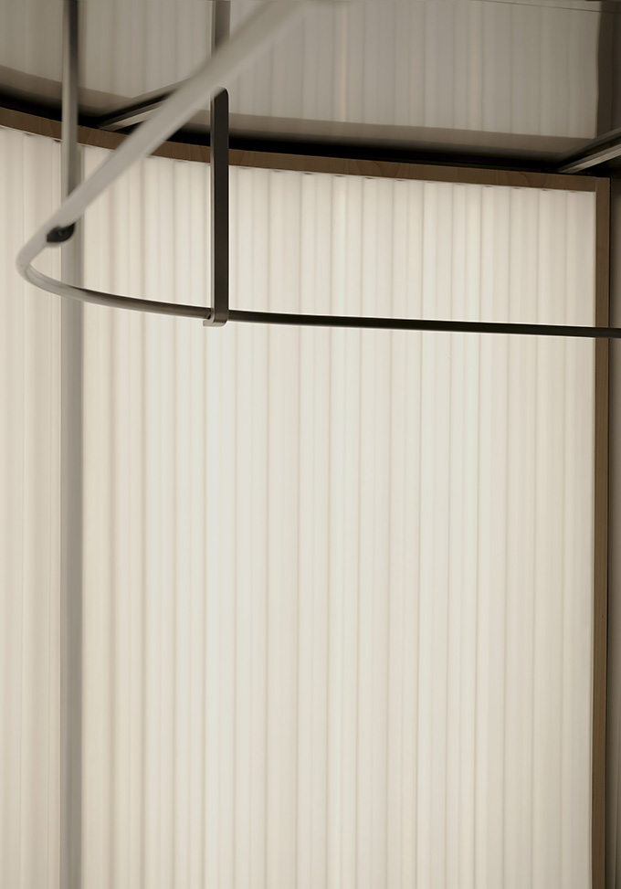
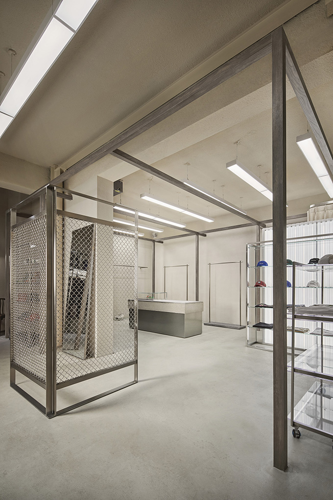
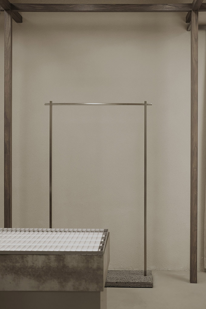
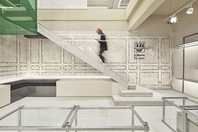
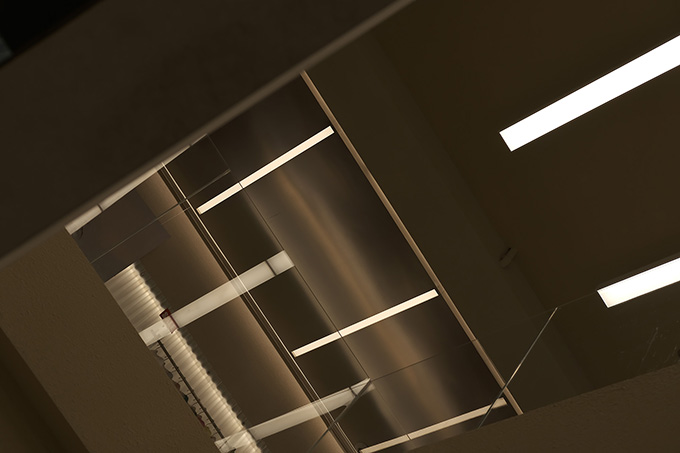
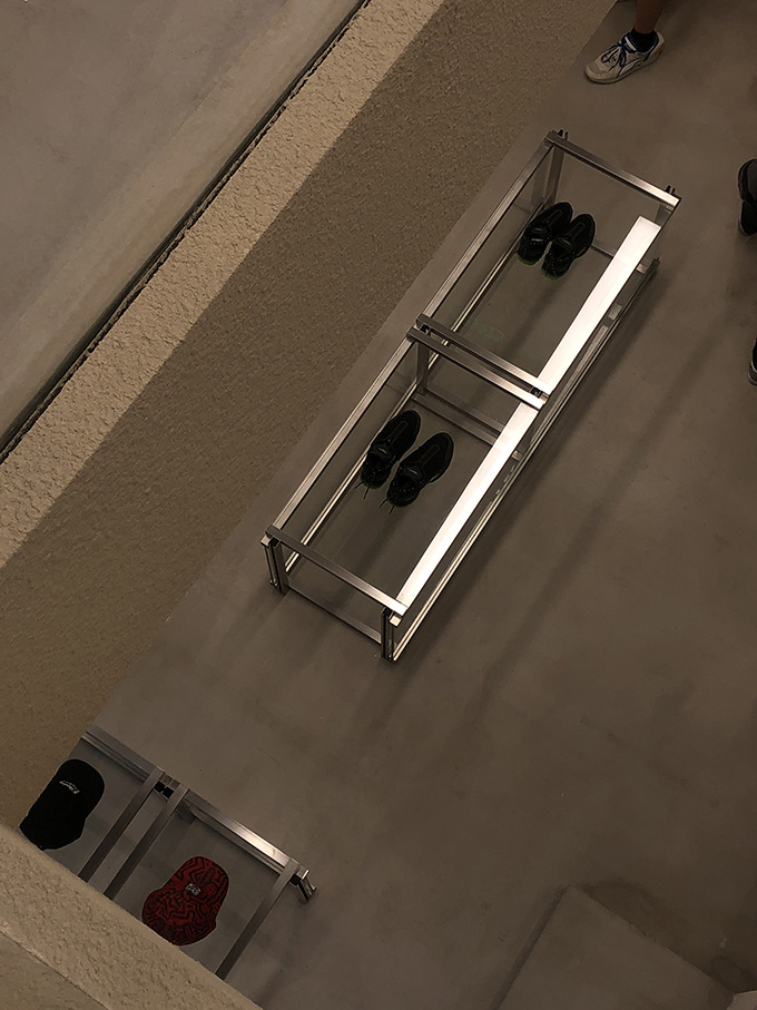
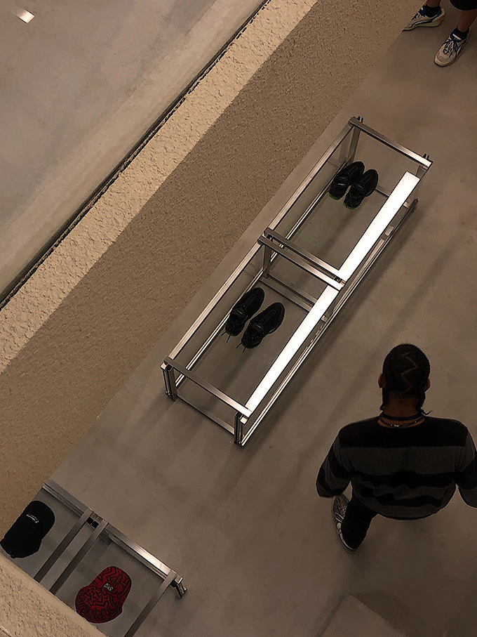
In this space, we display several “box” in different specifications, for example, the green glass box hung above the stairs, wood framed structure box which breaks the original space boundaries, rectangular green acrylic floor props, etc. We use the same elements but various in design techniques throughout the space to make it coherent and unified. In terms of lighting, instead of the point light source from a large number of tube lighting as the main lighting in the usual retail, we use a large-area of panel lights, light films, corrugated boards and other lights to make the indoor light source uniform and softer. The comfortable light source can significantly increase people’s desire to stay in. Besides, the affinity of the selected materials can also make people feel comfortable.
Interior Design, as the basis of shop display, we continuously think about that how to express it extraordinarily and vividly but avoid distracting attentions from products. Moreover, material is the basic element over constructing space while space is the container which contains material.
Then, we changed another container for the regular material in the city to acquire a diverse experience. CANAL ST. itself, with kind of street culture that comes from street and culture. For now, we hope to display street culture in our interior space through our design.
In the space, we utilized multiple materials with different textures by means of splicing, overlapping, bumping and recombining. Nonetheless, selection over most of the materials is based on the atmosphere that space will tell and also, we need to control rhythm of the overall experience.
And the experience above will promote space atmosphere subtly and carefully but avoid distracting attentions from products. When comes to the space area that need to be emphasized, we used materials that stand out of others to enhance the sense of conflict and hierarchy in the space.
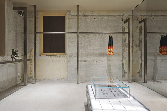
Living in the city’s former French Concession, it is hard not to feel excited and even obsessed with the historical buildings. During the early retouch period, we reserved some space for the possibility to the unknown to imagine its beauty, so we were exploring as we demolished it. After the removal of all the decorating, the site was entirely dilapidated, and we realized that the structure of this building is not as simple as we thought. Because of its old age, we saw the mixed type of structures, like wooden floors, red and grey brick walls, strengthening steel beam and plate, and concrete structure. The wallpapers, layer upon layer, showed the traces of different period’s reparation and reinforcement.
Whereas, we surprisingly figured that such hybrid structure with the mark of time turned out to be a good narrator who attempted to tell us stories in its own way. It reminded us the complex of “palimpsest”– to rewrite, to create through traces of the past. We thus decided to reserve its original structure and walls as we believed that when these old marks met with fresh design, it would produce a stipulating spatial experience to excite people’s conflicting senses. The typical practice is we try hard to create the narrativity of the space, this building can tell itself instead.
RELATED: FIND MORE IMPRESSIVE PROJECTS FROM CHINA
In the treatment of the space structure, we firstly carried out comprehensive building reinforcement, and then removed some of the original walls to make them more transparent and beneficial to retail. In addition, we reestablish the position of the stairs in order to ensure a smooth streamline.
The preservation design of the old wall synchronizes with construction. For the wall from one space planned to be painted in accordance with our original design. However, after the original grassroots layer was removed during the preparation of construction, we found that the traces left by the shovel and the color on the original wall matching with the space harmoniously and aesthetically pleasing. As a result, we decided to remain the original wall’s condition instead of doing the painting works on the spot.
Things like this are too numerous to mention, which is one of many uncertainties that cannot control in reconstruction of old buildings. When dealing with these uncertainties, an interior designer enjoys the surprises brought by the “accident” during the design procedure, which is also a fascinating part of the design procedure.
During the design procedure, we will face the unknown over a long period of time, by experiencing different narrative methods, unstable materials, and potential structures. We are obsessed with everything what we are unfamiliar with, so we keep saying there is no plan & beauty by the accidents.
Project information
Name: CANAL ST. Selected Store
Concept: downtown NYC
Gross Built Area: 300 m2
Address: No. 163, Xinle Road, Shanghai
Client: CANAL ST.
Completion Year: 2019.11
Design team: Sò Studio – sooostudio.com
Design director: Yifan Wu, Mengjie Liu
Space design: Yufei Li, Fei Wang
Image Production: MUYI Concept + Production
Photographer: Yuhao Ding, Elbe, Yufei Li, Mengjie Liu


