ArchUnits Studio recently completed works on Amico BJ, a fine-dining restaurant in Beijing, China. The new space that focuses on the creation of “light” and expresses the creative and high-end sense of the Italian-Japanese fusion cuisine by incorporating the ambience of an art museum into the dining space, providing a unique and non-daily dining experience for customers. Discover the complete story after the jump.
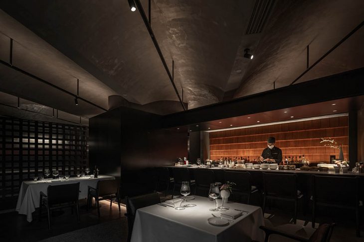
From the architects: Amico BJ is a fine-dining restaurant that has been relocated to Sanlitun, Beijing in early 2021. The new space designed by ArchUnits focuses on the creation of “light” and expresses the creative and high-end sense of the Italian-Japanese fusion cuisine in an art museum-like atmosphere, so as to provide visitors with a unique and non-daily dining experience.
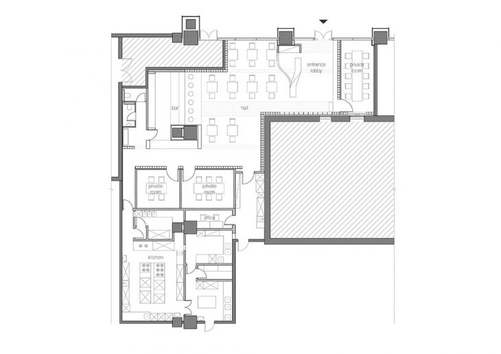
The restaurant is located on the ground floor of an office tower, facing the inner street, with an irregular L-shaped space. The architect arranges one wing of the L-shaped space with natural light for the dining area, while the other wing serves as a private room that needs privacy and a deeper back kitchen space. The iconic bar, where the chef enjoys talking with customers, is arranged at the corner of the L-shape. One side of the bar counter can be easily communicated with the back kitchen, while the other side make it easy for the chef to see the dining places.
Lighting as Prototype
For a fine-dining restaurant, the dishes are the protagonist, so the design concept was focused on how to better present the food. In this issue, the role of “light” is better than other forms of matter, which makes us naturally think of art museums. Although the objects presented of restaurants and art galleries are different, the use of light is essentially the same.
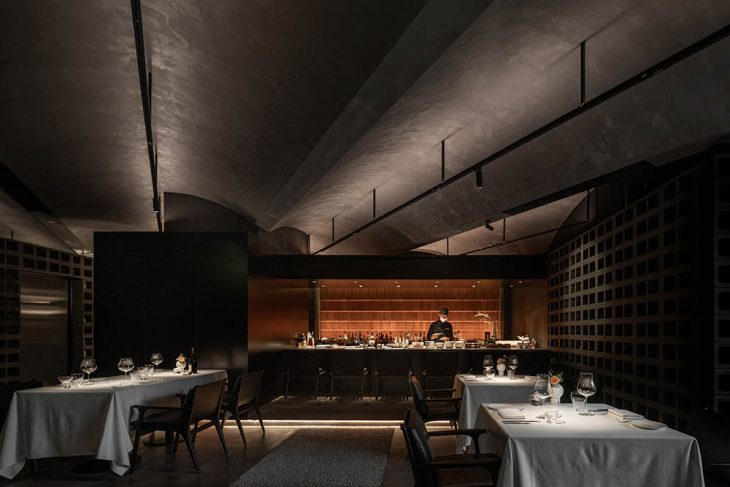
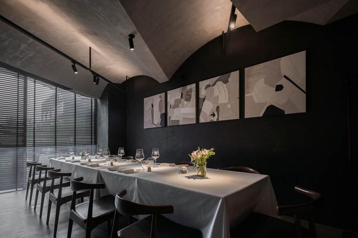
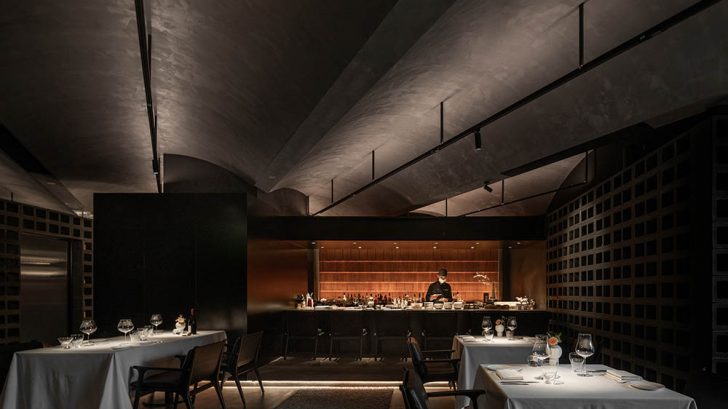
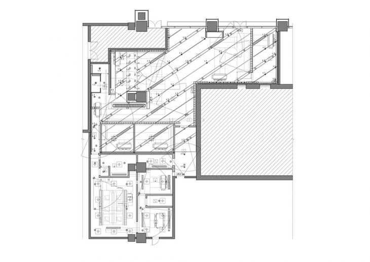
Therefore, the architect pays tribute to Kimbell Art Museum and develops the unique light and space prototype of the restaurant. A hanging track integrates all the lighting requirements: the linear up-lighting light strip slightly illuminates the center of the arch, thus forming a soft atmosphere after diffuse reflection. The down-lighting spotlight with a narrow beam angle can freely adjust the position and angle to focus the beam on the dining table and food.
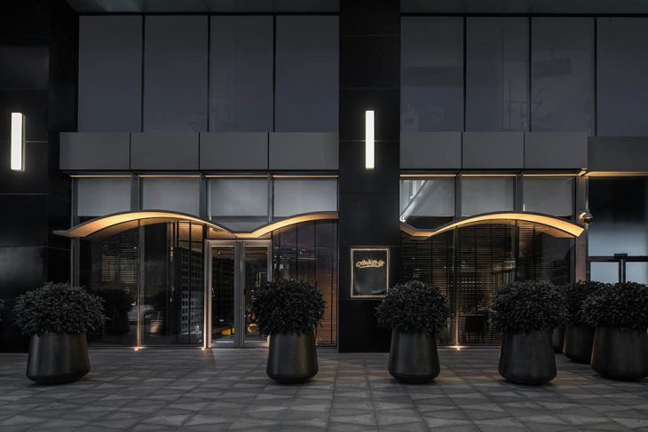
The arch is also extended to the outside, making it an entrance canopy while extending the indoor space. As the key element inside the space, these lightly illuminated continuous arches are visually enhanced on the facade, thus becoming the unique landmark of the restaurant.
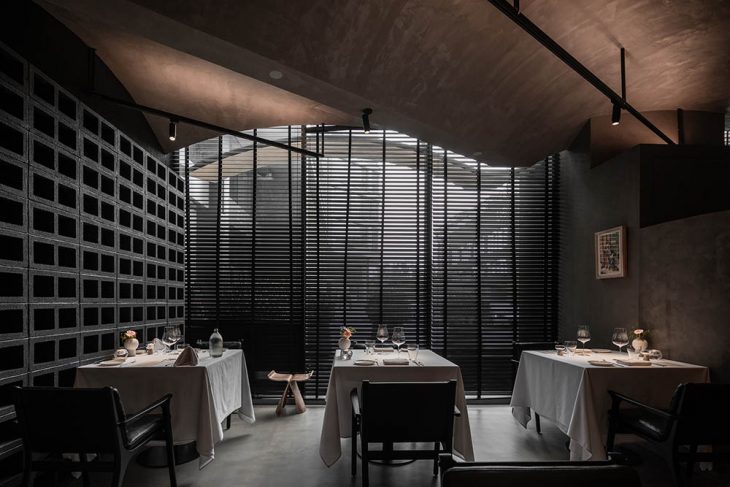
The rest of the space is low-key, with cement and gravel floors and black hollow concrete block walls retreating behind the scenes with a dull and simple texture. These materials, which are more common on the exterior of the building, are combined with large plants to create a casual “outdoor feel” for the restaurant. Moreover, the steps and waterside plats, which are also more common in outdoor landscapes, are adopted in local waiting areas, entrances, bars, etc., to echo this atmosphere of “outdoors”.
Juxtaposition and Contrast
The irregular floor plan resulting in fragmented small spaces, especially the narrow entrance space. In order to expand the space perception of visitors by way of sight guidance, the continuous arches of the ceiling are arranged diagonally, extending from the entrance straight to the depth of the space.
This set of ceiling diagonal system and the ground orthogonal system present an acute angle of 34 degrees. To enhance the spatial tension of this juxtaposition, the upper and lower systems are independent of each other. All walls are kept from touching the ceiling. Even in private rooms that require sound insulation, the gaps between the wall and the ceiling are filled through ultra-white transparent glass, to minimize the presence.
The connection point of the upper and lower systems is at the concierge. It is the first stop to enter the restaurant, and it is also the tipping point of spatial tension. Here, the reception desk, wardrobe, and entrance screen are integrated into a continuous form with a special-shaped GRG, making it the only object in the entire space that echoes the two-directional systems.
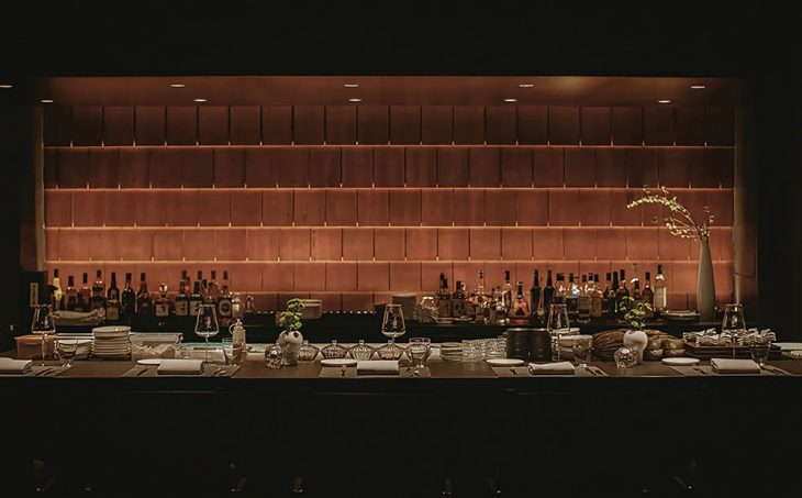
The iconic bar counter at the core of the space is clad with matte stainless steel panels, which has a touch of luster compared to the surrounding plain walls. The background wall of the bar is composed of gradually scaly-sized pine boards, which contrasts with this major space dominated by black, white, and gray, and meanwhile shows the important position of the bar.
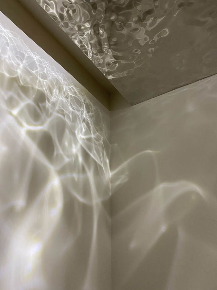
Similarly, the bathroom also adds a dramatic artistic effect with a contrast. The light and shadow formed by the reflection of the water wave stainless steel in the bathroom are bright and romantic, which contrasts with the gloomy walkway and the main hall.
Project Credit
Name: Amico BJ Restaurant
Area: 300 m2
Design time? 2020.07-2020.09
Construction time: 2020.10-2021.02
Address?Chaoyang, Beijing,China
Architect?ArchUnits Studio
Design team?ZHANGShuojiong,Gala,GUOPeijian, NI Chenhao, SHI Jieyu, YU Yang
Lighting?ZHANG Chenlu
MEP: QIN Hao, SHEN Zhanming
Construction: Beijing Zhongyi Decoration Co.LTD
Photographer?WU Jianquan, ArchUnits


