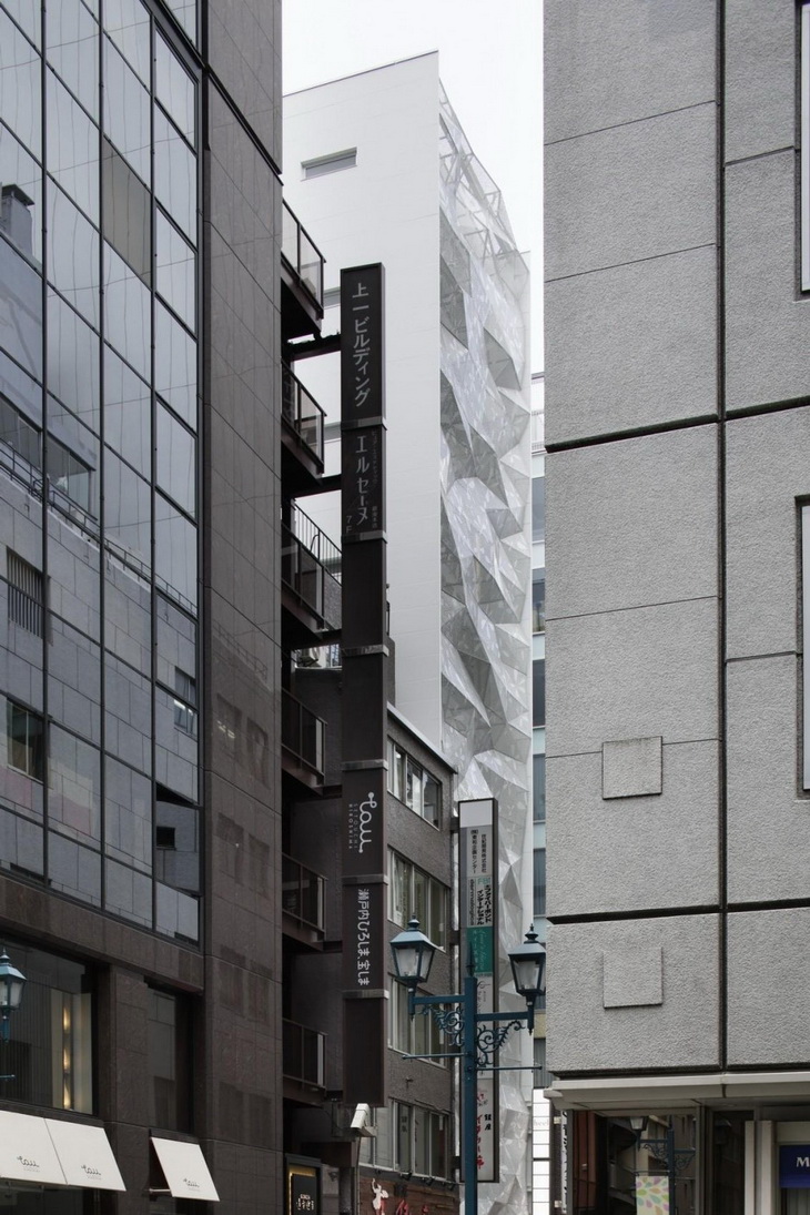
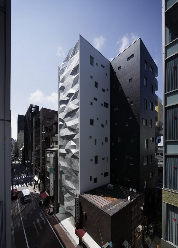
Amano Design Office creatives have designed the office building named Dear Ginza. The building site is on the Ginza 1-chome Gaslight Street, which is one street behind the Ginza Central Street.



From the Architects:
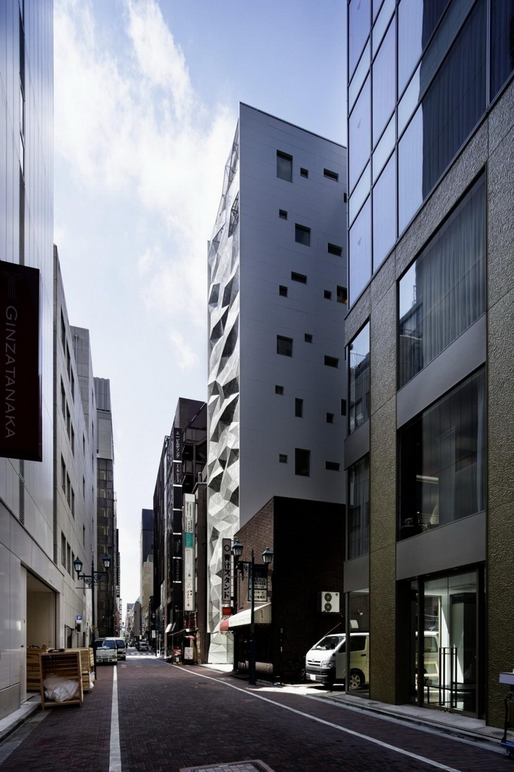
The client is a developer company. It purchased a long-sought after lot in Ginza, and planned to build a commercial /office building. The building site is on the Ginza 1-chome Gaslight Street, which is one street behind the Ginza Central Street.
It is on the back side of the Mizuho Bank and Pola Ginza buildings on the Central Street. The atmosphere is quite different from the gorgeous Central Street, and the site is on an empty street which is often seen behind the street with large-sized buildings. Attracting as many people as possible into such a street is our task. The client desired the building to be a gorgeous existence. In addition, the designer desired to provide a “slight feeling of strangeness” to the passersby that would attract them to the building.
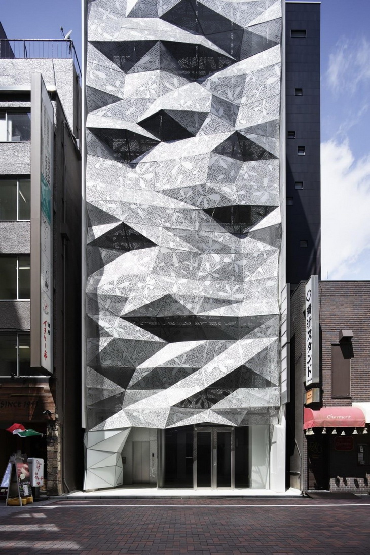
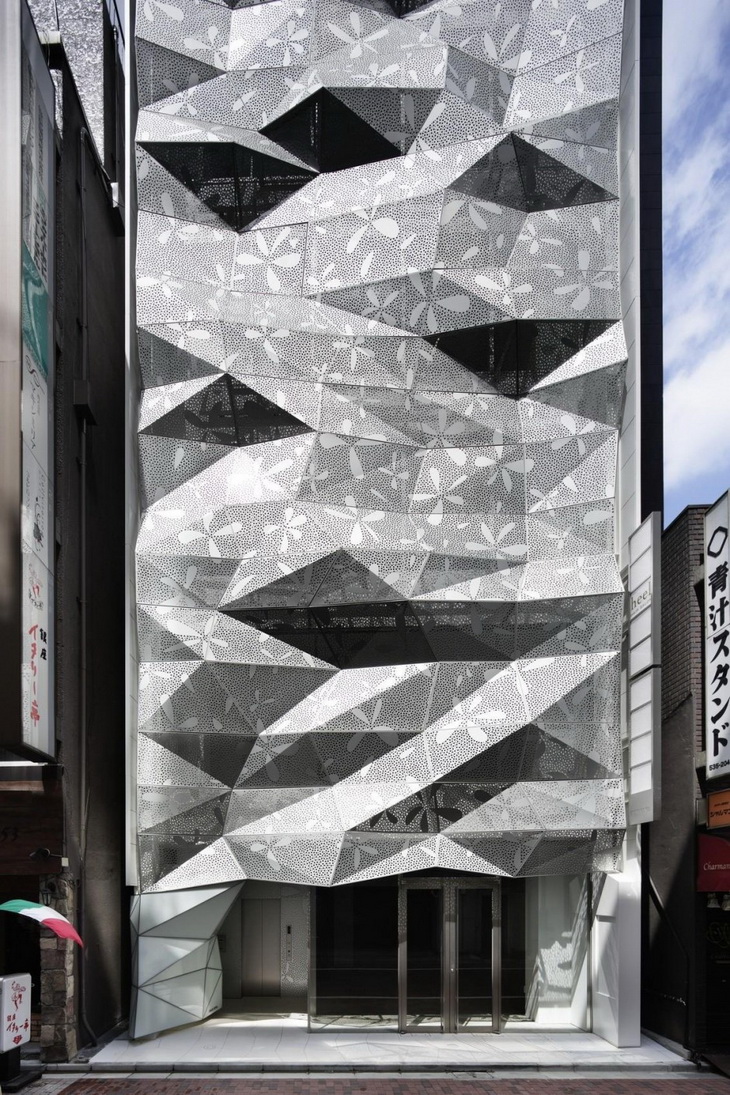
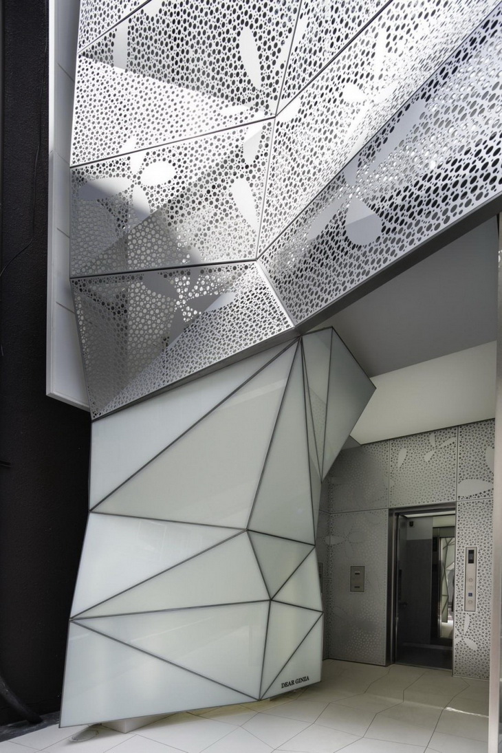
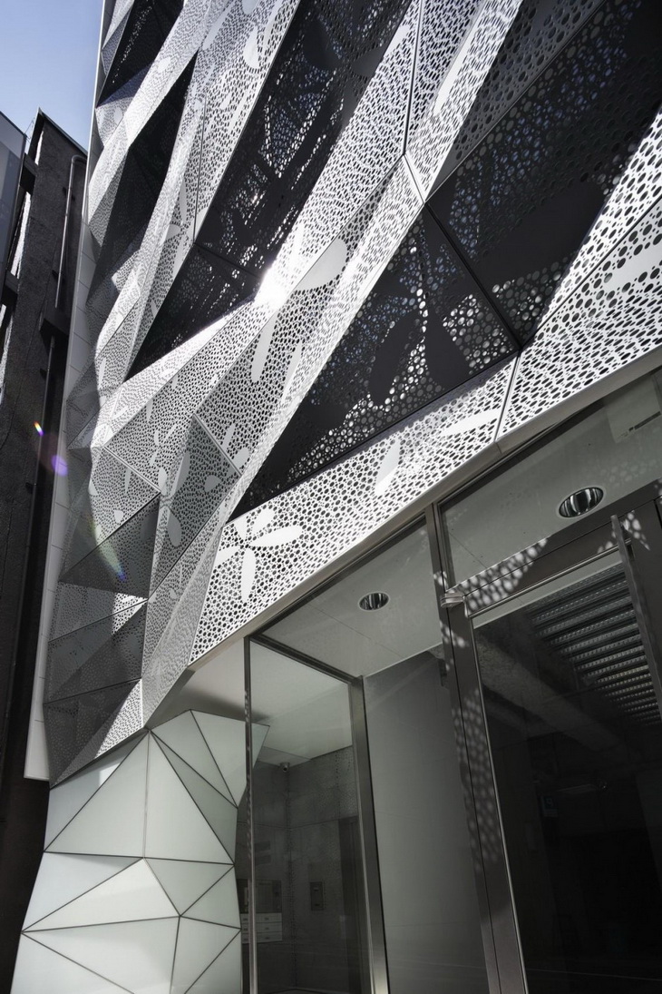
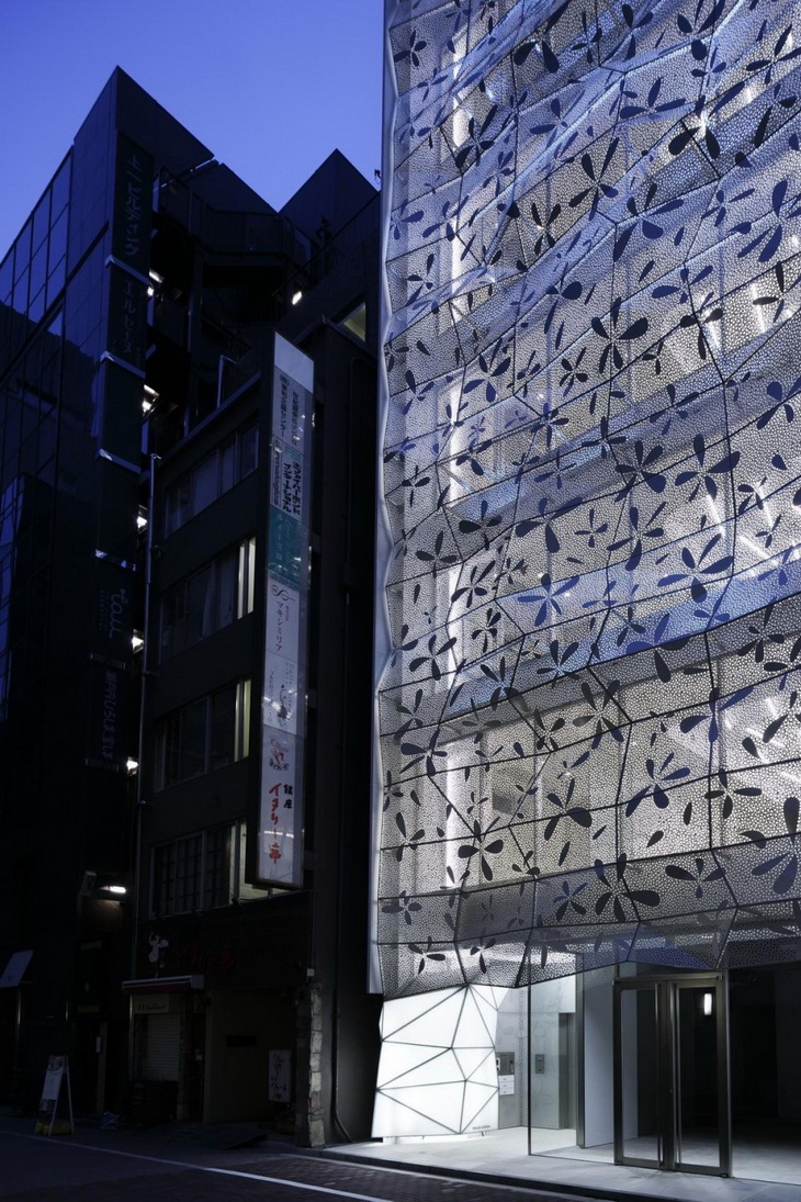
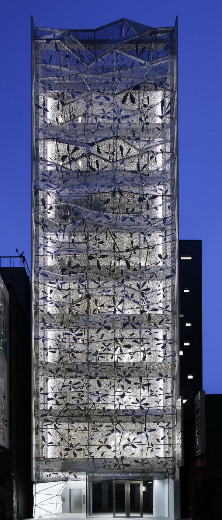
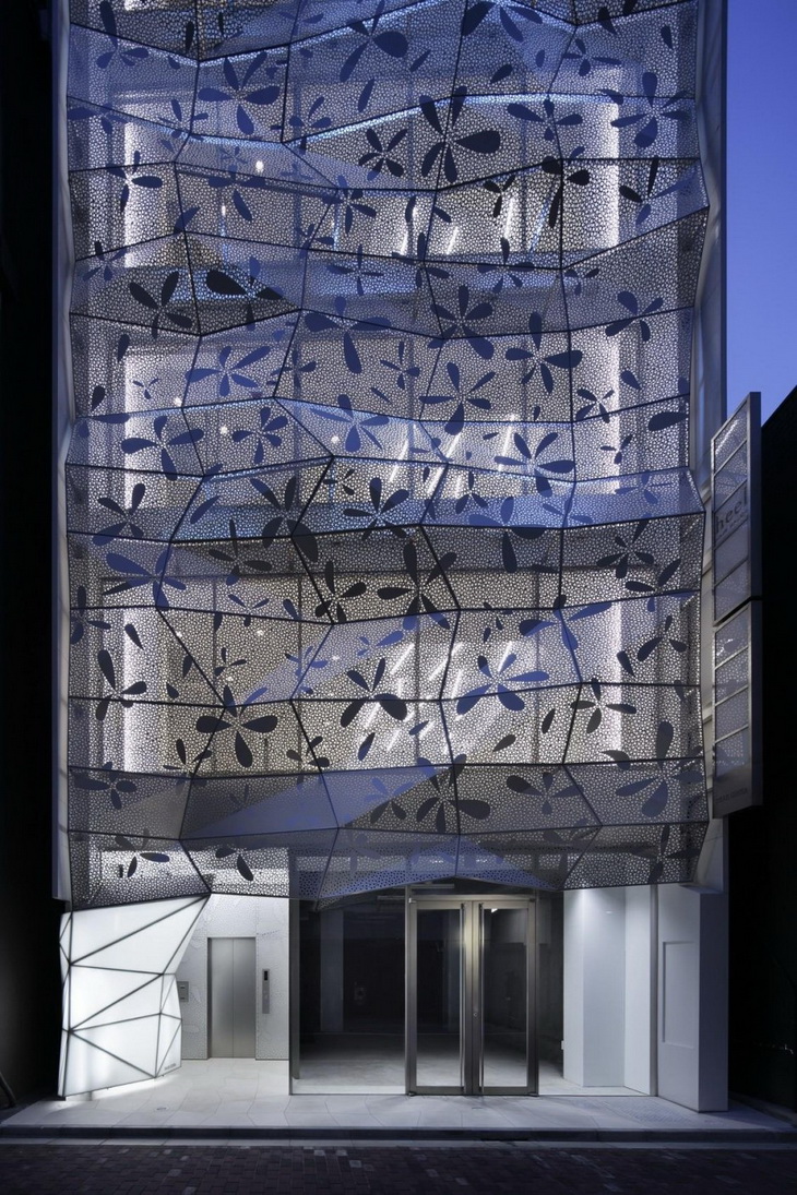
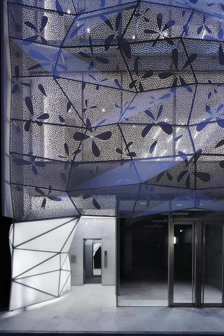
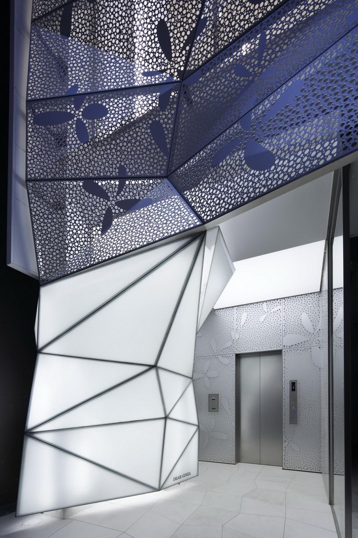
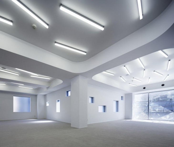
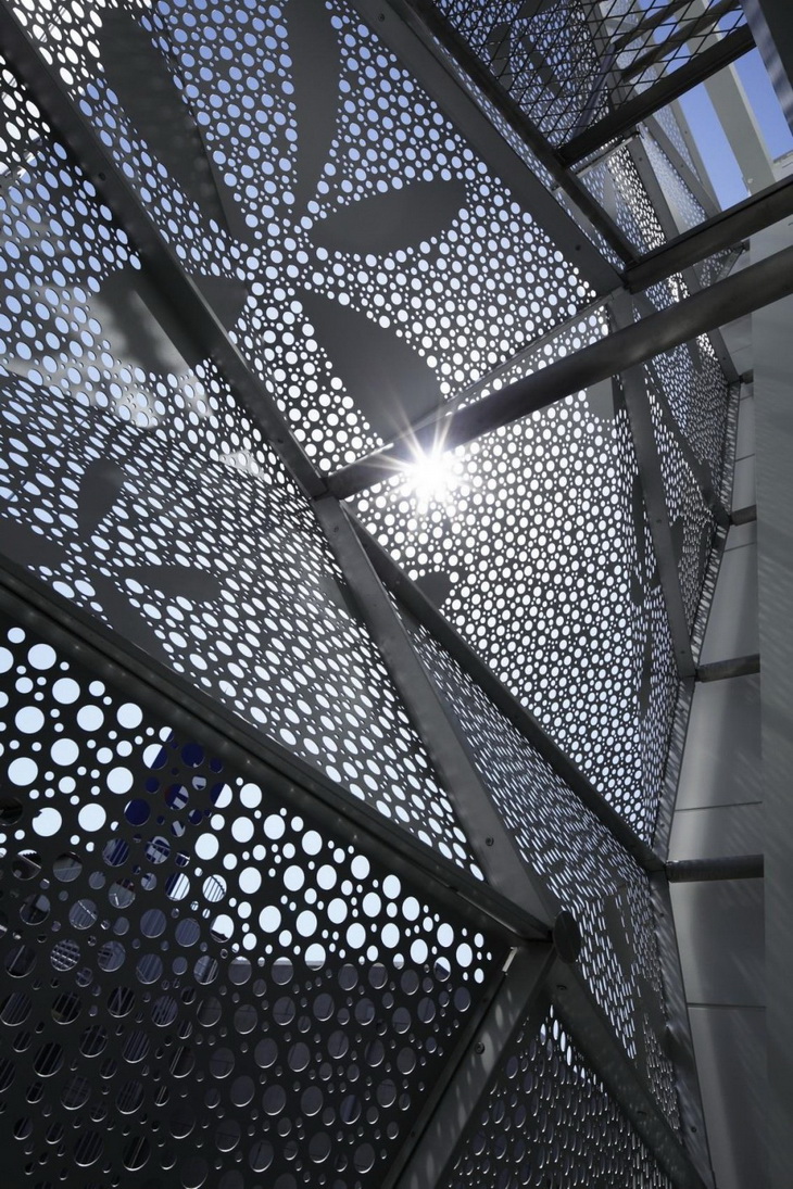
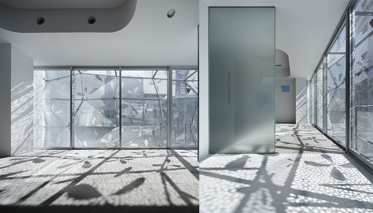
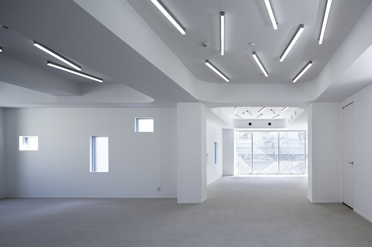
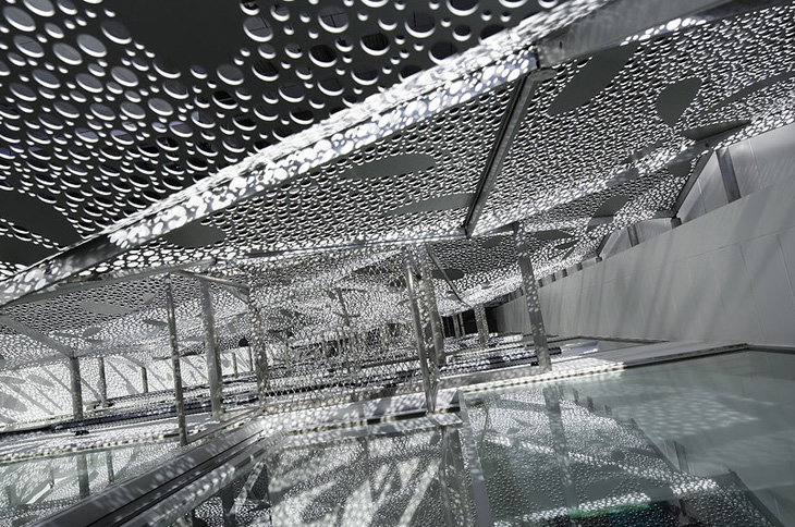
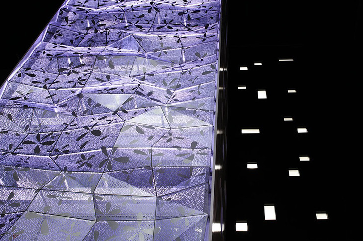
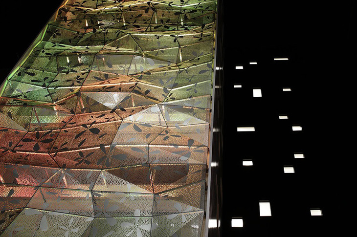
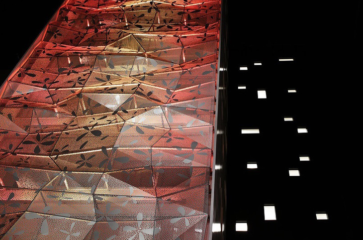
Considering the views from the inside, simply obtaining openness with glass seems futile, since the outside scenery is hopeless. Therefore, a double skin structure is employed, which consists of glass curtain walls and graphically treated aluminum punched metal. The façade becomes a part of the interior decoration and obviates the need for window treatments such as blinds or curtains. By using a double skin, reduction of the air conditioning load and the glass cleaning burden was also intended.
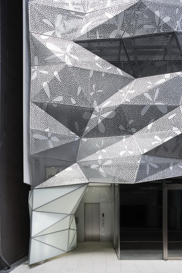
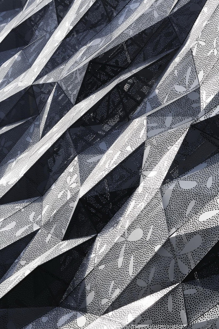
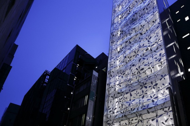
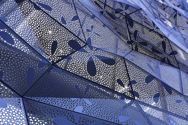
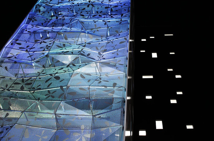
The irregular façade design was determined by computing a design to avoid arbitrary forms and to approximate forms in nature. We thought that a well-made incidental form would likely be a less-disagreeable design. In the neighborhood of mostly modernist architecture with horizontal and vertical or geometric shapes, the building has a proper feeling of strangeness, attracts special attention, and has an appeal as a commercial building. The abstract flower graphic is used to balance the impression of the façade, i.e., to free it up from becoming too edgy.
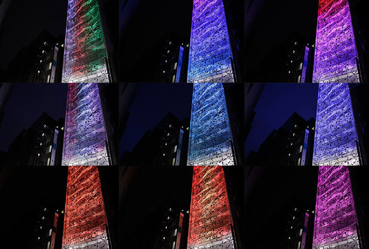
By computing the design, individual aluminum punched panels are irregular with different angles and shapes, yet all fit into a standard size, resulting in excellent material yield. To avoid being clunky, an extremely lightweight structure is required. Therefore, much caution was taken in its details. The colored LED upper lighting, which is installed inside the double skin, entertains the passersby with different programs depending on the season. Expected tenants included a beauty salon and esthetic salon, and the expectations are materializing.
Project: Dear Ginza Building
Designed by Amano Design Office
Location: Tokyo, Japan
Website: www.amanod.com


