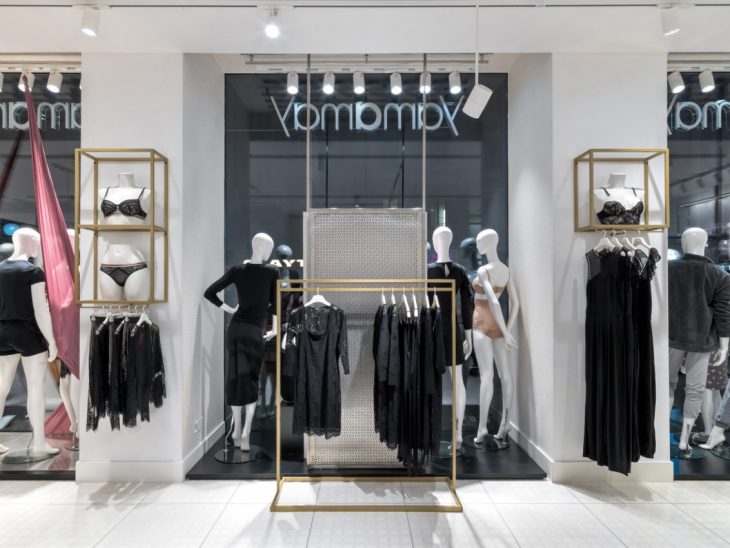
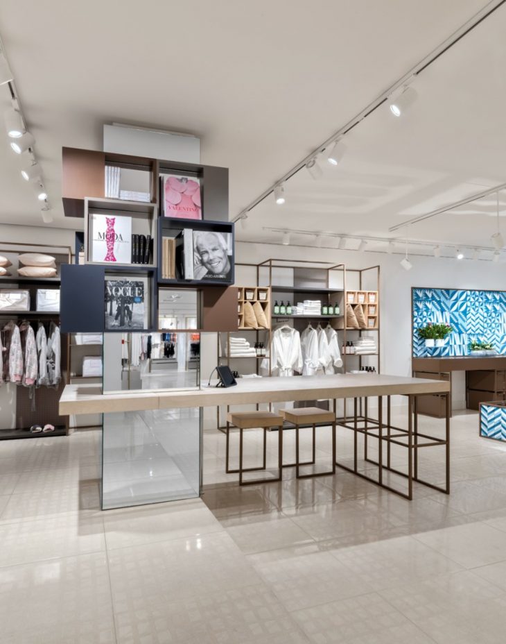
Piuarch designed the new Yamamay concept store. The space is light, luminous and soft, inspiring extremely rewarding visits. A new experiential platform combines interior design, product and extra services – available at the main stores – such as a corner for selling plants and flowers, bookcases and home accessories. Take a look at the complete story below.
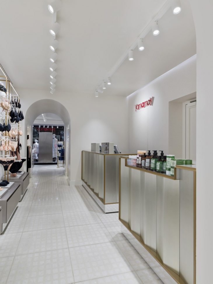
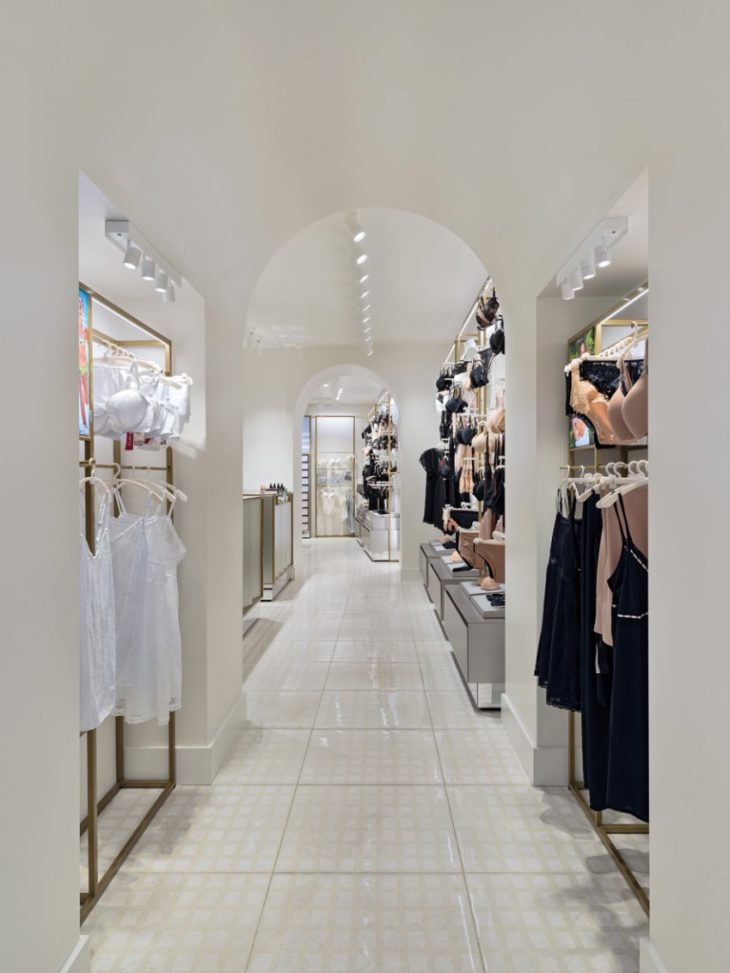
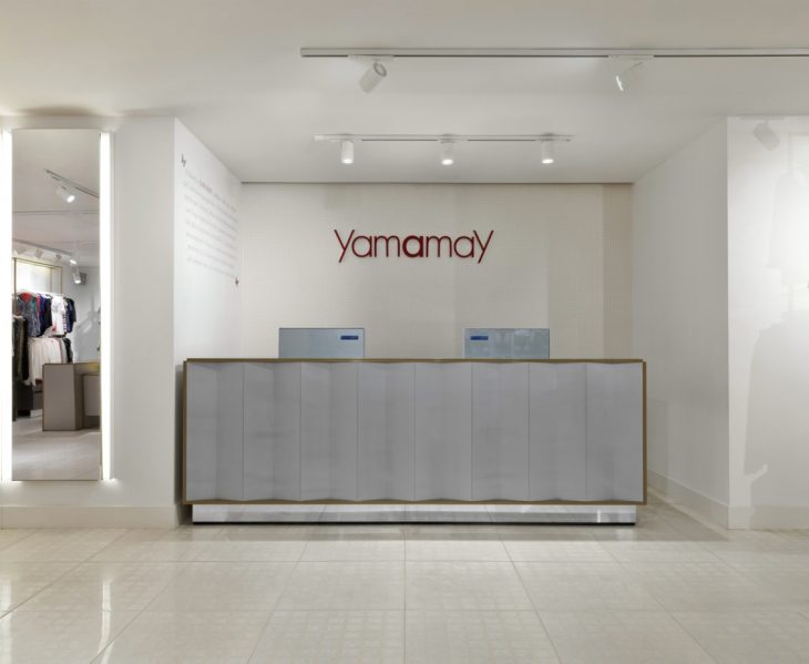
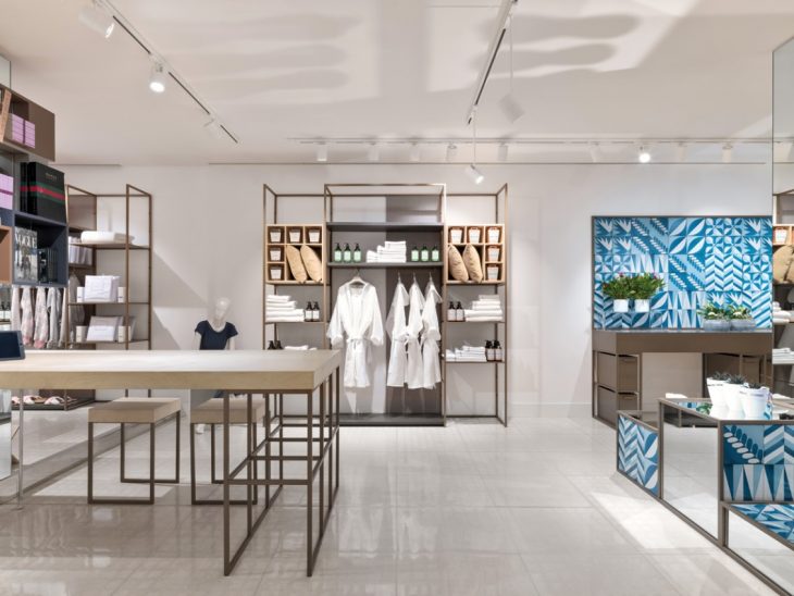
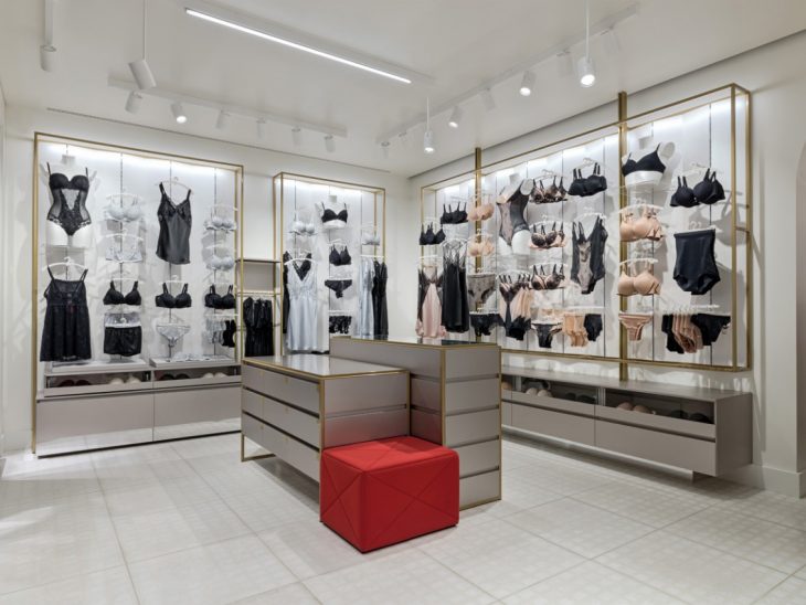
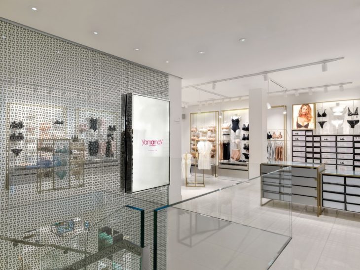
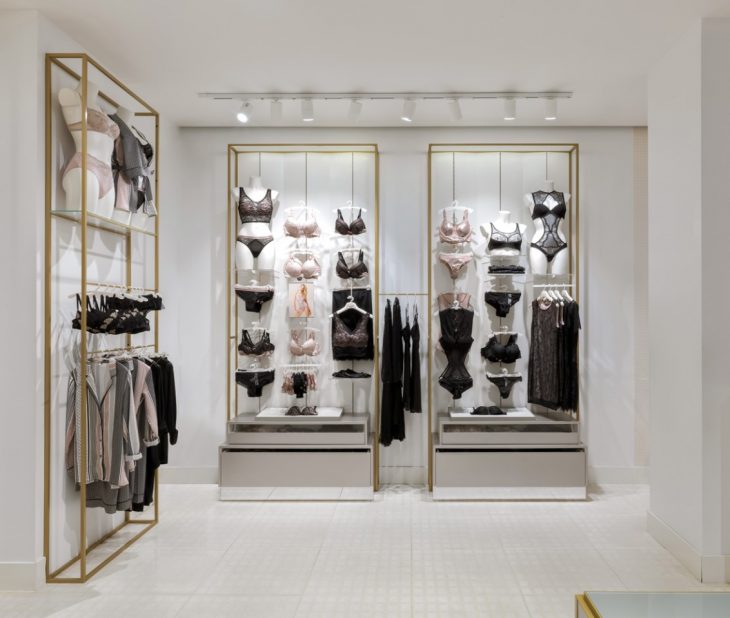
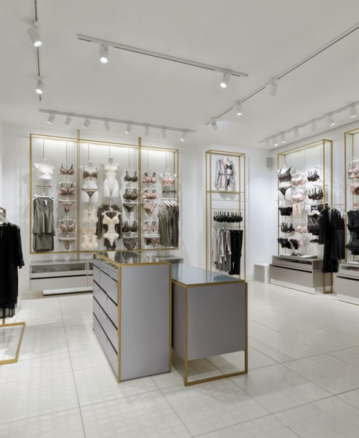
From the architects: The client is a famous women’s lingerie company, the designer one of the most famous architectural firm in the fashion world. The meeting between Yamamay and Piuarch arises from the desire to bring a fresh look to the glamour of the Italian giant’s lingerie collections; an image that can express the brand’s philosophy – based on the concepts of lightness, softness, brilliance, geometry and symmetry – in a dynamic, innovative retail experience that can be adapted to the more than 1300 stores it has opened in less than twenty years in Italy and abroad.
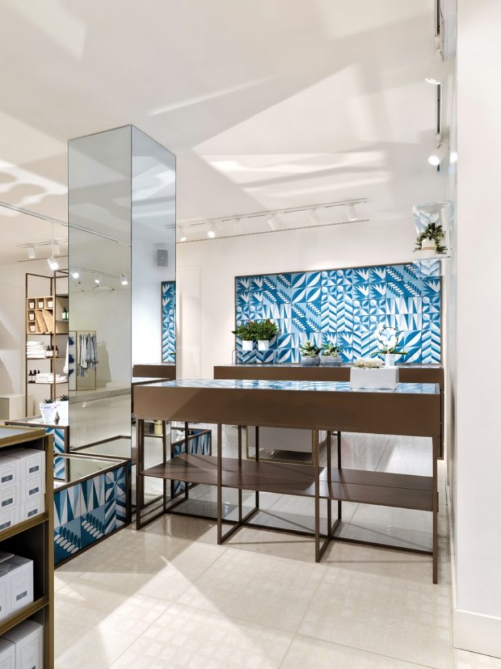
And so this sensual, feminine world of lingerie, founded by the Cimmino family in 2001, thus becomes a precious vessel from which ideas can drawn at various levels for the design of the new concept store. Piuarch started with the theme of a butterfly, the exquisitely beautiful yamamay found in Japan that inspired the name and the identity of the brand, stylizing it in a double triangle and creating an identifying pattern that serves as the starting point of the decorative concept for the new store.
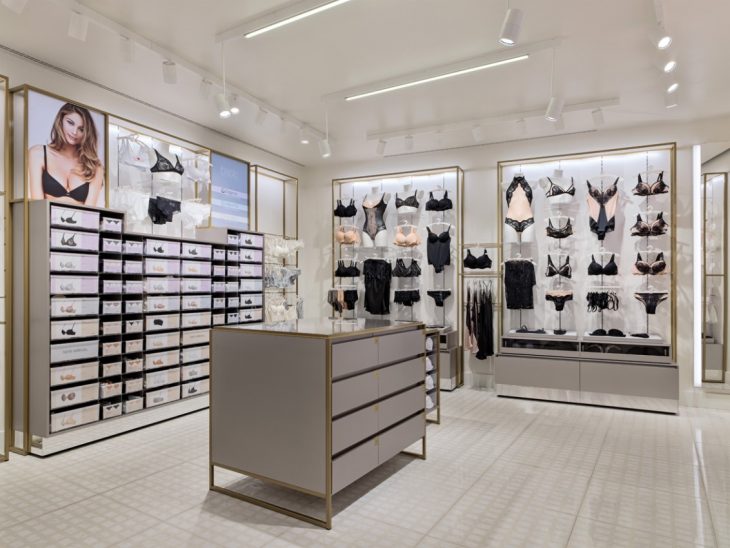
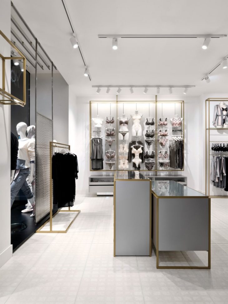
Used as a repeated symbol on wallpaper, on mirrors and even on metal screens with laser-cut designs, the new motif defines the background of the products displayed, and thanks to its abstract quality, it highlights the axiom related to lightness, geometry and symmetry. The wall-mounted display units become part of it: hangers with a slender frame in brushed gold finish, enriched by tilted ivory-coloured panels that create a sophisticated zigzag pattern, reminiscent of the graceful, impalpable movements of the butterfly. Placed below them are horizontal drawer units of the same width with a light gray lacquered wood finish and shiny steel base, handy for storing the garments and allowing them to be easily retrieved by the sales staff. The freestanding furnishings in the center of the sales area have the same features, with a metal structure and wooden drawers for maximum convenience. They have glass tops which can either serve as a convenient shelf for showing the items chosen by the customer or for placing small hangers with the most emblematic items in the collections.
Everything is harmonized in a flowing spatial sequence and, above all, in a colour palette that is limited to just the hues of white, ivory, light gray and gold: the parts of the wall without display units are plastered white, as are the ceilings, in which adjustable light fixtures, also white, are inserted. The floor is of the same colour, with large square tiles that combine the terrazzo effect with delicate tone-on-tone geometric marble inserts.
The space is light, luminous and soft, inspiring extremely rewarding visits, during which the customer’s loyalty is also gained through the building of a real experiential platform that combines interior design, product and extra services – available at the main stores – such as a corner for selling plants and flowers, bookcases and home accessories.
Photography by Matteo Piazza
FInd more projects of Piuarch: www.piuarch.it


