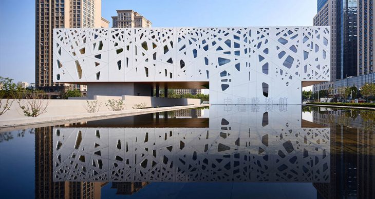
Studio A+ designed this stunning art gallery in Hefei, China. The architecture and landscape have combined to create a warm and welcoming public area where people may readily access, experience, and celebrate art while feeling inspired and informed. Take a look at the complete story after the jump.
From the architects: The design was finished in 2008. 10 years later, the construction started and was completed by the end of July, 2019.
12 year ago, the CEO of the Central Ring Real Estate Group, found us after visiting poor folk artists in the rural area of An Hui province. Seeing so many outstanding art works stacked inside humble residences with no opportunity to be shown to the public, he decided to build an art gallery in a new urban district in the capital city of the province.
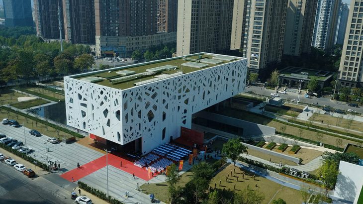
He envisioned this low density and low-rise art district to be the place where art and artists meet the public, to radiate its unique energy to the surrounding neighborhoods, and to become a must-visit attraction. To do so, the site must stand out from the backdrop of a typical urban jungle – high-rises.
Concept
How do we turn this simple but idealistic goal into reality? After analyzing the site and its surroundings, which were totally vacant at the time, we decided to introduce a ‘manmade nature’ into this new urban area that will be typically occupied densely by tall buildings and super wide motorways according to the planning. We believed that no one who lives in the city would refuse a land of idyllic beauty – a land full of cherry blossoms may have a better chance to be more attractive than a tall concrete forest. We wanted to create a micro-climate characterized by art and nature, or an urban oasis with an art utopia within it.
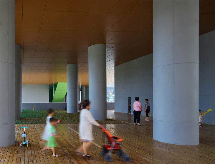
Such invaluable setting of nature becomes a stage to accommodate art and art activities. Art and nature, though independent from each other, juxtapose, flow, connect and fuse with each other at the same time. In the spring time during the flowering period, activities such as special art festivals can even give the place a one-of-a-kind signature, which attracts people near and far.
RELATED: FIND MORE IMPRESSIVE PROJECTS FROM CHINA
The main expected activity on site is promenading, through which people can enjoy and contemplate art and nature on multiple levels. The gallery in turn is not an isolated inward-looking art container. Together with the settings, it becomes a welcoming and inclusive public place, where people can easily access, experience, and celebrate art while feeling inspired and enlightened.

The priority of landscape design
Art is a harmony that runs parallel to Nature. —— Paul Cézanne
Landscape design was the first step of the design work. A series of parallel lines are adopted as the matrix of re-formatting the site. Upon this configuration, colors from different local vegetation were mapped out to articulate the manmade nature.
The areas defined by the parallel lines later become a sunken plaza, stepped seating stands, reflecting pool, giant sloping walkway, terraces on different levels, array of cherry trees, and bushes of different local species with various colors.
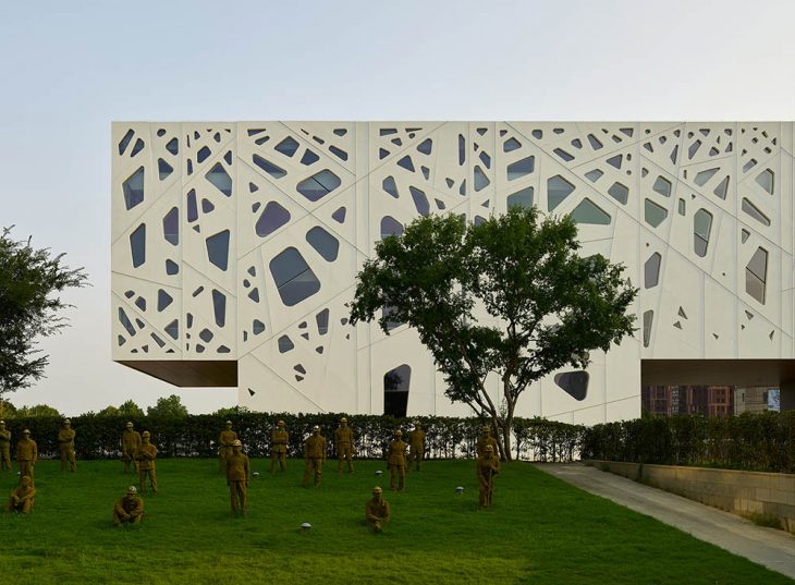
Within this configuration, there situates the Central Ring Art Saloon, the first phase of this project which was completed 10 years earlier in 2009. A group of human scale sculptures based on real construction workers of this project stands on the sloping lawn in the backyard. With the façade of the new art gallery as the backdrop, the sculptures commemorate ordinary workers in a special language of art.
Architecture and Interior Space
Positioned at the point where a pedestrian shopping street ends from across the road, the gallery building invites people in and engages them with a pleasant journey with art.
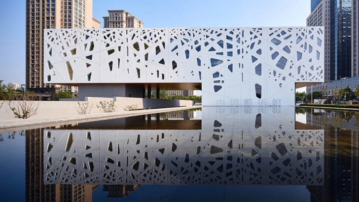
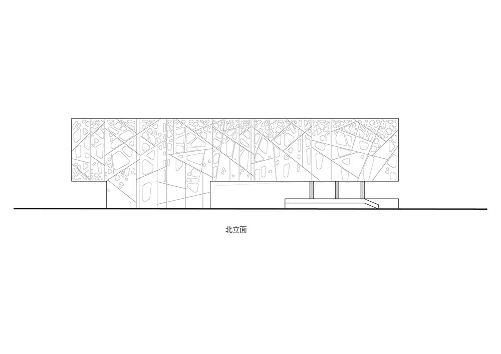
Perpendicular to the parallel lines of landscape, the gallery building floats above the ground and gives way to the landscape that runs through the site. The building becomes a floating scene, with a specially designed envelope derived from a fragment of ‘forest’. The floating structure forms a series of semi-outdoor space that hosts various art activities.
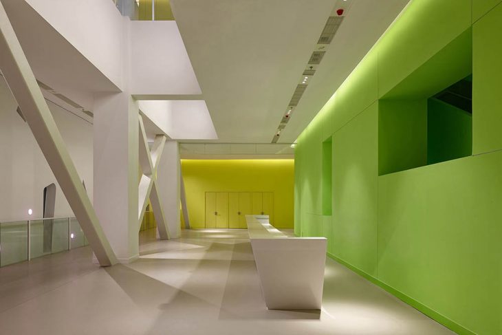
The indoor journey begins at a grand entry stairway, leading visitors directly to the lobby and an open multifunctional space on the second floor. The VIP lounge and conference room are immediately adjacent to the open space, where activities such as opening ceremonies can take place.
Two exhibition halls – one large and one small – are placed on the 3rd floor and only open to the sky partially. Space around these two boxes is liberated in such a way that the building skin is highly permeable and the indoor and outdoor are blended instead of being separated via this interface. The spaces can accommodate temporary non-official art shows. Walking along it, people can enjoy both the indoor art exhibition and the nature beyond.
Light and Color
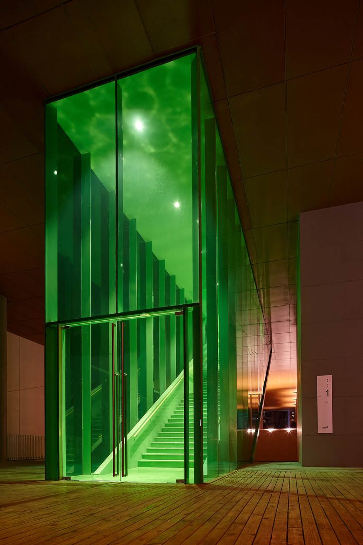
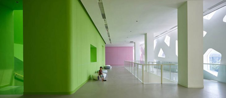
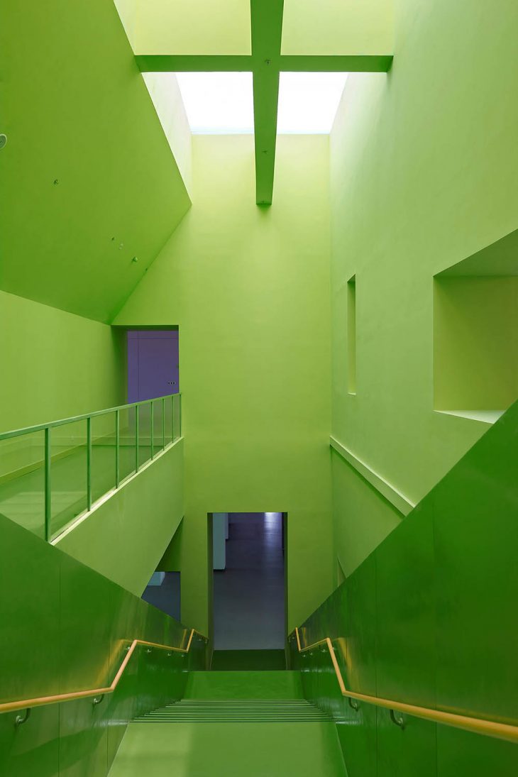
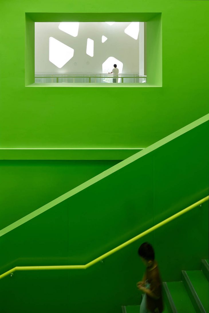
There are three major types of interior spaces in the gallery: the core spaces, i.e. the exhibition halls, where the daylight gets in vertically from above through the skylight; the spaces outside of the core, the promenade corridors and free spaces they connect, where the daylight gets in horizontally from side windows; and the grand staircase, somewhere in between. Inside the grand staircase, the daylight is sourced mainly from the skylight above, while horizontal daylight and views can also be borrowed through side openings from adjacent spaces.
The color of the exterior, the white and dark grey, are from the local ‘Hui’ style traditional building (mainly black and white). Pink (cherry blossoms), yellow (rape flowers) and green (young leaves) are applied to interior skin to echo the local landscape in spring time. The inside of the exhibition halls is painted white to ensure best lighting quality and artworks are best displayed. A fresh and bright green color is applied to both inside and outside of the grand staircase to give the space a character intentionally. When people start the journey with art on the first step, they would feel like they stepped into a painting to become the leading role of the stage.
Project Information
Project Name: The Central Ring Gallery
Architecture Firm: Studio A+
Firm Location: Beijing, China
Completion Year: 2019.7
Gross Built Area: 16525 sqm
Site Area: 30017 sqm
Project Location: Hefei city, Anhui province, China
Lead Architect: Min Wang
Design Team: Min Wang, Mei Ding, Hui Li, Wenwen Zhang, Chongshuo Wang , Xin Jing, Yuwei Wei
Project Type: architecture, landscape and interior
Project Status: Built
Design Period: 2008. 05 – 12
Construction Period: 2018.03- 2019.07
Collaborator: CCDI
Client: An Hui Central Ring Real Estate Group
Cost: 150 million RMB
Photo credits: Chen Su, Fang Chun


