LLI Design was tasked with completely redesigning and refurbishing a period apartment in a grand mansion building in Bloomsbury, London.
Located in the historic center of the West End and close to the theatres of Covent Garden, this two-bedroom apartment had not been refurbished in many years and served as a blank canvas for the clients to build a magnificent pied a terre.
The brief called for preserving and enhancing the apartment’s period details, as well as using the homeowners’ inherited furniture pieces and merging them with new contemporary pieces to create an eclectic mix that fit the clients’ style.
Existing Layout
The existing apartment was designed with a large central corridor and rooms on either side.
All rooms had high ceilings, original cornices, skirtings, and architraves, and windows with ample proportions. Although at the center of the apartment, the central corridor that connected all the rooms benefited from borrowed light via fan lights above most of the room doors.
The two bathrooms were modest and relatively dark, as was common for an Edwardian mansion flat.
There were two reception rooms and a bedroom on the north side of the apartment. A second reception area, the kitchen, and another bedroom were located on the apartment’s south side. There were two bathrooms on the west side of the unit.
The rooms on the north side of the apartment viewed the large house block’s central courtyard, with the nearest neighboring tall building approximately 5 metres away. The rooms on the apartment’s south side featured views of the city, with the next nearby tall structure some distance distant. As a result, there was a significant difference in natural light levels between the north and south sides of the apartment.
Revised Layout
To make the apartment work for the clients and to make the most of the available space, the layout was changed as follows. The two reception rooms on the north facing courtyard side would be combined to form a large open plan library / dining area.
The light-filled southside welcome room would be transformed into a music room, with a baby grand piano as the focal point.
The bedroom on the south side was chosen as the master bedroom because it had a lovely, tall tree outside the window, which was unique for a 5th floor flat. The other bedroom on the north side would be converted into a guest room.
The kitchen would be mostly kept in its original location, but fully remodeled and redesigned to include a small island, a hidden utility area, and a pantry space.
The kitchen door was relocated so that it could be reached from the central corridor rather than a short dog leg off the corridor as it was previously. The surviving dog leg became part of the new master bedroom.
The guest bedroom and family bathroom remained in their original locations.
Part of the library was converted into a tiny coats cupboard accessible from the central corridor.
To visually connect the areas, wide plank timber flooring in a pleasant pale grey tone was picked for the bulk of them. The bedrooms were carpeted in a deep pile soft grey carpet, while the bathrooms were tiled with underfloor heating.
The lighting design for the apartment was difficult because the ceiling construction did not allow for recessed lighting, therefore all luminaires had to be surface mounted or incorporated into joinery.
Central Corridor
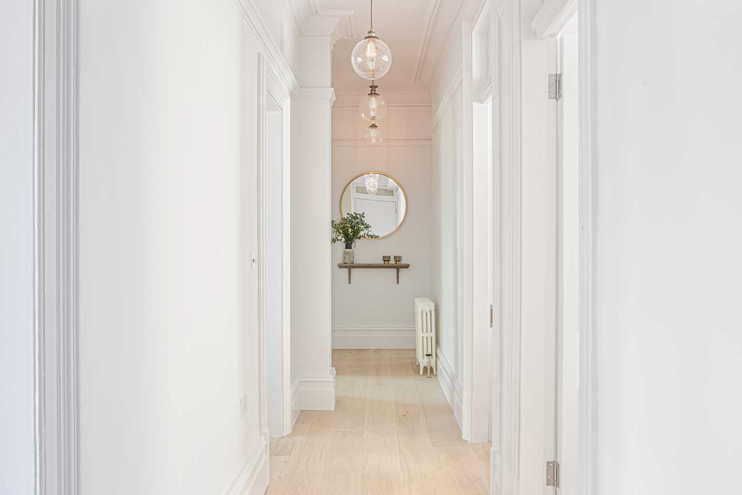
The apartment’s entrance needed to be warm and welcoming, with no clutter. A coats cupboard was not included in the initial design. Because the corridor was fairly narrow, a joinery cabinet could not be easily accommodated; therefore, it was decided to ‘nibble’ a small portion out of the big library room adjacent to the hall in order to make storage for coats, shoes, bags, and so on.
To keep the corridor’s strong lines and the cabinet as unobtrusive as possible, a ‘invisible’ door was developed, with no architrave and the skirting detail included in the door design, so that the entire wall read as one.
The property’s high ceilings were highlighted with a tonal color scheme in half tones of grey that highlighted coving and skirting elements. To emphasize the corridor’s length, enormous dramatic pendant lamps were requested all the way down, with a large round mirror and a console shelf providing a visual full stop at the end.
Library
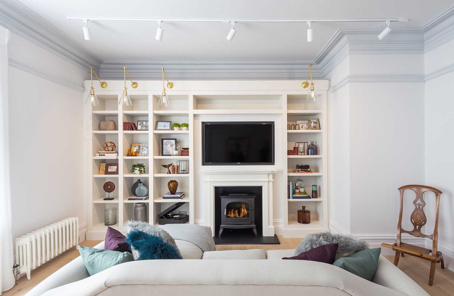
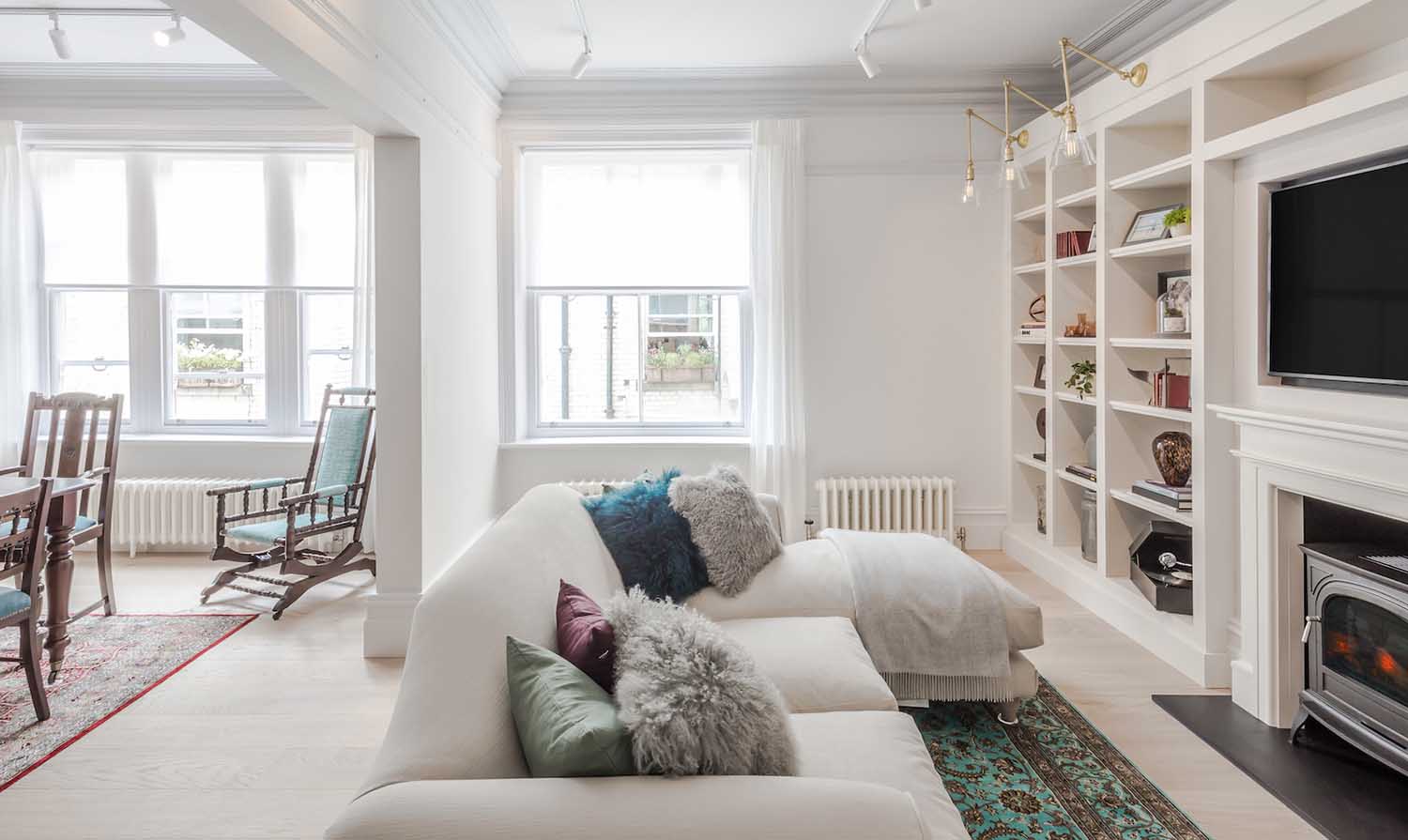
The two reception rooms on the north side of the home were combined to form a single library/dining room. This allowed natural light to flow from one area to the next and added a light, airy sense to otherwise dark places.
A working fireplace was part of the brief because it was not practical to install a gas fire and associated flue / chimney due to the confines of the apartment block, but a fire surround was designed and integrated into the new bespoke joinery unit and a cast iron, realistic faux log burner was installed in the new fireplace surround, bringing a sense of coziness to the space.
The cloak room in the central hallway was constructed by partitioning off a small portion of the existing library room. This generated a small return in the library, but it was not visually intrusive because the coving, skirting, and dado detail wrapped perfectly around the new return. The new return was then incorporated into the custom joinery bookshelf constructed along the rear wall.
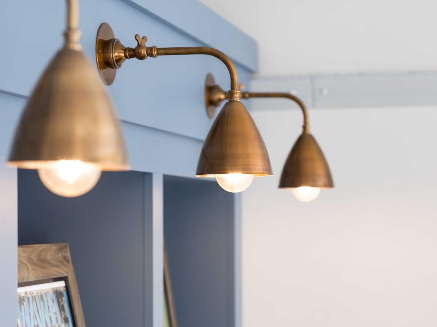
A huge TV was fitted into an alcove above the fireplace so that it sat flush with the wall and did not dominate the space. The bespoke joinery unit along one wall gave much-needed exhibition space for artifacts, books, and collectibles, and feature wall lighting with brass embellishments rounded out the joinery unit.
To suit the clients’ collection of antique furniture and rugs, a simple classic style sofa with a chaise end was added.
RELATED: FIND MORE IMPRESSIVE PROJECTS FROM THE UNITED KINGDOM
Again, historical elements were highlighted in half tones of mild greys to create a warm and tranquil atmosphere in the area. London interior designers LLI Design dramatically altered these spaces by integrating these two rooms and carefully considering and specifying furniture, woodwork, and the material palette.
Kitchen
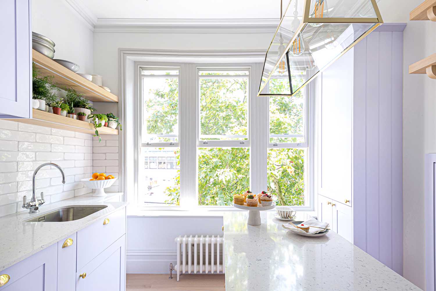
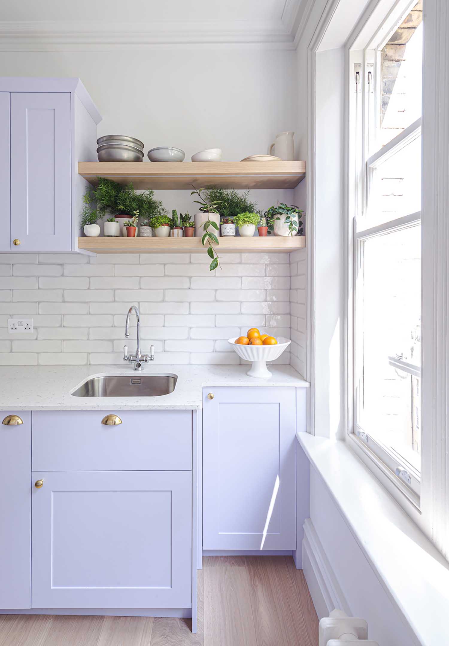
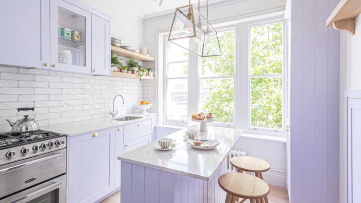
The kitchen and master bedroom shared a window with views of the gorgeous, tall tree outside. Pale lilac lacquer, palest dove grey, and gold highlights with bleached wooden shelving created a fresh and cheerful modern kitchen with plenty of visual intrigue.
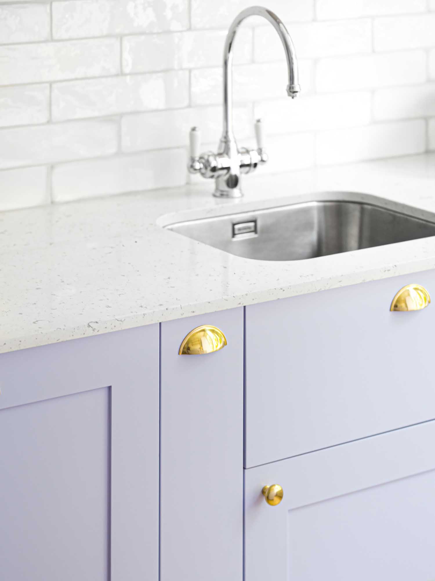
The bespoke joinery kitchen arrangement included a center island with a pale grey composite surface and a dramatic gold pendant light. Classic shaker style kitchen units, some with glass fronts to showcase glassware, added aesthetic appeal. Cabinetry had gold cup pull handles and knobs, which contributed to the kitchen’s contemporary vibe.
The kitchen featured the same warm toned wide plank floor as the rest of the flat, as did the underlit wooden open shelving for plants and books. The backsplash was made up of glazed porcelain artisan metro tiles in subtle tones with a pale grey border.
A tall lilac lacquer unit concealed a small but quite useful utility room. The washer and dryer were installed at a high level, with a pull out drawer for laundry below and shelves above for linen storage.
The original fireplace range aperture was converted into a pantry cabinet with pull-out wicker baskets.
Dining Room
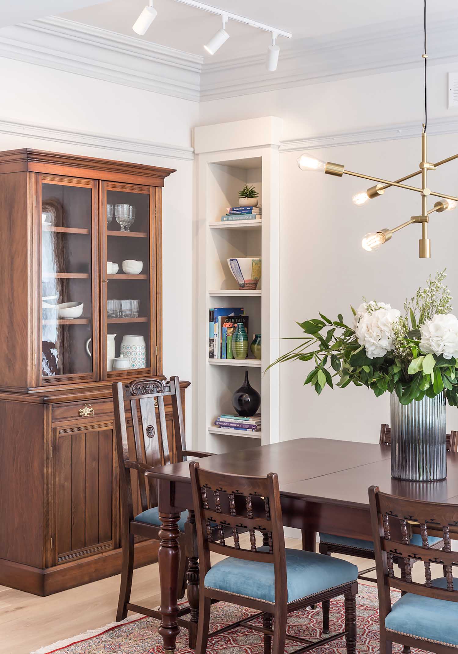
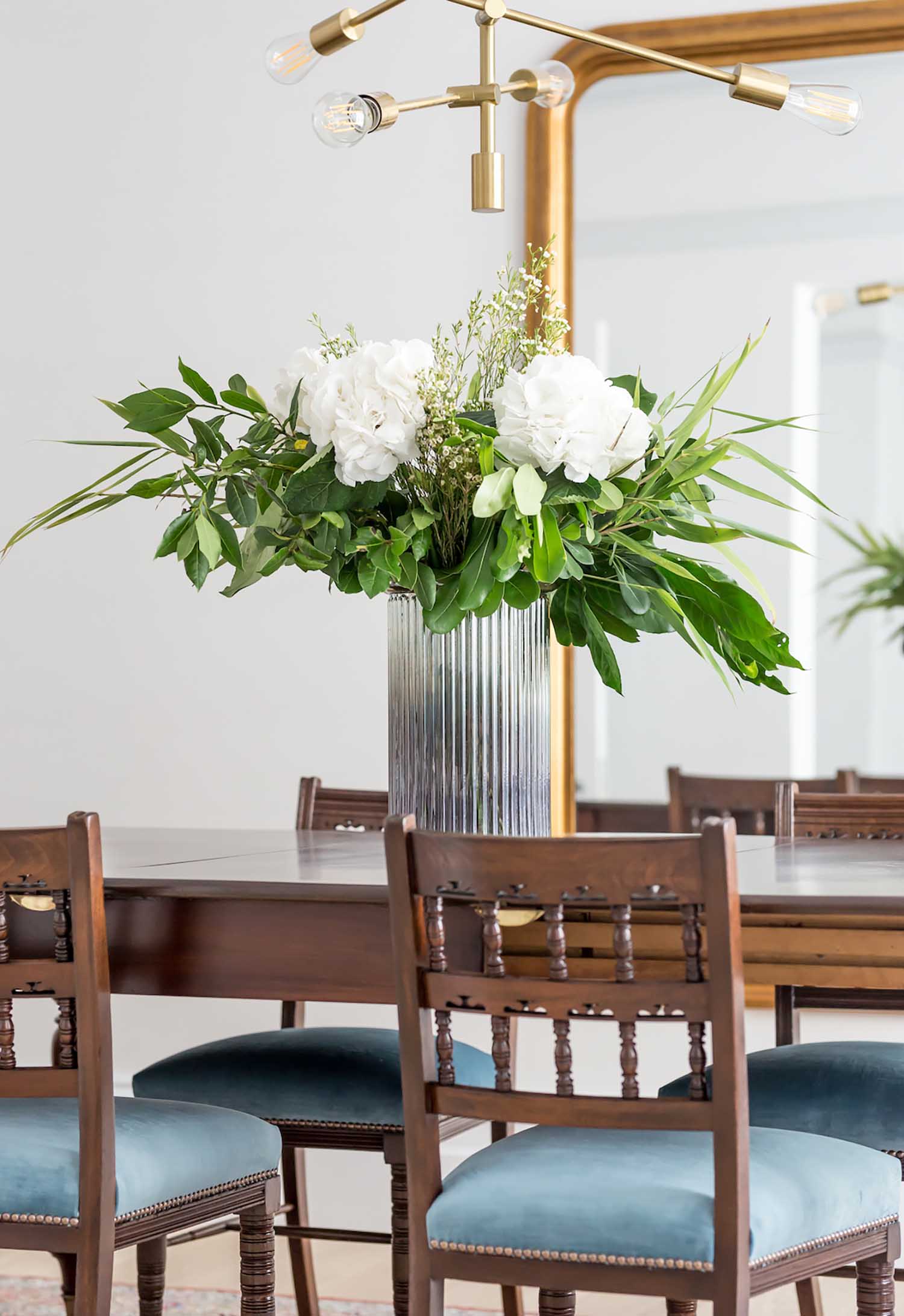
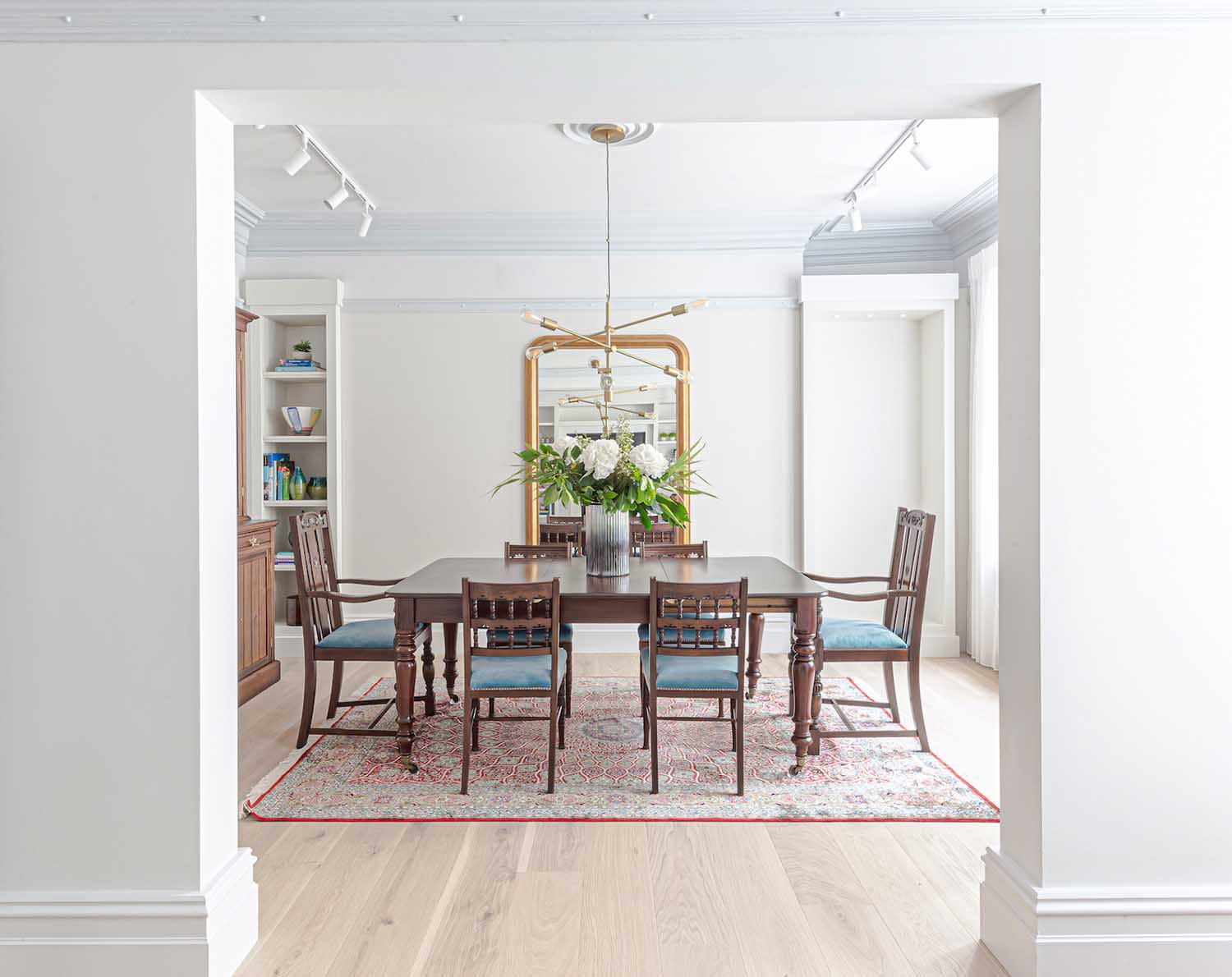
The dining room furniture was made up of the clients’ much-loved inherited pieces that were refurbished, restored, and french polished to put them back to their former splendor.
A big contemporary, bronze pendant light with exposed squirrel cage lights was installed above the dining table to contrast with the vintage furniture. The chamber was illuminated by an ornate, enormous, gilt-framed wall mirror. Custom joinery alcoves were built on either side of the chimney breast to maximize available space. All of the aesthetic aspects were brought together by the clients’ highly patterned Persian carpet.


Music Room
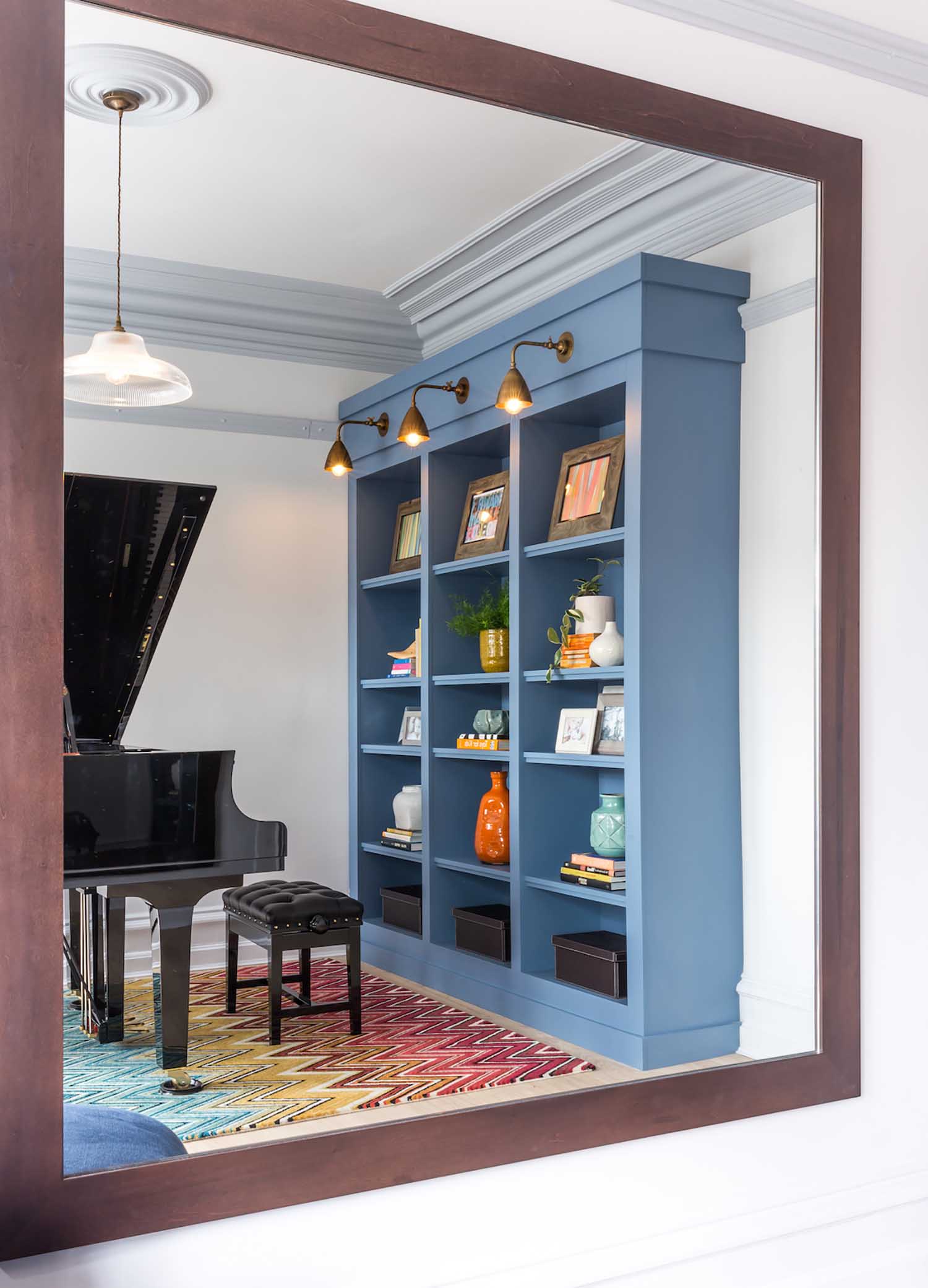
The music room was created to be a vibrant and dynamic place, with bright colors and patterns to balance off the drama of the polished black baby grand piano that served as the focal point.
An extra large oak framed mirror was hung on one wall to balance the visual prominence of the piano, and a classically designed chaise lounge created an air of opulence.
The room was completed with a bold statement multi-colored Missoni chevron rug and a striking mid blue handmade joinery unit with brass wall lights above.
Master Bedroom & Ensuite
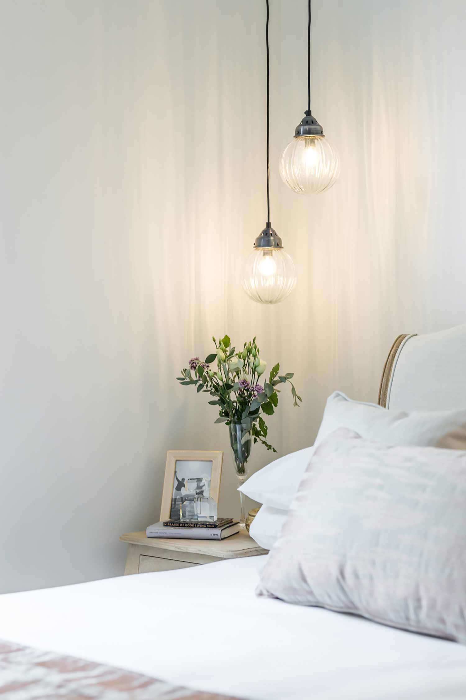
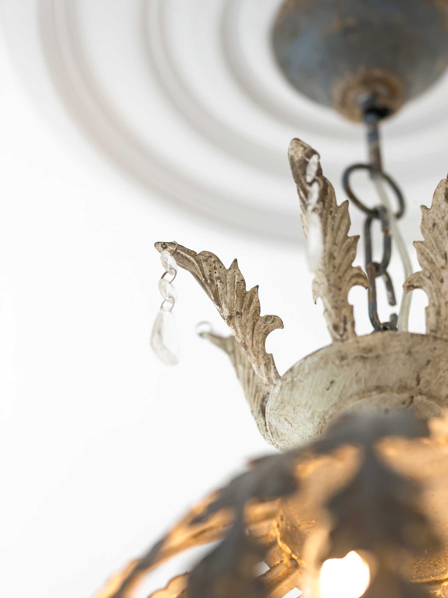
The master bedroom suite was given a soft romantic look with a palette of bruised pinks, greys, and taupes, as well as a variety of tactile textiles to create a luxurious feeling. The attractive classically fashioned bleached out bedside tables, which had staggered height vintage ribbed globe pendant lights above them, were complemented by the french styled bed in a natural coloured grey linen with a bleached wooden frame. Over the bed was hung a massive vintage metal damaged chandelier.
A full-height joinery wardrobe in taupe satin lacquer along one wall, with hidden drawers and hanging space. To accentuate the sense of peace and grandeur, a delicate and extremely subtle texture wall covering was used.
Family Bathroom
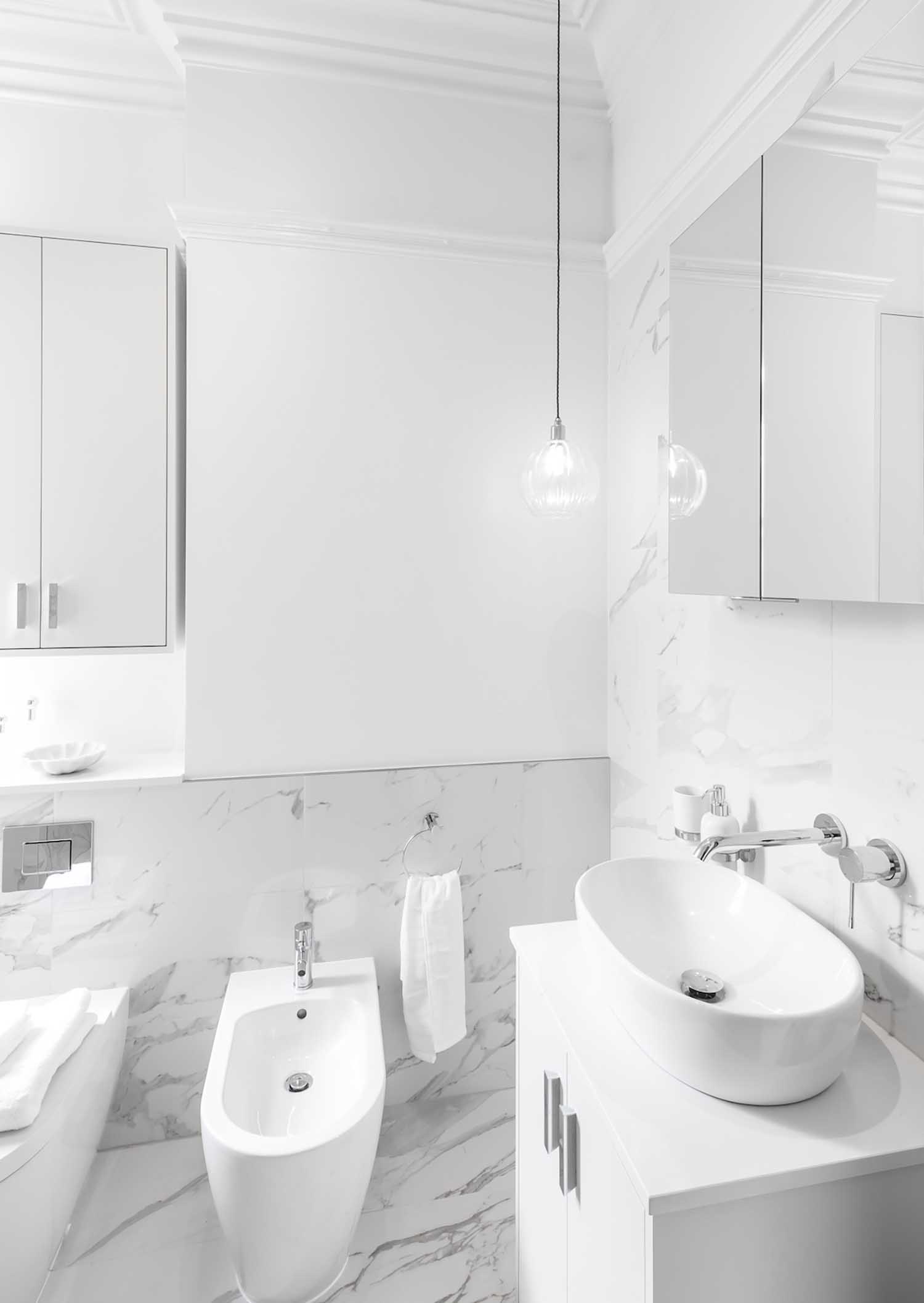
Despite its small size, the family bathroom had unusually high ceilings and a window, bringing natural light into the space. To make the area feel as large and bright as possible, a clean, light palette of soft whites and carrera marble effect porcelain tiles was used.
To give character to this little space, new ceiling coving and picture rails were specified to match characteristics seen elsewhere in the building. This served to provide a period sense to the whole and emphasize the room’s height, while also adding texture and visual interest.
A bespoke white lacquered cabinet over the WC, a mirror cabinet above the basin, and the vanity unit itself provided ample storage.
Guest Bedroom
The clients’ inherited classical bow-fronted brightly colored wood chest of drawers served as the inspiration for this room. A classical gold gilt mirror above and a wall of panelled lacquer wardrobes along one wall emphasized this. The blue linen upholstered bed and the contemporary styled foxed mirror bedside table made this room feel warm and friendly.
Lighting Design
Because the ceilings were concrete, no recessed lighting could be placed. As a result, all ceiling light was given by a simple architectural track lighting system, which supported the feature lighting, which was included through pendants and joinery lighting.
Find more projects LLI Design: llidesign.co.uk


