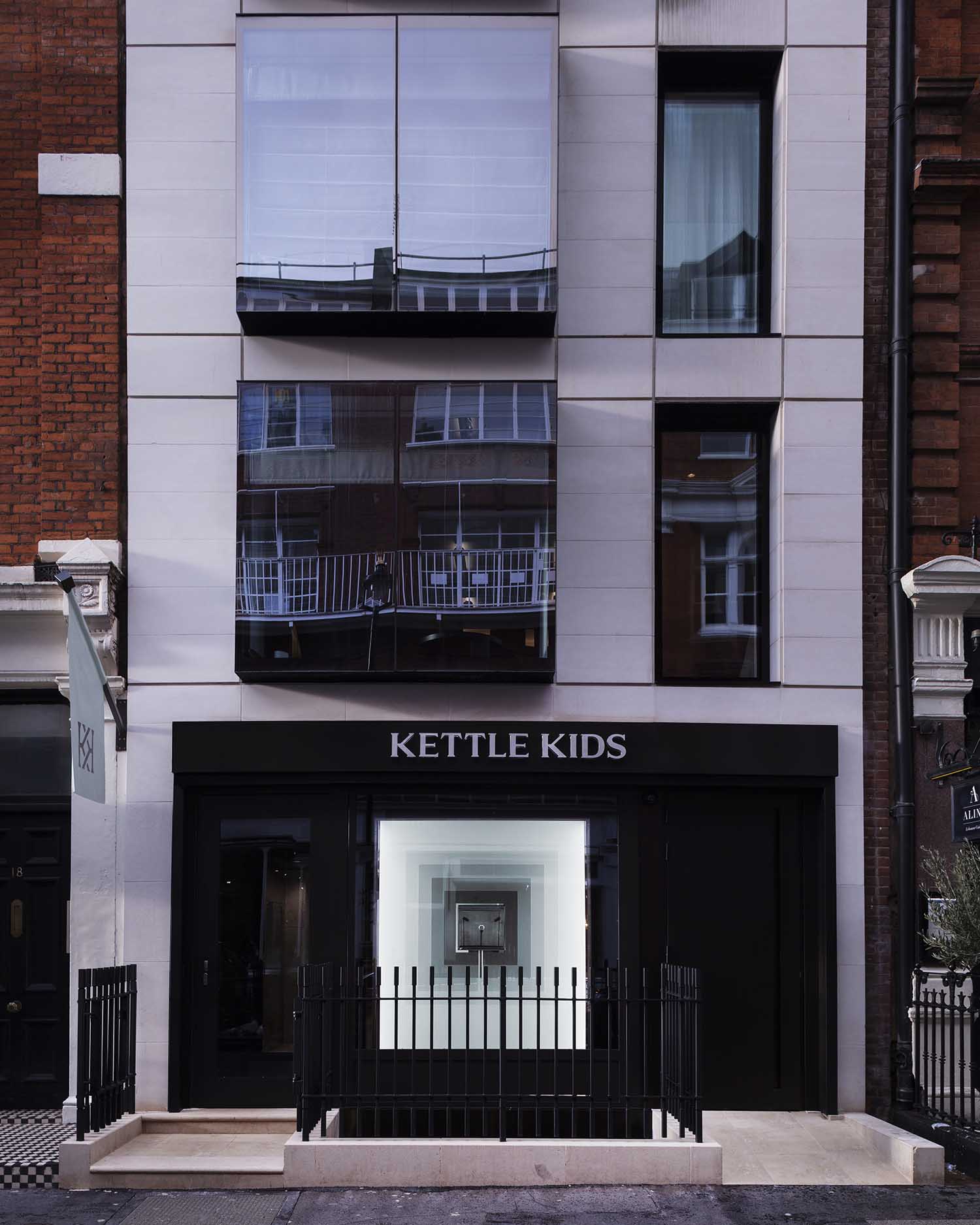
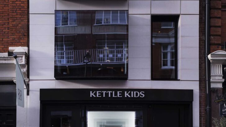
Architectural studio Hesselbrand has recently completed its latest project: The Kettle Kids on Maddox Street. The journey of The Kettle Kids founders Harvey and Jacob Hutson to Maddox Street and how they made their goals come true by developing an astonishing new method for exhibiting, viewing, and interacting with some of the finest watches and jewelry in the world is a fascinating one.
The Kettle Kids on Maddox Street is the result of a real partnership with Hesselbrand. It is a place that, as seen through the eccentric design lens of architectural studio Hesselbrand, highlights Harvey and Jacob’s dynamism and ambition at every touch point, going beyond the bounds of what a traditional watch and jewelry brand can be. Right when you walk in, every last detail has been taken into account. Even the store’s name, “Kettle,” a cockney slang term for “watch,” sheds light on its remarkable history and contents.
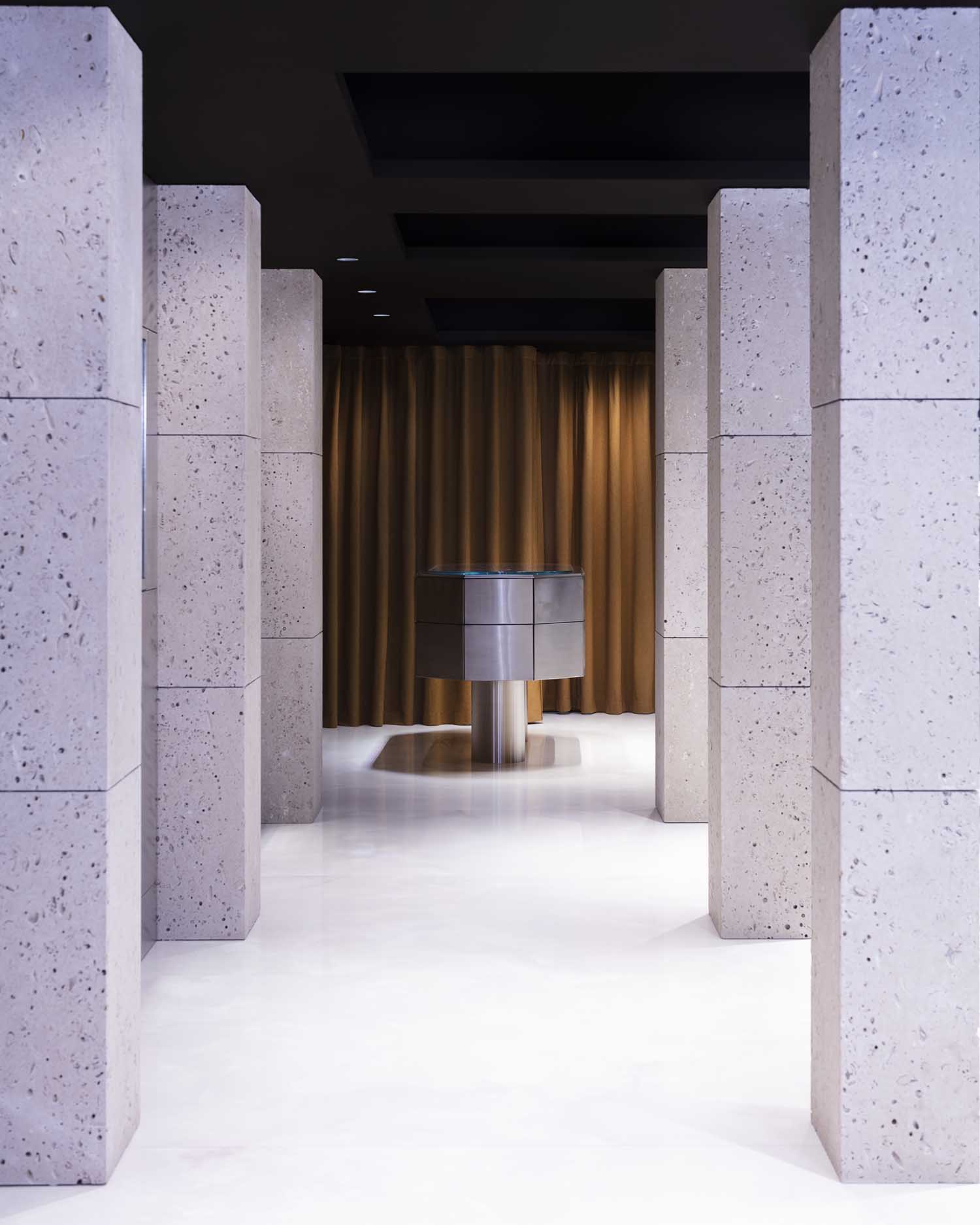
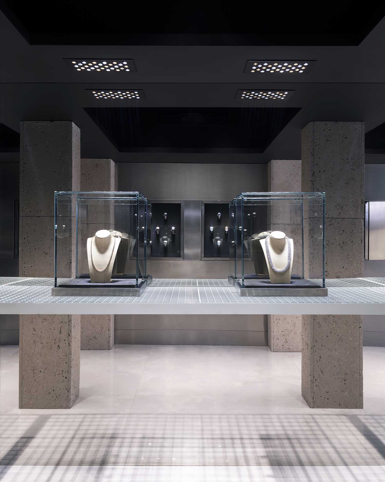
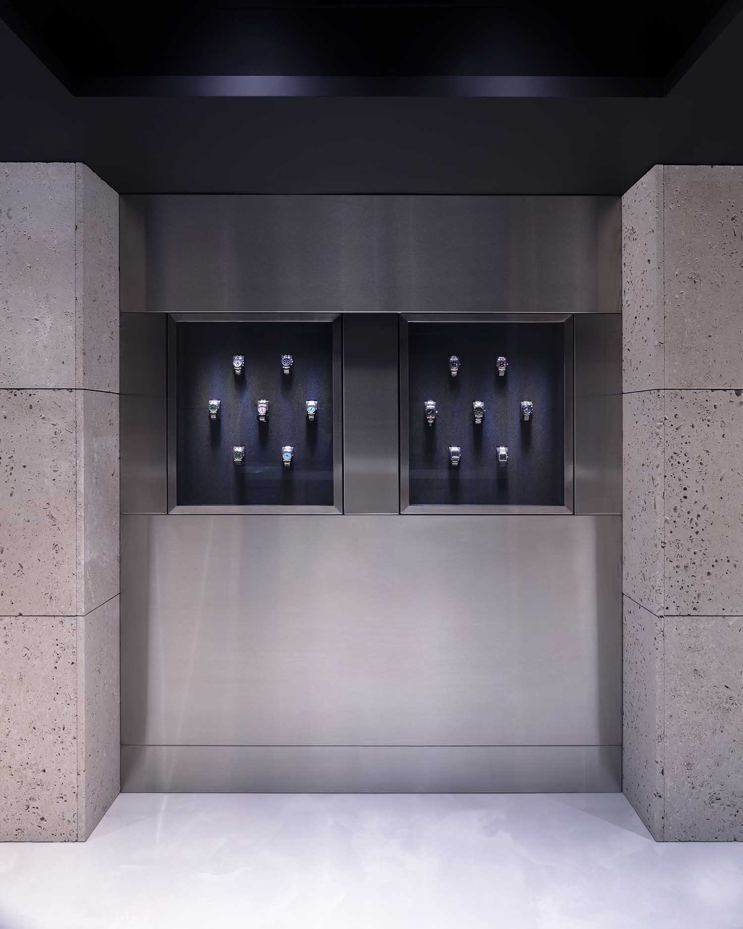
We spoke with two of Hesselbrand’s founders, Magnus Casselbrant and Jesper Henriksson, about their design influences, the inspiration behind the project, the biggest challenges in the design process, the importance of lighting in interiors, material palette and the project’s main design features.
How would you describe your architectural style?
Through our work we are pursuing a new style. Our aim is to create architecture that reflects contemporary life while also being based on classical principles and proportions. We are passionate about how space performs, what it allows the user to do and feel. This drives our style too.
What inspires and influences your designs?
We are very much inspired by early modernism and classical architecture. To us, there is a clear, unbroken trajectory between the two, and in many ways our architecture sits at the very front of this path. In each project, we try to ask the right questions to define what is at stake in the project and how architecture and design push that particular case. We don’t apply a blanket solution, each project is very individual. At Hesselbrand we have developed our own design language and particular process, which allows us to be specific to each project yet work coherently across different scales.
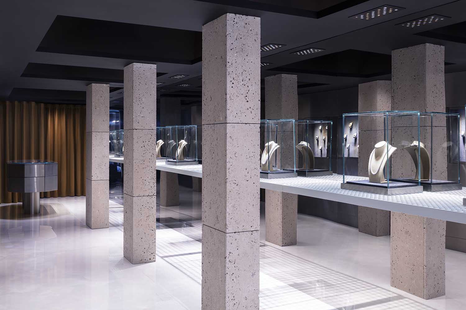
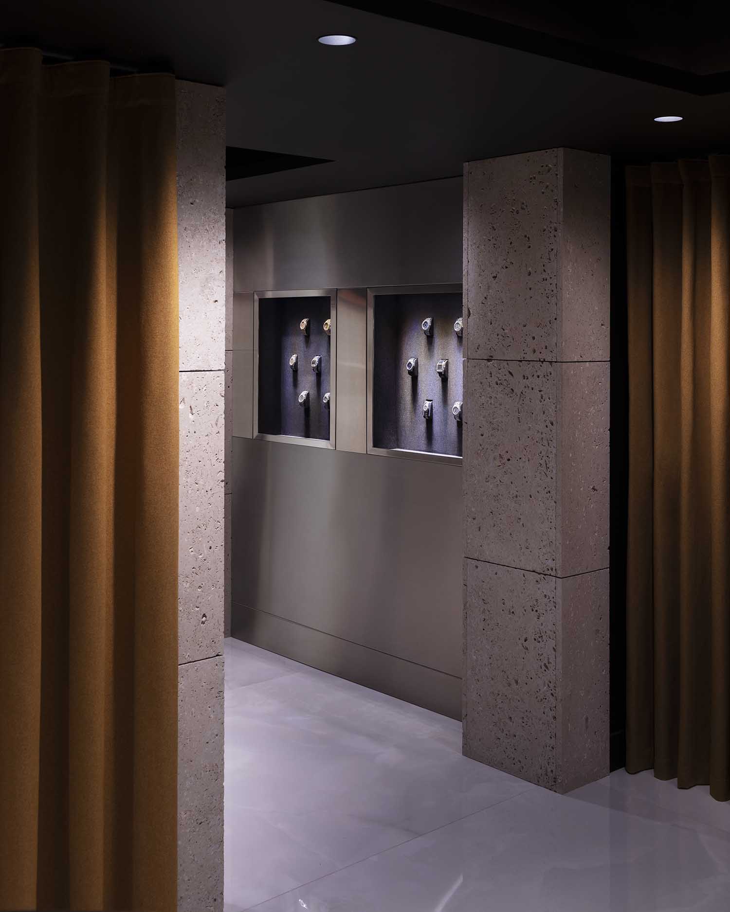
Could you briefly introduce the concept behind The Kettle Kids on Maddox Street project?
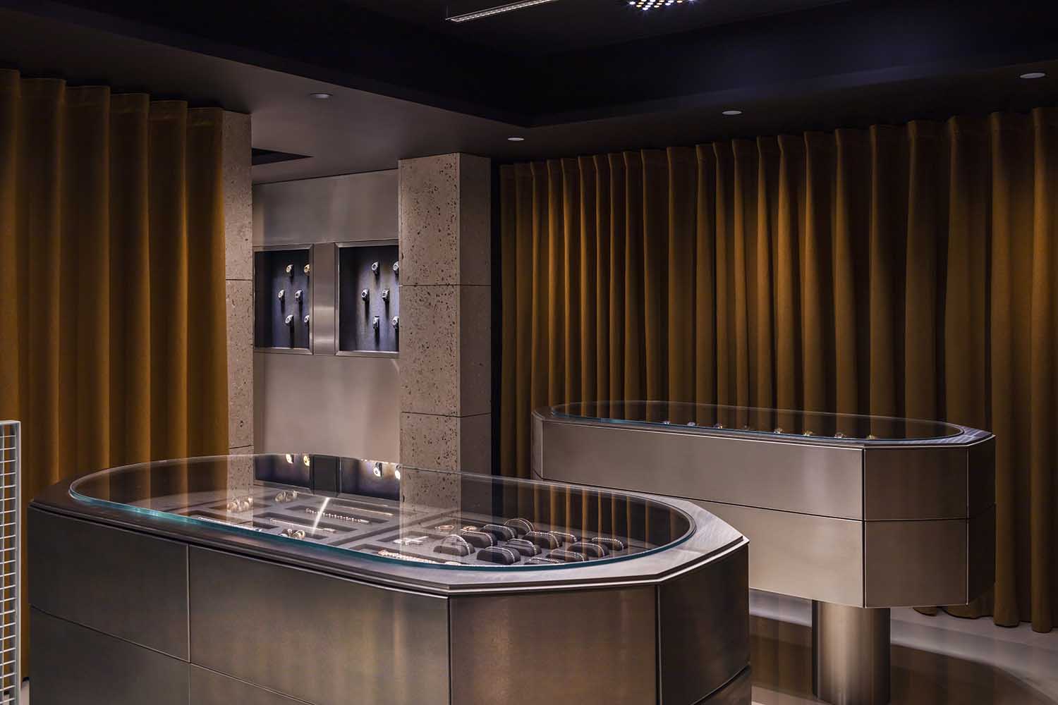
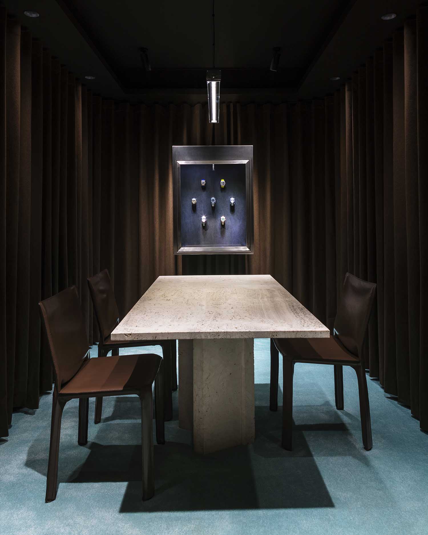
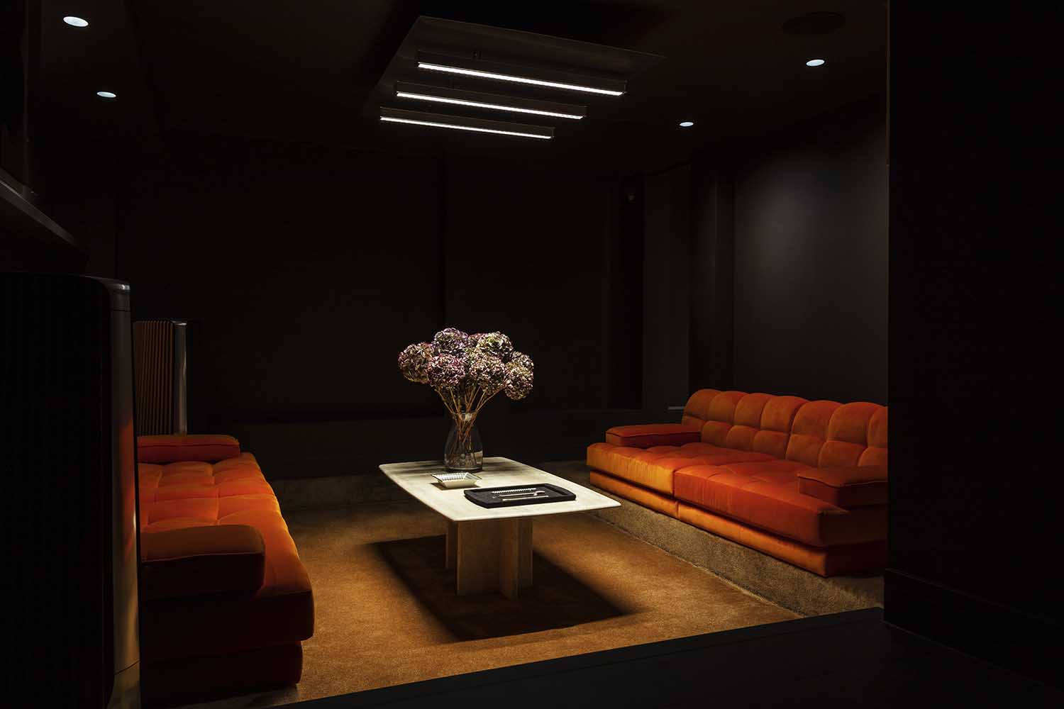
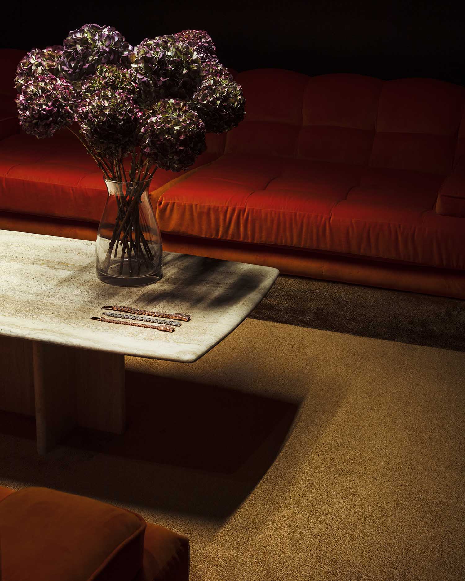
Like any Hesselbrand project, the concept reveals itself after a while of working closely with our client and the specific context. In this particular case this meant creating a space that conceptually works as a set in a movie, with a range of different atmospheres for different interactions to play out. The space is conceived as a sequence of rooms, which go from a bright and open, gallery-like atmosphere with very few items on display, through to a viewing room which feels very social and intimate, and further down to the basement where a dark, velvet clad lounge seems to be far removed from a traditional retail space and more focused on entertaining.
What was the brief for the project, and what did you set out to achieve with your design?
The purpose of the project was to create a new Spatial Identity for Kettle Kids, which would give the brand a complete vocabulary for how to represent itself within a space, whether it be a flagship store like this one on Maddox Street, or a pop up in Miami. The flagship store is only a first iteration of this spatial identity which will manifest itself across all spaces related to the brand. The spatial identity was developed to reflect the brand and the culture of their customers.
How much freedom were you given to create your design?
There were some practical constraints as with all projects but these are essential for a good design. We often experience that a clear definition of the rules is actually what will set you free as a designer. The Kettle Kids were very open to our interpretation of their business, and trusted us with the design from the very beginning. It has been and continues to be a very productive collaboration.
How did you shape the space in regards to materials, layout, forms?
In this project as in so many of our projects, we tend to define atmospheres and moods rather than functions. These spatial definitions force us to ask more challenging questions in regards to what form and material to use. For example, the store begins as a public gallery, it is bright and expansive. We use materials that can usually be found on the exterior of a building, such as metal, stone and glass. As you progress into the store, there is a shift in atmosphere, to a softer and warmer space, which is reflected with fabric, leather and carpets.
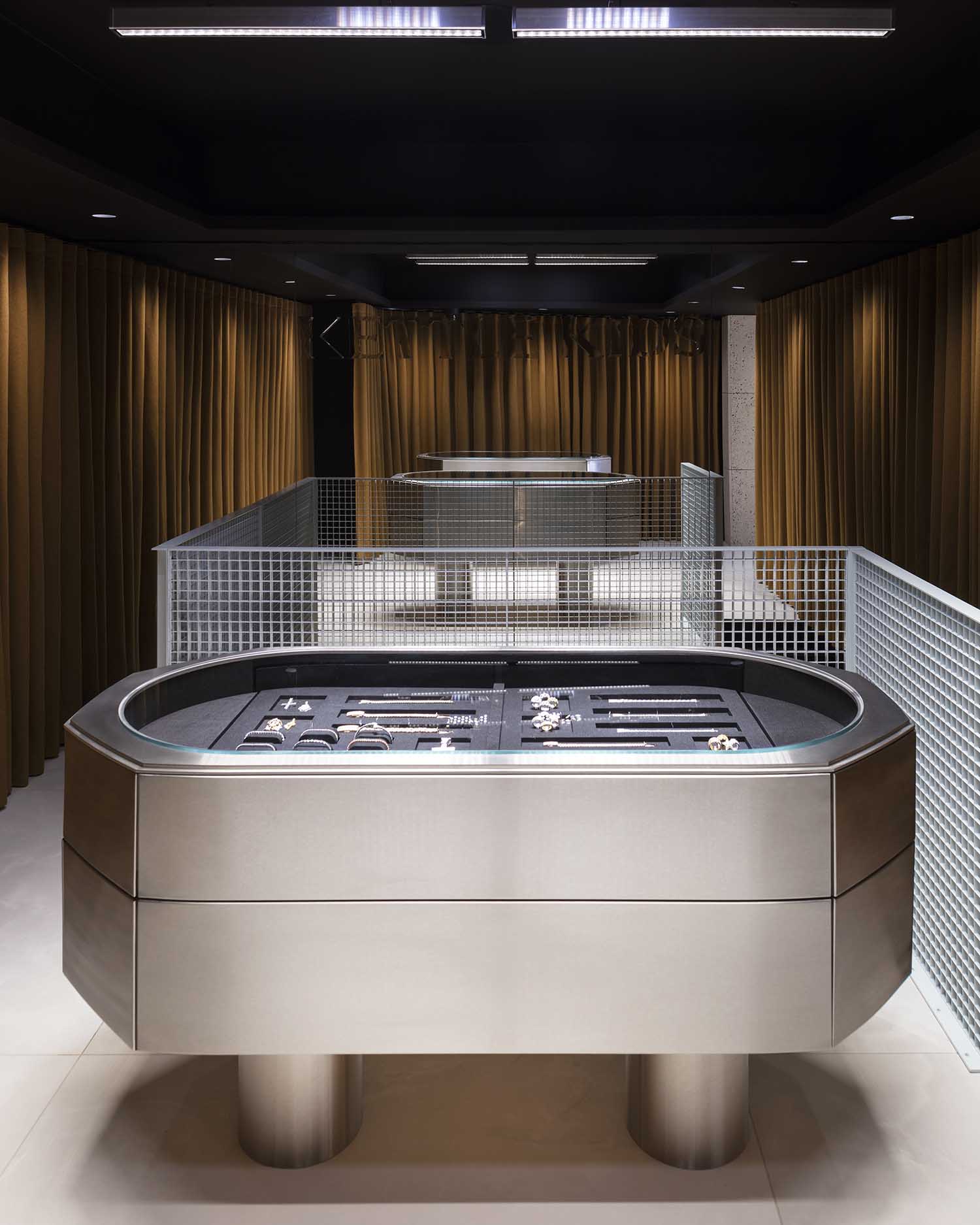
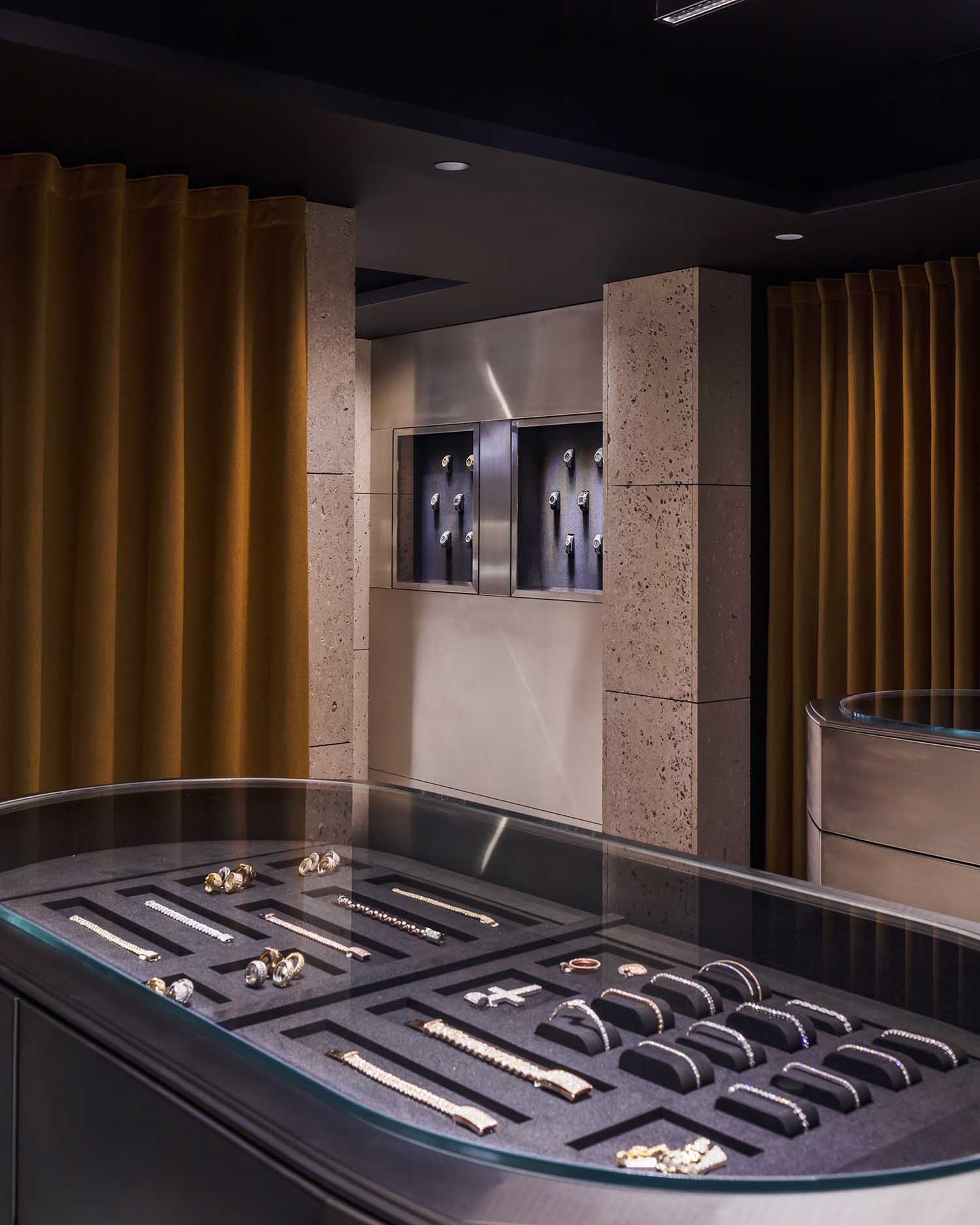
The space attracts the customers by an interesting combination of textures and materials. Could you tell us more about the finishing details and the intention behind it?
The store is a place for people as much as it is a place for product display. There is a lot of conversation taking place here unlike many other shops, and the materials and texture responds to that. The harder spaces are less social and the softer spaces are more intimate to allow for personal and private conversations. There are many different tiers of privacy built into the store, almost like a Russian doll.
Could you tell us more about the lighting used in the interior?
The lighting design is a complex system designed to look deliberately simple. To illuminate multifaceted surfaces you need a combination of white and yellow lights from various angles to get the most out of it. Depending on what is on display you can fine tune the light to be perfect in that space. It is the opposite of a generic gallery light set up.
After we designed the British pavilion at the Venice Biennale we decided to work a lot more with artificial light in our designs. We felt that as a profession, architects have in general very limited knowledge about artificial lighting. We tend to focus mainly on natural light despite the fact that artificial light has been one of the areas that has seen the biggest innovation within the building industry in recent years.
DISCOVER MORE INTERVIEWS ON ARCHISCENE
What was the most challenging part of the design process?
Walking the thin line between tradition and contemporary culture is a challenge, but doing it right is what produced the unique character of the Kettle Kids spatial identity. It sits right in between disruptive and respectful, youthful and traditional, rough and refined.
What kind of impression do you want to leave on the visitors?
Our goal is to make each visitor feel inspired and welcome. We want people to experience a physical representation of the community that surrounds the watches and jewellery world. To achieve this, our design breaks down the boundaries that are usually present in this kind of retail space. Essentially, by making the store feel like a public gallery and a watch collector’s living room at the same time, the visitor is left with a feeling of inclusivity while browsing through exclusive products.
Looking back at the whole experience, what was your favourite part of the project?
As in most of our projects, while we propose our designs we are also learning. At Hesselbrand we always design very specifically around the project and client, so all of our designers immerse themselves in the world of the client while working on the project. It’s an extremely exciting and rewarding process, and ultimately also the basis for a creative and successful project.
What’s your most memorable interior design project?
We designed a hotel and art foundation in Tuscany a few years ago, called Villa Lena. It’s a very special project to us, as we were designing not only for hotel guests, but also for artists in residence. This meant creating interiors with rustic and inspiring atmospheres – typical for Tuscany – and merging them with contemporary design and expectations of hotel guests. The result was a truly unique project which has a very strong identity, and has become a favourite destination for the creative communities of cities across Europe. It’s a place where unexpected meetings happen, and new friendships are formed, very much thanks to the way the interiors were designed.
What do you feel are the greatest challenges for today’s architects?
Not to get caught up in fast moving trends. Architecture always has to be considered in the long term role it plays in our lives. It is not an instant snapshot – it is the backdrop to our lives, and ultimately also a manifestation of our culture and era. Good architecture stands the test of time, something that easily gets forgotten. Architecture is also not a perfect concept, it is part of life, with its unpredictability and imperfections. With today’s obsession of reference images and quickly consumed information, the challenge is to stick to our cause, and not be persuaded to create spaces that pleases the user only for a moment.
What is next for Hesselbrand? Could you give us a sneak preview of your upcoming projects?
We are currently working on a beautiful house in the south of France, set in a parklike garden with a view of the riviera and alps in the background. We will restore the original 18th century villa, and extend it on three sides with typical Hesselbrand-style rooms, which are both classical and contemporary in their expression. The project will be an amazing demonstration of how to live together and apart in a house that will be used for hosting events and guests, while also being the home of a family with young children. The project also features a new aesthetic that we have developed as a fresh take on Mediterranean holidays for the next generation.
Discover more interesting projects by Hesselbrand: www.hesselbrand.com


