Living in Mumbai, India it is impossible to ignore the informal settlements in the city, and if looked at closely there are many lessons to be learnt in frugality, adaptability, multi-tasking, resourcefulness and ingenuity. A visual language emerges that is of the found object, ad-hoc, eclectic, patched and collaged. An attempt has been made here to apply some of these lessons without romanticizing or fetishizing them. The project looks at the idea of recycling and collage in several ways, from the very physical – like materials, energy, etc. to the intangible – like history, space and memories.
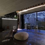
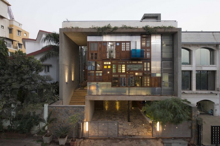
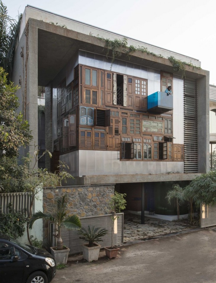
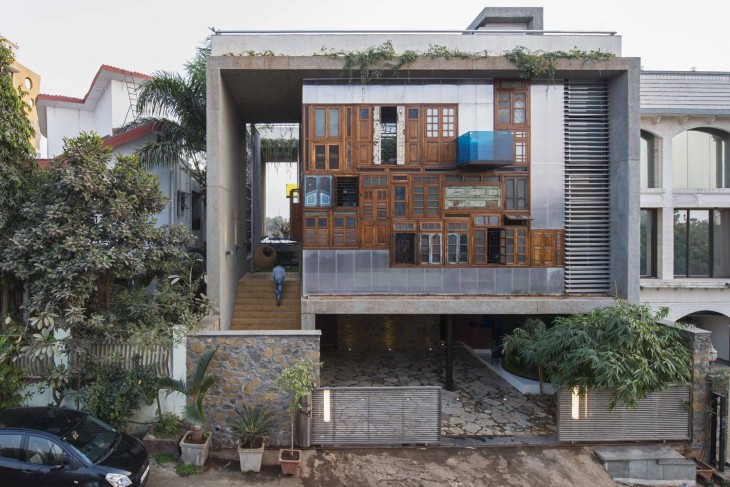
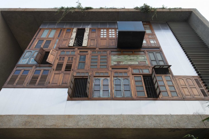
The front façade sets the tone for what lies within, with a “corner of windows” that recycles old windows and doors of demolished houses in the city. This becomes a major backdrop for the living room with a exposed concrete faceted ceiling above countered by the polished white marble with intricate brass inlay on the floor. Metal pipe leftovers pieced together like bamboo form a “pipe wall” integrating structural columns, rainwater downtake pipes and a sculpture of spouts that in the monsoon are a delight for all the senses.
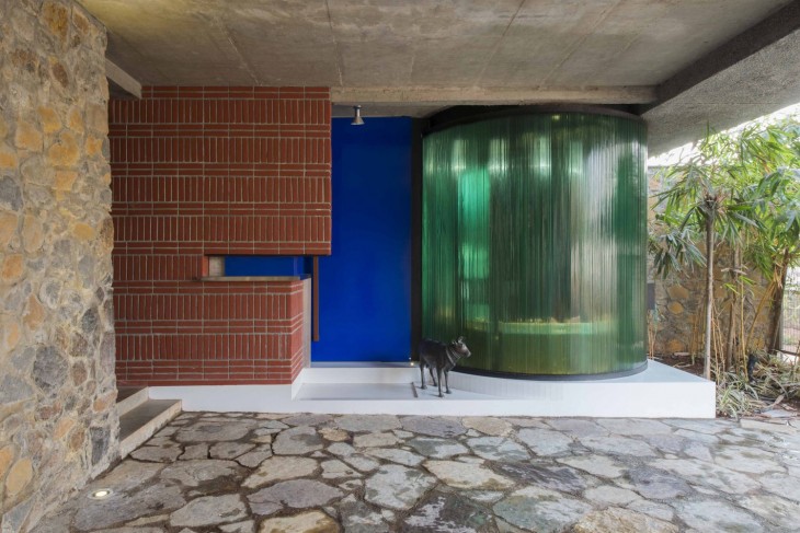
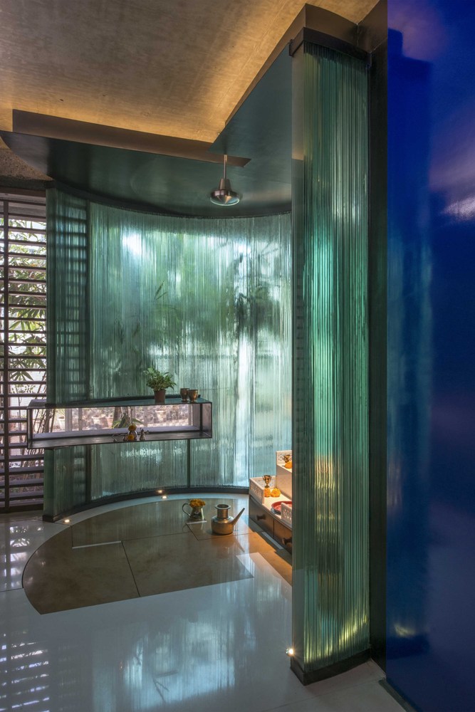
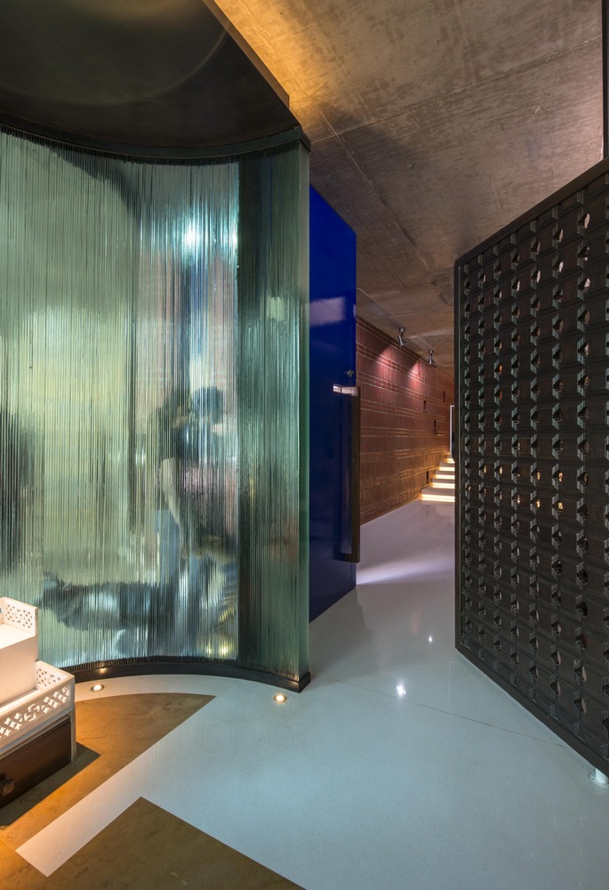
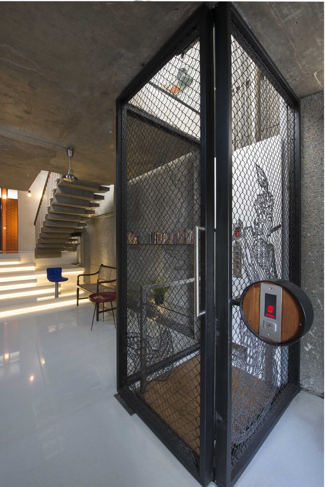
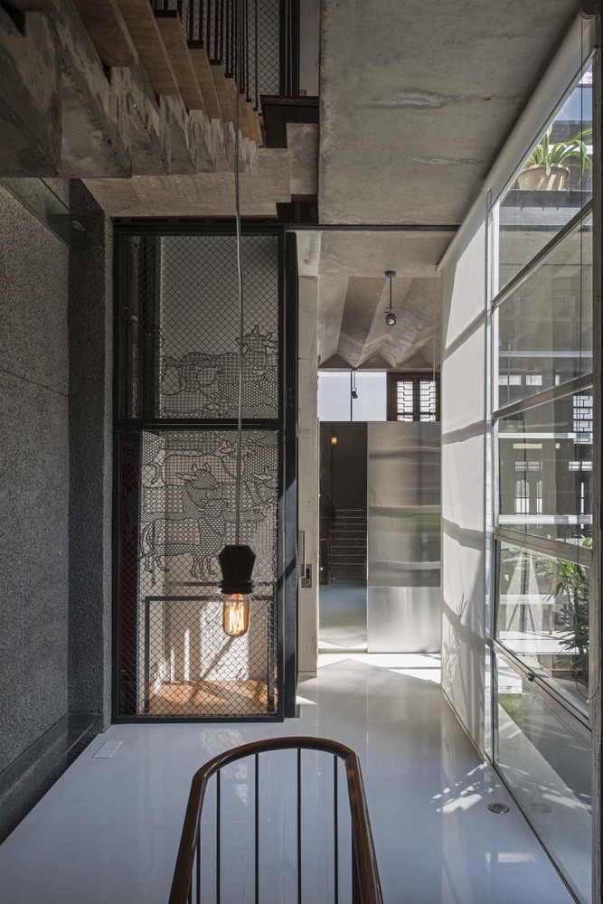
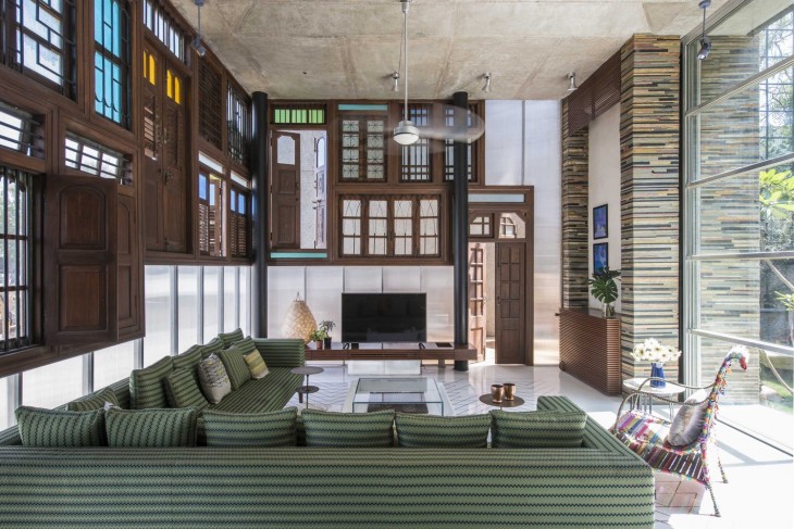
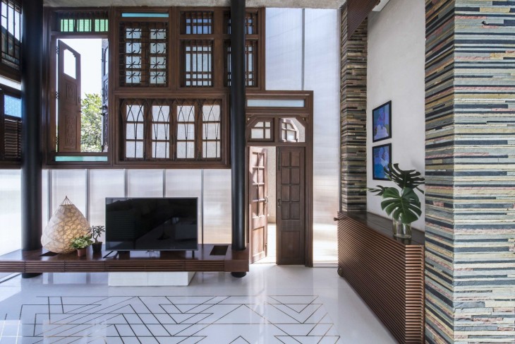
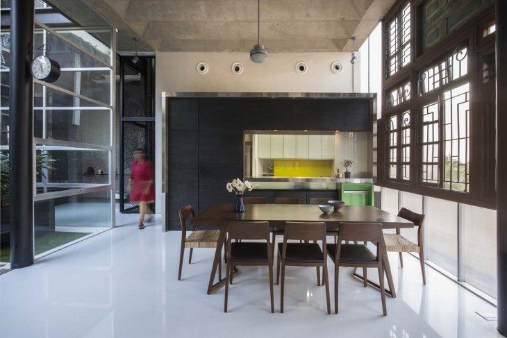
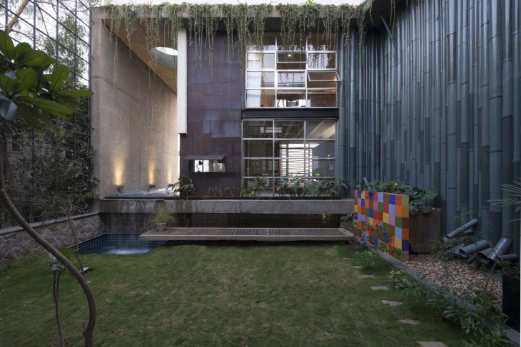
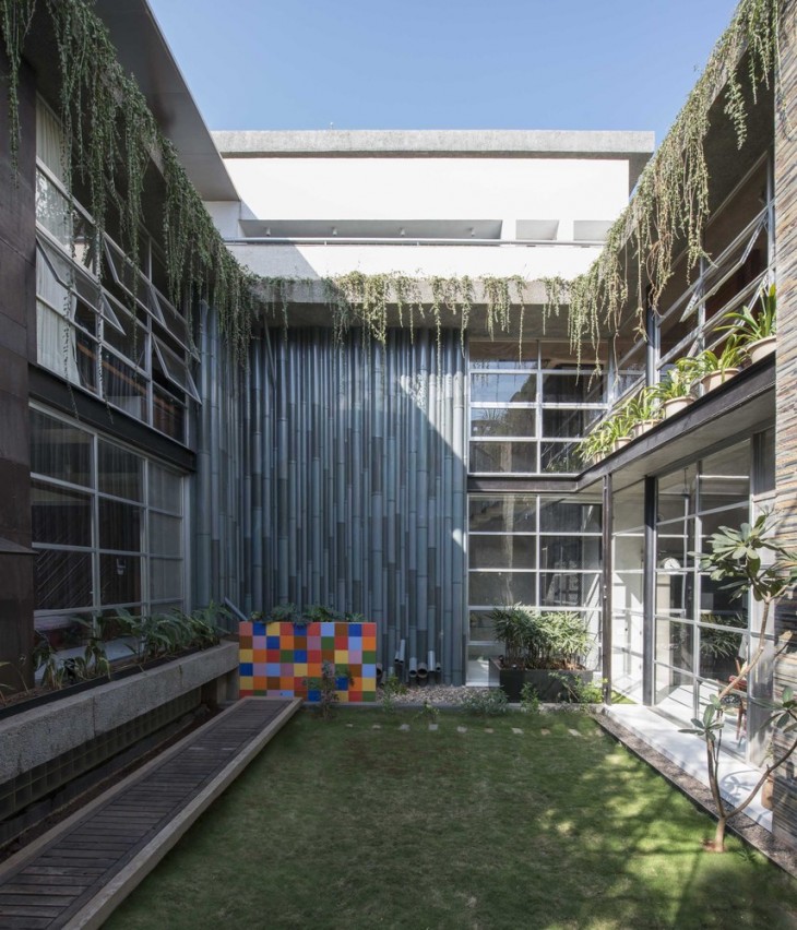
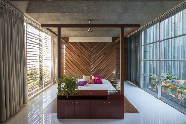
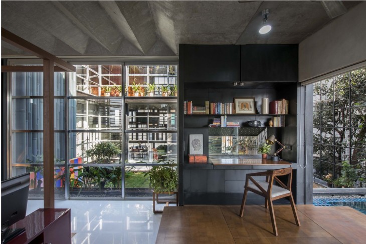
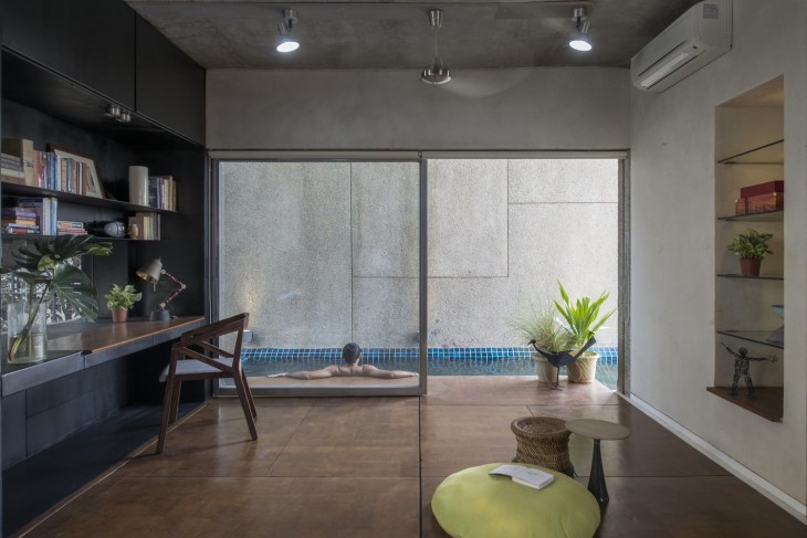
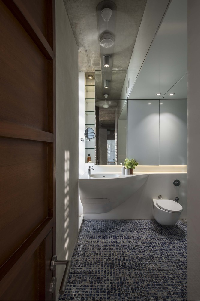
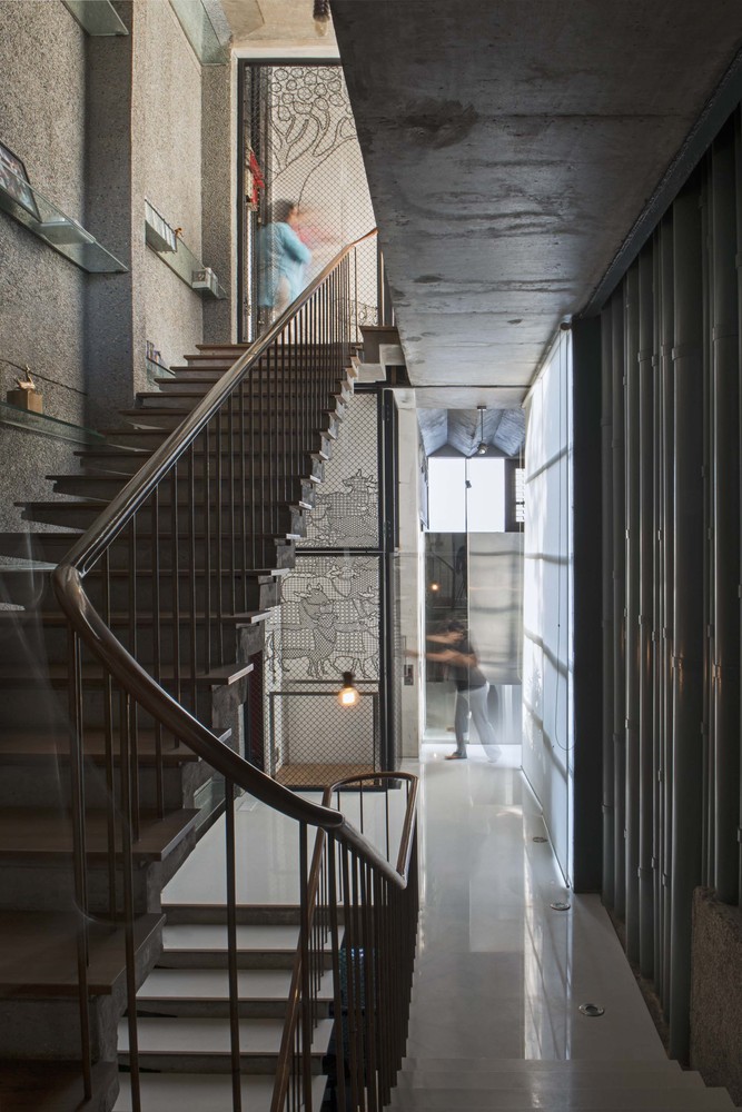
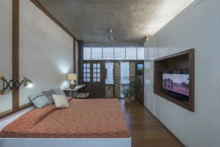
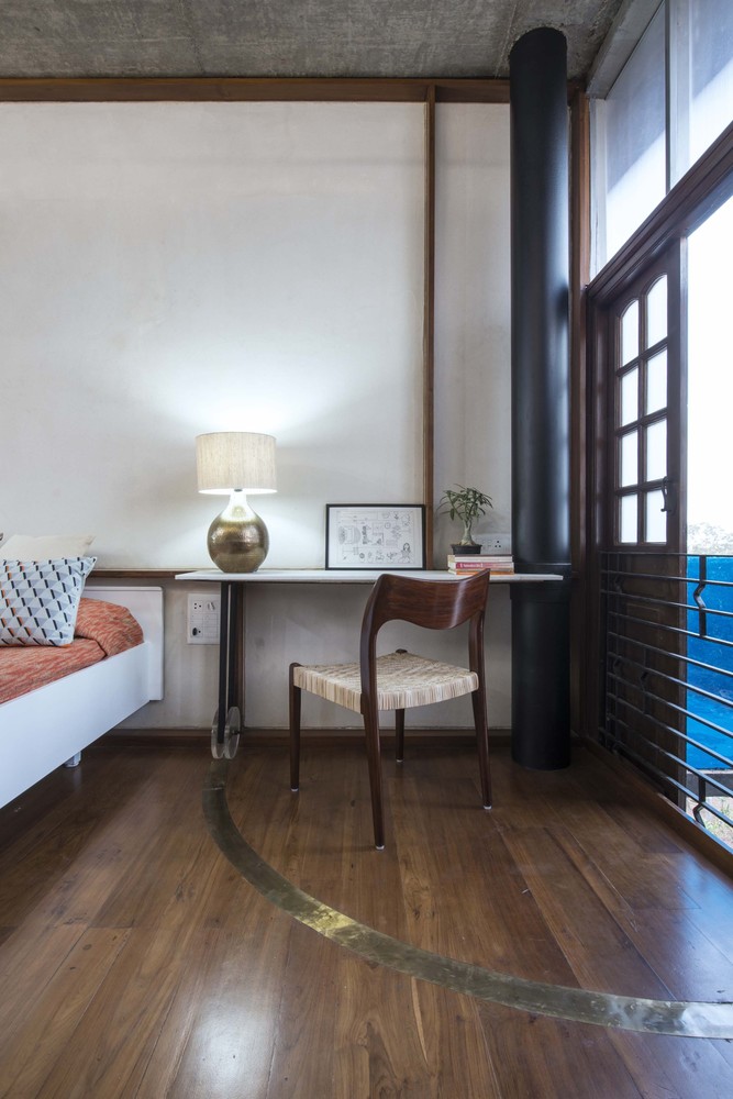
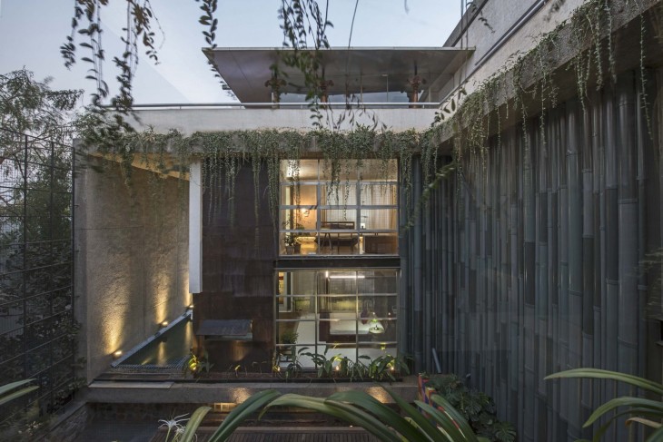
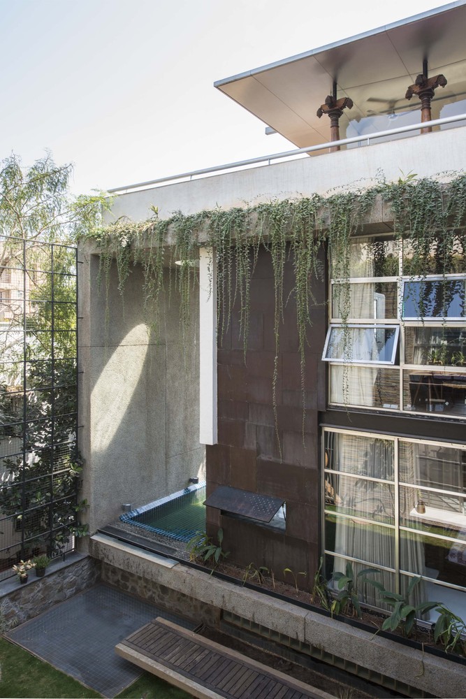
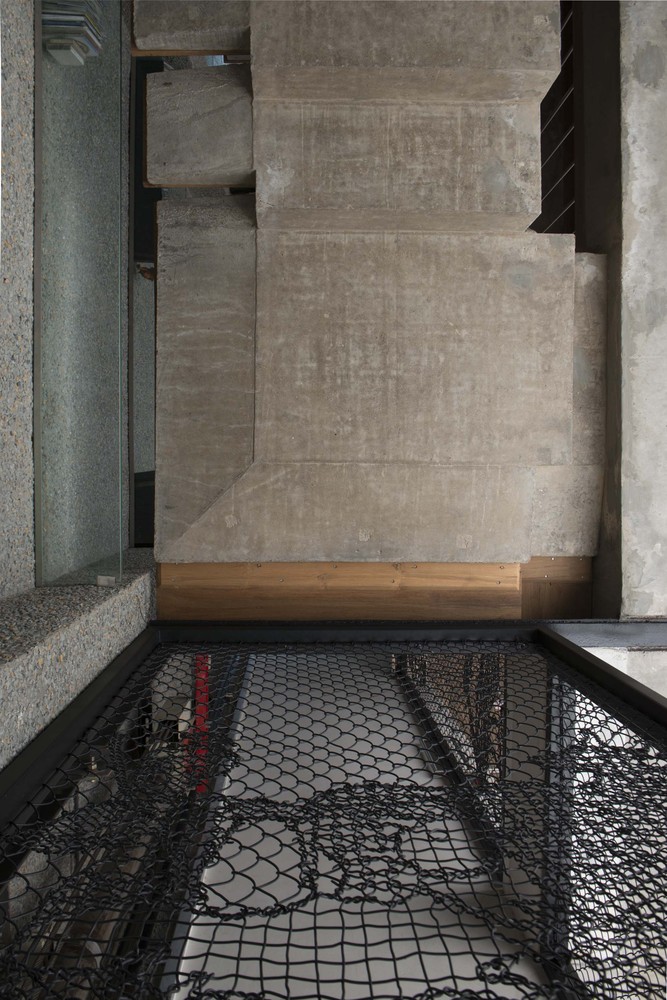
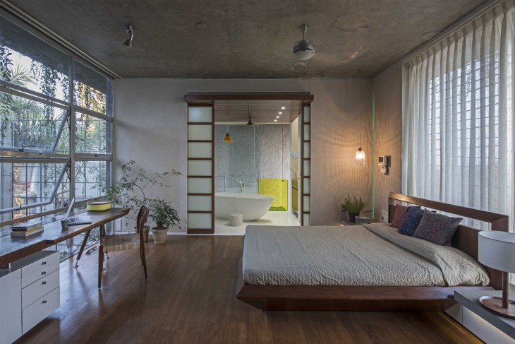
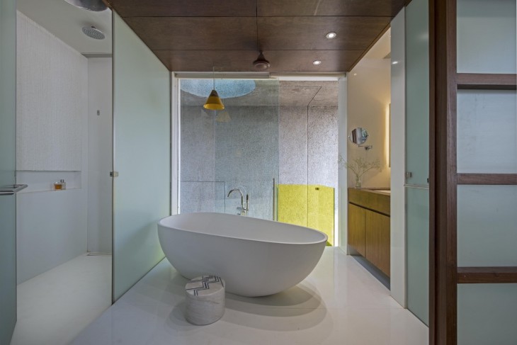
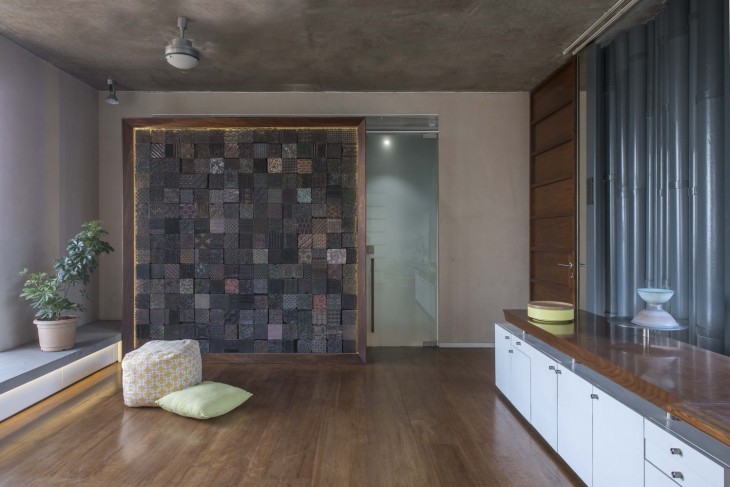
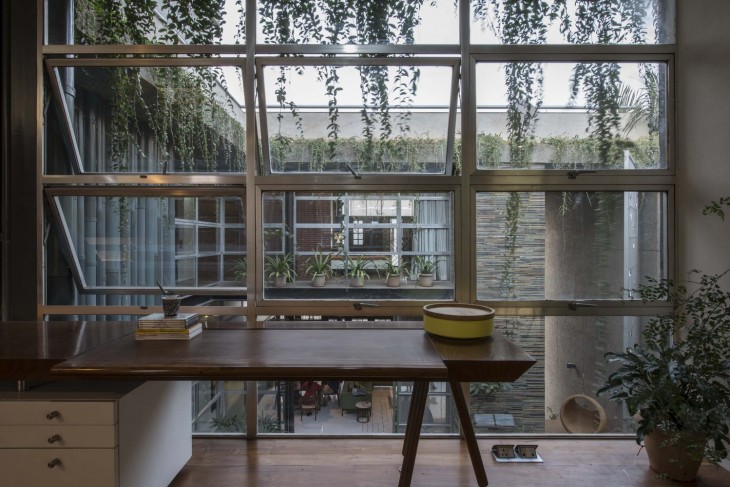
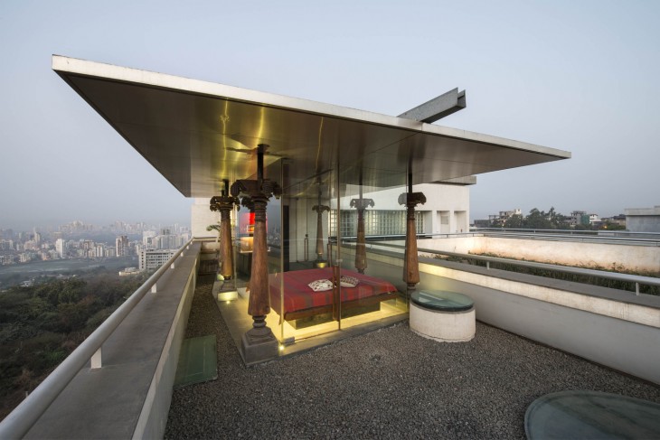
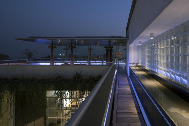
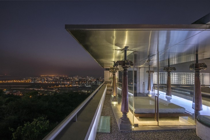
In the central courtyard on one side scrap rusted metal plates are riveted together, Kitsch colored tile samples retain a planter in the middle and on the third side is a wall clad in cut-waste stone slivers lifted off the back of stone cutting yards and waste generated on site. Hundred-year-old columns from a dismantled house bring back memories, and nostalgia is nourished with a lightweight, steel and glass pavilion (with solar panels above) on the terrace level overlooking fabulous views down the hillside. This approach is reinforced again in the interior materials and elements. It plays up this contrast between the old and the new, the traditional and the contemporary, the rough and the finished. One finds use of recycled materials like old textile blocks, Flooring out of old Burma teak rafters and purlins, colonial furniture, fabric waste (chindi) along with new ways of using traditional elements and materials like carved wooden mouldings, beveled mirrors, heritage cement tiles, etc.
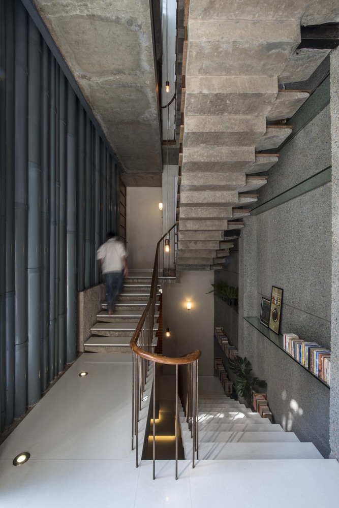
A language emerges that is both new but strangely familiar at the same time and that makes us rethink notions of beauty that we take for granted around us. To make this mélange more “acceptable”, it is encased in a “garb of modernity” (Nehru). This concrete frame – in a rough aggregate finish outside and in a smooth form finish inside – wraps and connects all the spaces from back to front and across all three levels.
To build on top of a hill is always exciting, until the architects discovered here that they were surrounded by neighbours on all sides. This led early on in the design process to look inwards and build around the quintessential Indian courtyard, albeit slightly modified. The court is actually raised a floor above the ground level and hidden below is a large rainwater harvesting tank wrapped with rock that was removed from the hillside during excavation. It is the core around which this large four-generation family is organized and comes together.
Photography by Sebastian Zachariah, Ira Gosalia, Photographix Pinkish Shah


