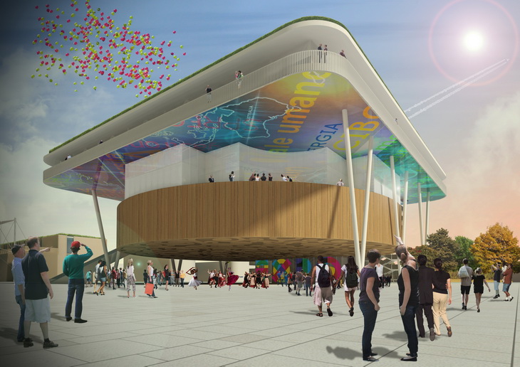
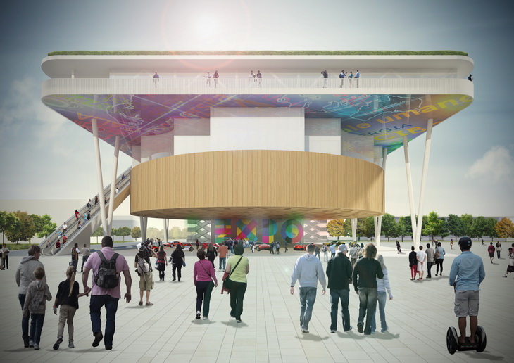
Andrea Maffei Architects share with us their splendid design for the Italian Pavillion EXPO 2015 to be held in Milan, Italy.
Text – Italian Pavilion Expo 2015
The competition rules required to design five buildings aligned along the Cardo that characterizes the entire masterplan EXPO 2015 until a large circular water lake.
They consist in four two-storey linear buildings that contain various exhibition spaces, market and restaurant and the Italian Pavilion itself.
This had to be develop in a square area of ??57.5 meters side and a maximum height of 25 meters.
The Palace was supposed to represent a symbolic message of representation of the beautiful country and we wanted to develop it according to the following concepts.
Decomposition and Overlaying
The theme of the Italian Palace hid the great difficulty of synthesizing the richness and complexity of the culture of a country in a single building.
To this end, it seemed interesting to use the concept of the decomposition of the building in a series of architectural themes.
At the same time it was interesting to propose the architecture as an overlay of the same themes together to resume the complexity of layers of urban complex and buildings of our cities.
As a nation is divided into an infinite number of topics and cultures, so the Palace could be released from the bond of a unique morphology, or shape of a single default, and be broken down into a series of sub-themes that represent the architectural richness of its various cultures.
The overlap of these architectural themes symbolizes the complexity of a nation and the historical process of overlapping cultures and different ideas that characterizes the wealth of our country. This overlap could be implemented in different architectural forms with different colors, materials, and we chose to those described below.
The Tree
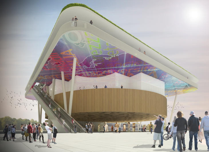
The theme of the entire Italian palace is to create a metaphor for the theme of the Tree through a structure that creates a large main cover to which they hang all the volumes of the palace.
Two rows of steel columns in V on the sides represent the branches of the Tree structure growing from the bottom upwards to reach the fourth floor of the new intervention. The foliage of the Tree metaphorically translates into a large steel truss structure, consisting of beams that connect the pillars V, whose nodes descend from the tie rods that support the floors and all the facilities of suspended floors of the Palazzo Italy.
Trees in nature is expanding with a large crown to cover natural green space below and to protect from sun and rain. Since ancient trees have represented the first gathering places and meeting under a cover already developed spontaneously in nature.
Similarly, the palace spreads upward into a large canopy that covers the other structural conceptual themes of the palace: the squares and the exhibition spaces.
The Square Below (Piazza Bassa)
The square is one of the themes that characterizes all Italian cities and the way of life and to join Italian citizens.
Starting from ancient Greece Mediterranean cities have always developed in a centric radio from a central square where they were the centers of political and religious power.
In other cultures, such as Asian or American, the theme of the square was not so important in the design of the city and its development, based instead spent on road grids or lines of linear and non-radiocentric.
In Italy the theme of the central square with the Cathedral and the Palace of the Lord local have always been at the heart of development and still remain the focus of concentration of the citizens.
In Italian cities the major events of communication and entertainment events are held in the central square which remains the focus of attention and social life. Just think about Piazza Duomo in Milan or in Piazza della Signoria in Florence.
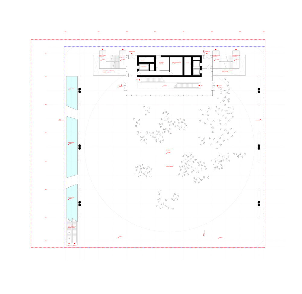
For this reason we thought it was interesting to go beyond the concept of a building intended as a simple closed building and open it to turn it into a "square" in which everyone could be living together for the Expo theme.
For this purpose we first designed a large square covered by a roof 57.5 meters wide that covers the entire project area and allows you to use it in case of bad weather.
The cover protects from the sun in summer and in winter from the elements and allows the constant availability of a public space by citizens.
The square can get events of various kinds, from concerts, events, conferences, exhibitions, fairs and anything else in all seasons of the year.
The square does not have a single point of entry but can be accessed by 360 ° around the perimeter without directional pre-established hierarchies.
The main access will be mainly from the Cardo and the Piazza d'Acqua, but also on the other sides you can access it without any barrier in a fluid continuity with urban spaces Expo.
References to Leonardo Da Vinci
In the choice of the forms of the Palace Italy we wanted to concentrate on two geometric shapes: the square and the circle.
This choice belongs from a desire to bring the famous drawing by Leonardo Da Vinci's "Vitruvian Man" in 1490 in which it was expressed the centrality of the Renaissance man as a rediscovery of man "vir faber", or man at the center of the universe and creator of reality.
The drawing depicts a man inscribed in the square and the circle as the two absolute geometric shapes that define the whole of reality.
So in our design for the Italy Pavillion we wanted to take these two Renaissance forms to express a tribute to the Italian Renaissance and Italian Culture.
The Palace suspended
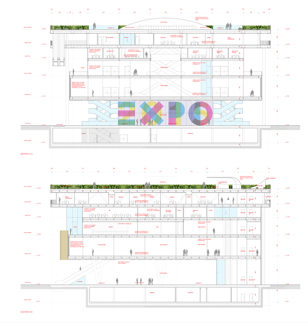
To get the square we have designed all the exhibition spaces and conference rooms hanging from the large roof, so as not to take anything in the ground floor and allow a large new urban space.
This was possible by making a large portal structural composed of three "V" steel external supporting a grid of trusses in the top floor. They in a series of rods according to a regular grid of 8.1 m and they hang all the floors of the building.
This solution is a unique never done before in the history of Expo International.
The Palace Italy for the first time is floating in the void and leaves the ground floor completely empty for many different uses.
The exhibition spaces
The exhibition spaces more efficient must be very flexible to adapt to any type of show and allow any type of construction. The form of the building should interfere as little as possible with this flexibility.
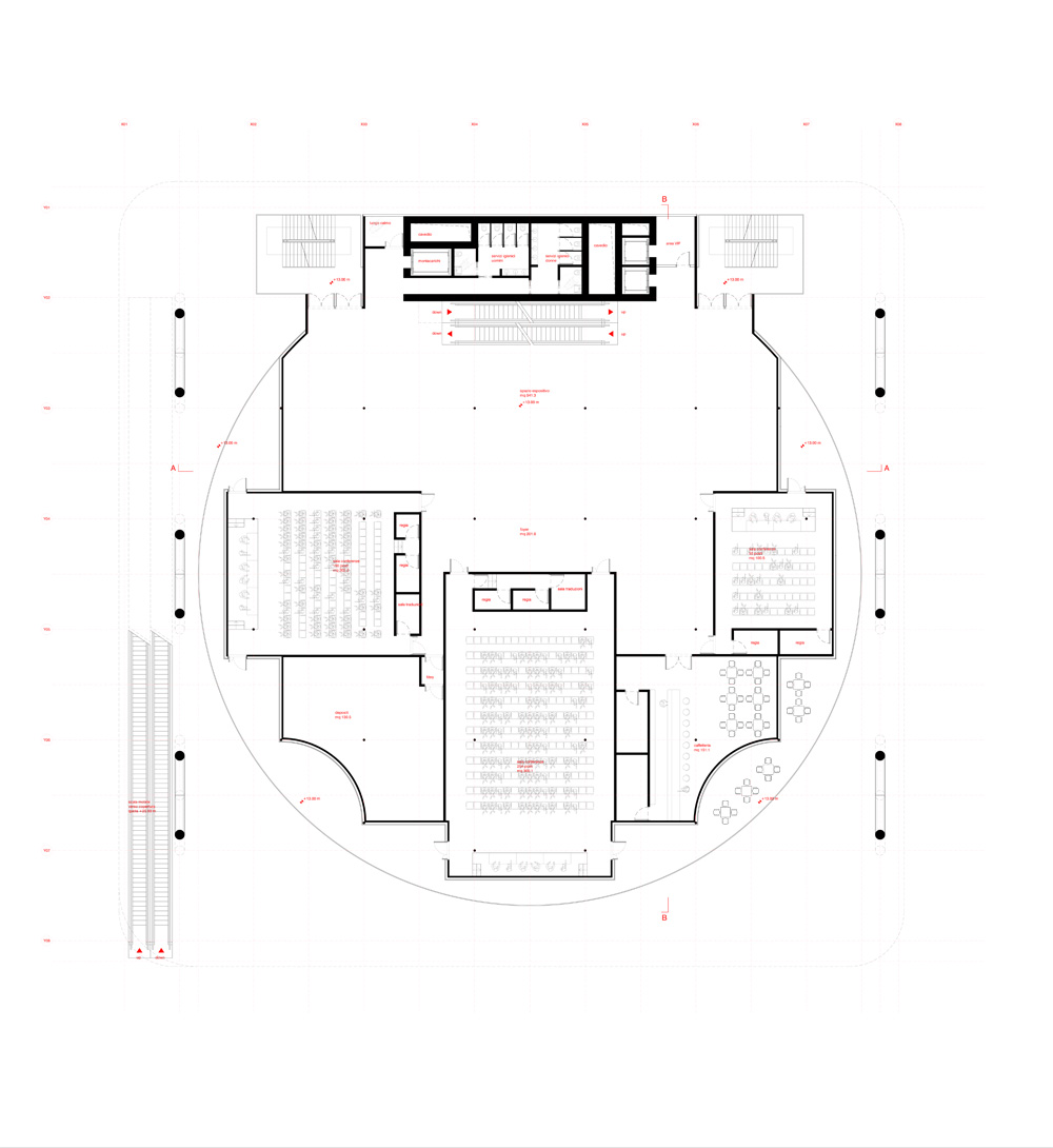
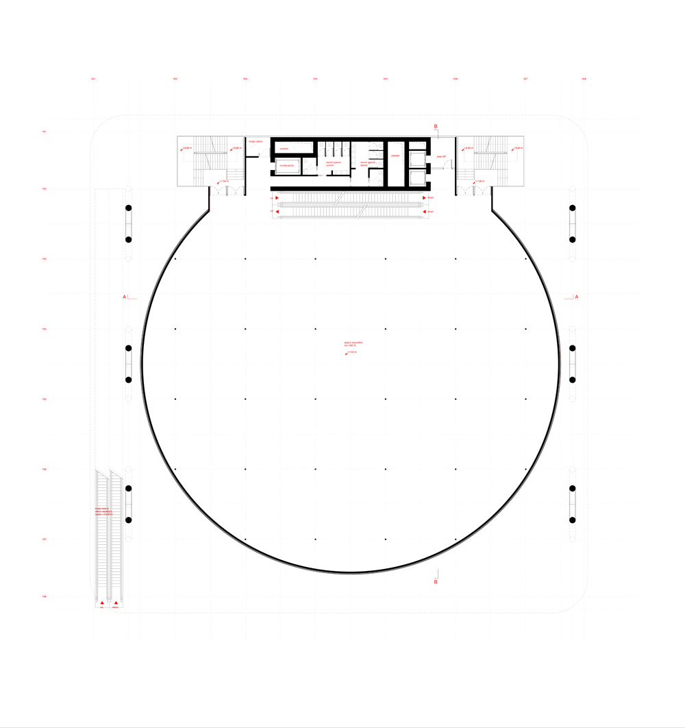
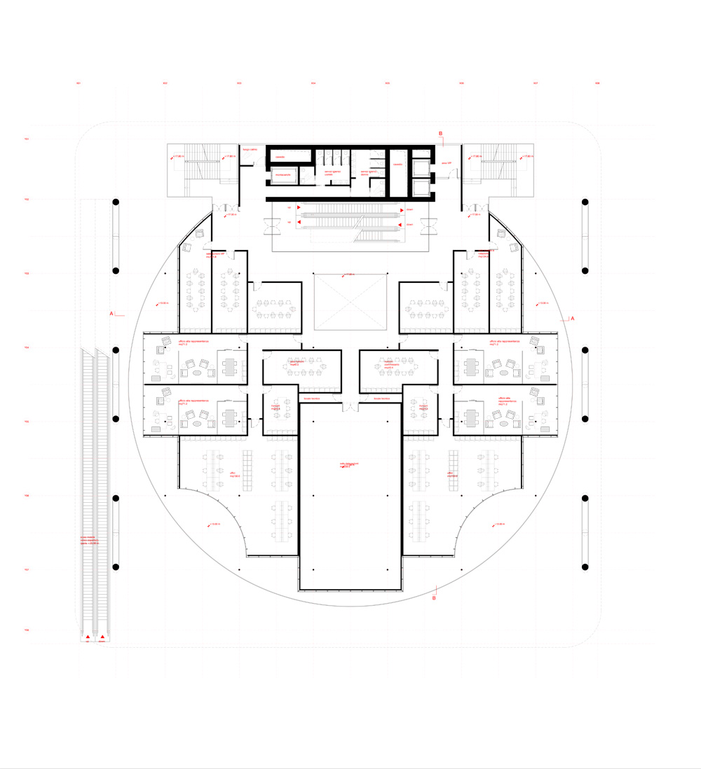
For this purpose we expected an absolute form of circular type on the first floor of the palace, suspended from the large roof consists of one large open space with a regular grid of circular thin pillars steel rods.
The curator of the Italian pavilion will be found to have maximum design freedom exposure without any constraint of bulky structures or walls limiting in any direction. The exhibition can be defined by additional plasterboard walls that separate the various arguments or equipment of any kind that allow a single or multi directional path of the visitor at the discretion of the editor.
The walls have been scheduled windowed – only during the Expo – to prevent the entry of natural light which would be a problem for the exhibition.
This solution respects the request for an floor to floor height 5.5 m for the exhibition space and allows interior ceiling up to 4.5 m.
The ceiling will be equipped with guides to power spotlights and removable at will in order to ensure maximum flexibility of installation of the exhibition.
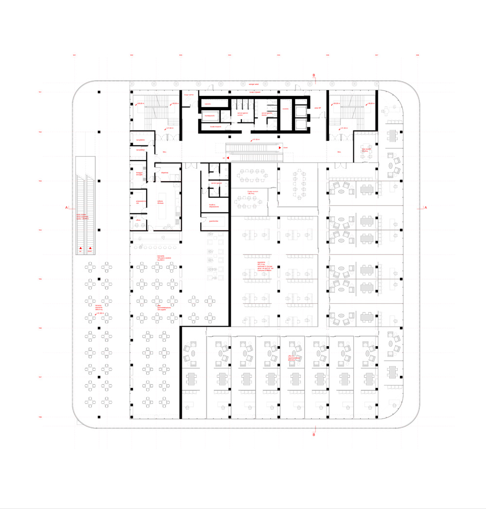
The exhibition spaces are developed with the same criteria in the second floor of the Palace.
The conference rooms
The second floor of the building continues the exhibition space of the first floor by the escalators connecting that allow a seamless continuity.
On the back of the exhibition is located in the foyer of three conference rooms, respectively, 250, 150, 50 places to conduct business meetings and conferences of various kinds on the themes of the Expo.
Given the importance of the conference rooms, the architectural external shape wanted to put them in clear evidence through three parallelepipeds that develop over the volume of the circular exhibition space and which remain surrounded by panoramic terraces all around.
Alongside the conference were provided spaces for the café and for a deposit. In particular, the bar has a panoramic terrace facing the Square Below (Piazza Bassa).
The lateral volumes are characterized by a reading of the Baroque curvilinear shape to establish a dialogue with ironic architectural forms of the cylinder below and to recall the charm of the Italian Baroque and evoke the architectural history of the Bel Paese. The curvilinear forms follow the vertical development of the project in a continuous growing from the Square Below to the Roof Square.
The Roof Square
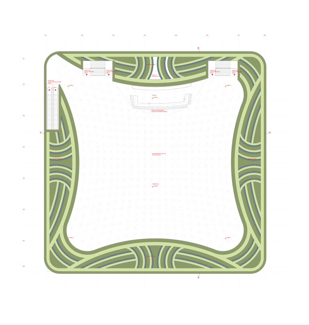
In our project, we wanted to offer the Italian Pavilion also set up a second Square on the roof of the palace itself.
Often the covers are left out of the halls to host plants or simple coatings of coverage, while it seemed interesting to quote the theme of the terrace, that features many Italian houses, also on the top of the Italian Pavilion.
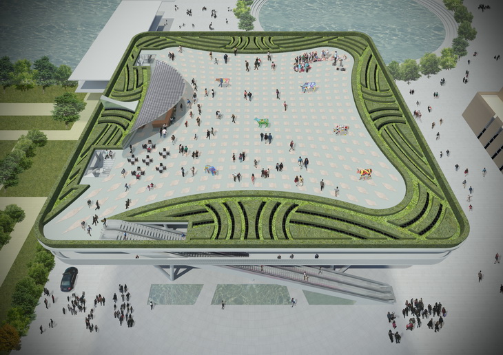
This function is emphasized by a large escalator that allows access to the Roof Square (Piazza Alta) directly from the street of the Cardo.
The escalator is the charm futuristic technology that allows you to go immediately on the roof of the Italian Pavilion to admire the Expo and in the evening "to see the stars."
The Roof Square is characterized by a large square paved in stone with LED lights on the ground and from an Italian garden on the perimeter.
It seemed interesting to report on the roof gardens which are often found on the terraces of Italian villas to convey the feeling of Italian culture to foreign tourists. In particular, the Italian garden has always been much admired at the international level and its revival in contemporary brings the charm of the Italian tradition.
Long hedges of cartridge case conceal a 1.1m high perimeter fence and create a geometric design in dynamic large flower beds laid on the perimeter to characterize this architecturally space from which to admire the panorama of Expo 2015.
The Water
The theme of water has been developed providing a long pool of water on a lower edge of the Square Below to emphasize the projection of large escalator on the cover.
This is a metaphor for the Italian rivers and it must be crossed by two bridges by visitors from the west side to access the Piazza Below.
From the tank will leak out various water jets as in the most famous Italian fountains to remember the charm squares. gardens and public places of the Bel Paese.
Multiplicity of use and interpretation
Due to these solutions, the use of the building is diversified in various ways. Some visitors can only go on the Roof Square, while other visitors can only go inside the palace, others may go in the Lower Square to listen to a concert, for example ..
The Palace Italy is thus not unidirectional, but can be experienced in various ways and acquires the charm of an urban and cultural complexity.
Various events can take place simultaneously in various parts of the Roof Square, in the Lower Square, Conference rooms, without interference and with an unusual way to live a pavilion for Expo.
For example, there may be an event at the same time on the Roof Square, conference halls inside the palace and a show in the Lower Square.
Multi-material
The facades of the building are split into different materials and finishes in the various plans and characterize the polymorphism of the building.
The suspended cylinder of the exhibition space is characterized by the use of the wood finish on the whole facade. It is composed of long vertical panels of Canadian cedar wood that in post-Expo will be used as shutters that open to allow the entry of light through the windows in laboratories distributed around the entire perimeter.
The same type of wood is used for the ceiling of the cylinder or above the Lower Square. It consists of a general coating and decorative elements in thick wood with a design reminiscent of the designs of the Italian Baroque. In this way the ceiling acquires a perception less heavy and more friendly thanks to the use of this material more "hot" and natural.
Its baroque design makes it unique to cover a public space and long strips of LED lights will follow and emphasize the dynamic curves typical of our tradition.
The volumes of the second and third floors are covered with low iron glass type with double chamber, selective coating and screen-printed in white. This choice allows to have high thermal insulation performance and low solar factor for post-Expo.
The architectural effect is that of a white marble covering almost volume to resume the Italian charm of historic architecture. This choice of material will emphasize the suspension in the vacuum of an object so heavy and sculpted in white marble.
The facades are coated strip on the back of the same wood used to coat the cylinder of the exhibition rooms. In part, they hide a cladding photovoltaic panels on two large sections of the building behind the vertical structures V to produce a high yield of solar energy.
The Lower Square is scheduled paved with local stone to create a design centric radio. The square is lined with high local stone paving of two types to make a drawing as described in the materials and rendering.
Project: Italian Pavillion EXPO 2015
Designed by Andrea Maffei Architects
Design Team: Takeshi Miura, Alessandra De Stefani, Stefano Bergagna, Takatoshi Oki, Roberto Balduzzi / Andrea Maffei Architects s.r.l. Milano
Structure: Alberto Ferrari, Steve Alemanno / Ramboll Ltd.
Facade: Nicoletta Bacchin / Ramboll Ltd.
Net Area: 10,146.6 smq.
Gross Area: 12,758.4 smq.
Maximum Height: 25 m
Location: Milan, Italy
Website: www.amarchitects.it


