Project: BASF Headquarters
Designed by SPACE, Juan Carlos Baumgartner, Gabriel Téllez Galindo
Design Team: Humberto Soto, Enrique Martínez, Elena Schneider
Constructor: GIA
Lighting: LUA
Area:
Location: Mexico City, Mexico
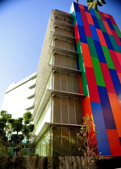
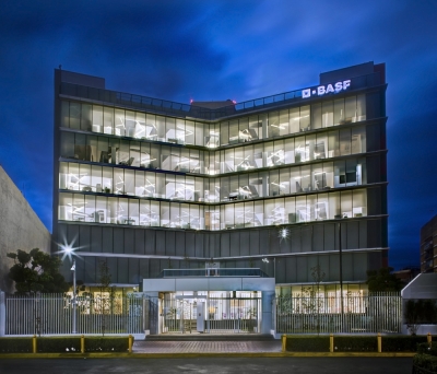
SPACE architects are sharing with us their design for the BASF Headquarters in Mexico City, shaped with a contemporary sentiment colour plays an important role in the design. Discover more of the project after the jump:
From the Architects:
The BASF corporate building is situated in Insurgentes Avenue, one of the most famous avenue in Mexico City.
The ground floor is of 1,315.0 m2 and each standard floor of approximately 942.0 m2. The shape has three differently-oriented squares brought together by a central core.
BASF's corporate office project consists of the ground floor and 6 levels, the second floor will be for leasing and the first floor will be developed in the future. The design program for the other floors includes spaces such as a lobby, open and private offices, meeting rooms, a dining room, rooms for informal or casual meetings, an auditorium, support areas and sites. A requirement of the client was to achieve LEED certification, so the design must had to incorporate maximum parameters of energy efficiency and sustainability.
On the ground floor there is a showroom for the display of the company's own products with the facilities to project images of the different products on screens.
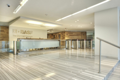
Also located on this floor is the reception area which has a staple with a stone finish and the BASF logo on the back wall. With its waiting area and turnstiles with scanners giving access to users, it will service the entire building.
Restrooms are divided into two parts, one for the meeting rooms and the other for the dining area, executive dining room and showroom. They will have everything to serve the needs of the customer with water-saving equipment which will help consumption. As this equipment has its own water treatment plant for used water, it will have a second use generating water for the air conditioning.
There is a public space with meeting rooms, two of which will have a movable wall making it possible to use the space in a different manner. The small rooms have audio-visual equipment and a wall mounted screen and the large rooms have projectors and electric screens. The executive dining room on this floor has three separate rooms with movable walls that can be made into one when the space is needed. The general dining room serves 100 people in two shifts, and this space will have a shared use, as an auditorium as it also has projectors and screens on columns. It features an audio cabin and store for tables and chairs, the latter being in the same space as the kitchen which has on-site food preparation.
It has an office area and a space for medical services, a lactation room and an ATM.
The pedestrian entrance to the building has ramps allowing access to disabled persons in wheelchairs. The smoking area is in the same area, designed to have lower visual impact, so only the floor finish changes.
There are bicycle racks in this floor’s parking lot, and there are showers for bicycle users on basement 1 with others to be found in the roof gym. The racks and the garbage can for separation and recycling are requirements of the building certification.
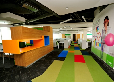
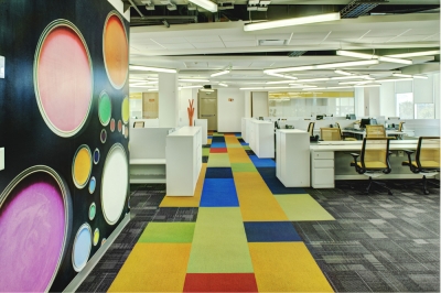
The floors second to the sixth could be called standard floors, whose three wings are comprised of open areas, except for the sixth floor where the presence of the chairman’s office results in more private offices.
These floors have a closed printing room with extraction as well as a stationery storage cabinet, enclosed phone booths consisting of a seat and a telephone line for private telephone conversations between two or more people. These floors also have meeting rooms, mainly for 4 to 8 people, which will be equipped according to need and size with projectors and screens.
There is also a janitor’s room in the emergency stairwell, for storage and cleaning facilities.
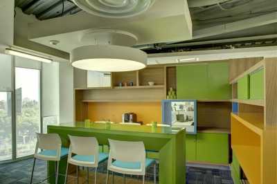
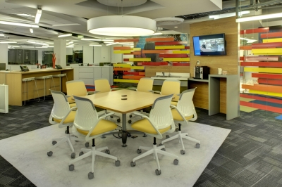
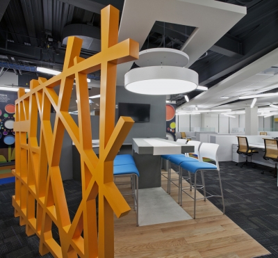
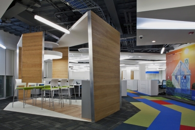
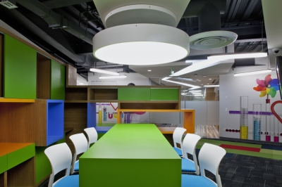
A distinguishing feature of these floors is the informal meeting space, strategically located to serve coffee and water, so that people to gather casually and watch presentations run from a laptop set on a table. The screen is wall-mounted or suspended from the ceiling as appropriate.
Each informal meeting space is decorated with a different theme, in order to bring something special to each floor.
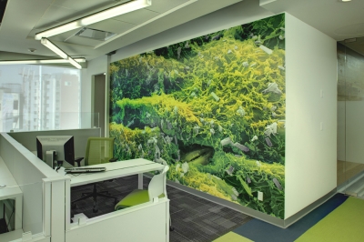
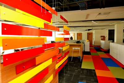
Low partitions between the workstations allow us to create a sense of spaciousness. Unlike the ground floor where the ceilings are either smooth or in a grid, these floors have shim plates and a center soffit grid, creating more movement and depth as you can see the slab behind.
On the sixth floor, the directors’ area has a smooth drywall ceiling with recessed linear luminaries with louvers; these fixtures will have different intensities and scenarios.
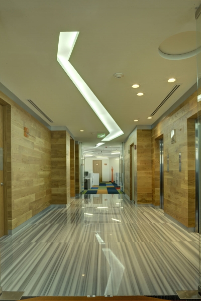
The elevator lobby will have a smooth ceiling and a light box along its length to round off each wing of the building.
The lighting designer’s proposal for the open areas is to have randomly suspended luminaires at two heights, adding a touch of versatility as this form of lighting provides for greater uniformity of lighting throughout the space.
The air conditioning works with Fan & Coils which enables us to make as much use as possible of the ceiling space, and thereby to give a greater sense of space to each location.


