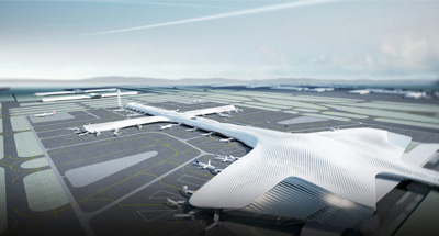
Project: Shenzhen Bao'an International Airport-Expation T3
Designed by Massimiliano and Doriana Fuksas
Client: Shenzhen Airport (Group) Co., LTD
Area: 400 000 sqm
Location: Shenzhen, China
Website: www.fuksas.it
Design for Shenzhen Bao'an International Airport-Expation T3 by world renowned architecture practice Massimiliano and Doriana Fuksas, for more images and architects description continue after the jump:
From the Architects:
Shenzhen is one of the most important industrial locations as well as a very popular tourist destination in China. The fast developing city is located in the south of the Guangdong Province, neighbouring the Pearl River delta and Hong Kong. Shenzhen Bao'an International Airport is the fourth largest following Beijing, Shanghai, and Guangzhou in China.
In 2008 Massimiliano and DorianaFuksas Architects won the international competition for the extension of the airport with the design of Terminal 3.
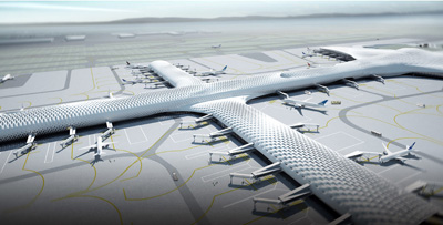
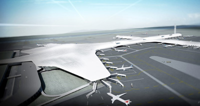
The concept of the project provokes the image of a sculpture with its organic shape. The structure of the building is in steel with a concrete substructure. The skin that envelops the structure, both on the inside and on the outside, shows the honeycomb motive.
The 300,000 mq facade is made of metal panels and glass panels of different size that can be partially opened. They follow the honeycomb motive. The building has a roof construction with spans up to 80 m. Through its double layer, the skin allows the natural light to filter and create light plays. The terminal and concourse constitute the major portion of the passengers? perception of an airport.
Concourse area is one of the key areas at the airport and it is composed of three levels. Each level is dedicated to independent functions: departure, arrival, and services. On the ground floor, the plaza provides access to the departures and arrivals as well as to the cafe and restaurants, offices and facilities for business meetings. Travellers reach the Terminal at level 14.40 m.
The spatial concept of interior is one of fluidity. It combines two different ideas: the idea of movement and the idea of pause. The honeycomb, developed in the suspended structure, is translated into the interior and quoted in different scales throughout the building. Retail boxes introduce the honeycomb idea in a bigger scale and will be repeated, in slightly different articulation, in the concourse. In the most public and open spaces, the honeycomb can be found as a 3D imprint in the wall cover as well as in the suspended ceiling.


