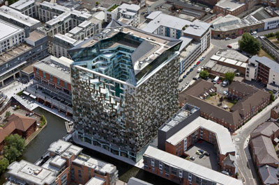
Project: The Cube
Designed by Make Architects
Collaborators: BuroHappold, Faber Mansell Fire, Faithful+Gould, GMJ, Hoare Lea
Client: Birmingham Development Company
Location: Birmingham, United Kingdom
Website: www.makearchitects.com
Make Architects develop a new approach to the atrium concept with their The Cube project in Birmingham spanning over 42,000 square meters. For more images and architects description continue after the jump:
From the Architects:
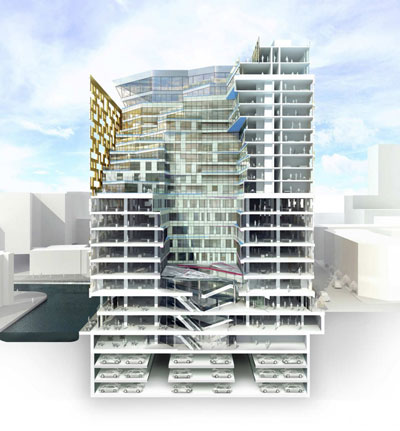
The Cube is the final phase of Birmingham’s Mailbox development and one of Make’s largest buildings to date, made up of a broad mix of uses including offices, apartments, retail units, restaurants, an automated car park, a boutique hotel, spa facilities and the city’s first rooftop restaurant. Over half the residential apartments were sold off-plan and the Highways Agency has let 50 per cent of the office space. The rooftop restaurant and bar have been let by Marco Pierre White and the hotel and spa by Sanguine Hospitality for an Indigo hotel.
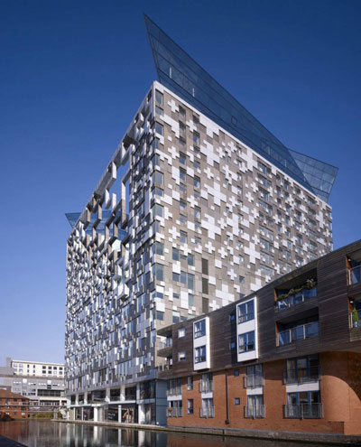
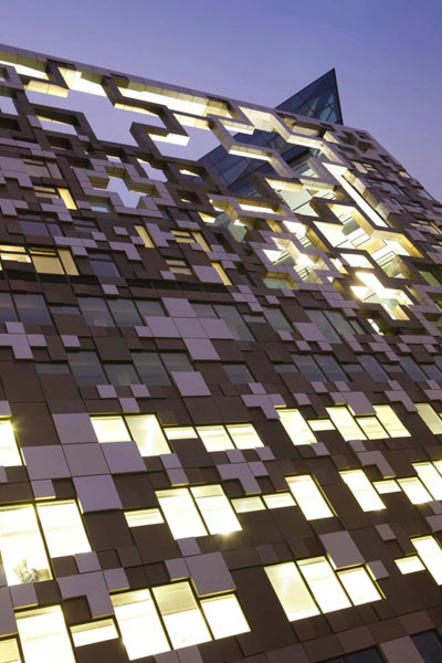
Pivotal to the continued regeneration of the surrounding area, The Cube’s striking appearance has had a dramatic impact on the Birmingham city skyline. The geometrical form of this 23-storey, £100 million building has remained unchanged from initial concept to completion. Its architectural language is derived from strong local references to Birmingham’s industrial heritage, celebrating the contrasts between heavy industrial metal working and hand-crafted jewellery and watch making.
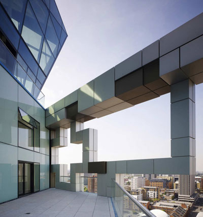
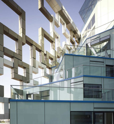
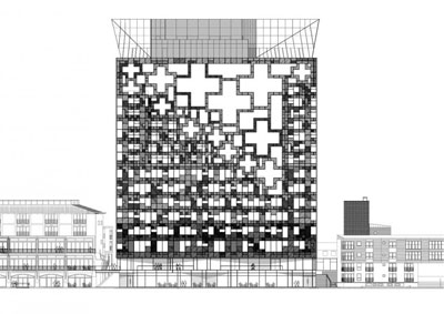
A bespoke unitised cladding system encases and defines the cube form. Gold and bronze-coloured anodised aluminium panels of varying size and depth are combined with glass, creating an intricate design which is complemented by an elegant and decorative metallic fretwork screen across the open side of the courtyard. The flexibility of this cladding system also plays a key role in the building's environmental strategy; the proportion of glass-to-aluminium varies from facade to facade, with greater solidity on the southern elevations to limit potential solar gain.
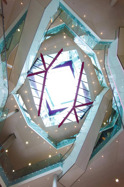
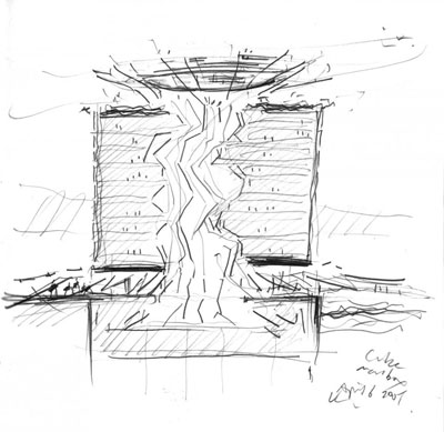
The geometry and materials of the courtyard are an unexpected contrast to the exterior; glazed unitised panels twist upwards through the central courtyard, forming a dramatic full-height open atrium which is animated by the colours of the soffits and ledges. This twisting geometry 'explodes' at the top to form the angular rooftop space which crowns the building.


One Comment
One Ping
Pingback:The Cube by Make Architects